

 1
1 - QCS
- All-Star
 Offline
- From: 🌌
- Registered: 5/18/2019
- Posts: 1,957
Sky Redesigns Nippon Professional Baseball (Series Complete!)
Hey, everyone! So, a couple weeks ago, I visited Japan and a stop on that trip was the Tokyo Dome, home of NPB's Giants. It got me thinking about Japanese baseball, and because I'm me, that got me thinking about the aesthetics of Japanese baseball. It's different from MLB, for better or for worse. But it just wouldn't leave my head until I tackled all 12 NPB teams plus 5 bonuses.
Before I begin, I'd like to thank the following people: H-Town, who created the jersey template that I'm using; Japanese Baseball Cards, an invaluable resource for researching historical uniforms with their "Memories of Uniform" series of blogs; and Japan Baseball Jersey, whose catalog of items made for excellent reference. More than one wordmark in this series was traced from a listing on their site.
Teams will have a max of four jerseys. Road jerseys can be a colored top over white pants (in fact, this is the standard in NPB) but they may also be a gray jersey. You'll notice that most teams have a corporate name, as 11/12 NPB teams are owned by a major company and mostly used as advertisements, hence the names. In general I prefer to not use the corporate name, but out of respect for history, more often than not these corporate names will be on at least the road jersey. In addition, real-life NPB teams have ads in several positions, but I've restricted that to just an ad for the owners on the right sleeve.


I'll be revealing teams in order of highest team payout from a posting, from lowest to highest, before moving on to four hypothetical expansion teams and finally Samurai Japan, the national team. The first team, the Hokkaido Nippon-Ham Fighters, will be posted after the conclusion of this year's Japan Series. Please look forward to it!
Last edited by QCS (11/21/2025 11:16 pm)


- sportsfan7
- All-Star
Offline
- Registered: 5/24/2019
- Posts: 370
Re: Sky Redesigns Nippon Professional Baseball (Series Complete!)
I am going to guess Kyoto, Niigata, Okayama, and Shikoku
- Steelman
- superadminguy
Offline

- From: The Wild West
- Registered: 5/19/2019
- Posts: 1,687
Re: Sky Redesigns Nippon Professional Baseball (Series Complete!)
Oh yeah, looking forward to this!

AHS Admin. Creator of the THL, PUCH, WHA: Redux and Retroliga.
- QCS
- All-Star
Offline
- From: 🌌
- Registered: 5/18/2019
- Posts: 1,957
Re: Sky Redesigns Nippon Professional Baseball (Series Complete!)
sportsfan7 wrote:
I am going to guess Kyoto, Niigata, Okayama, and Shikoku
2/4, though not in that order! If this was Wordle, your guess would look like this: ⬛🟨⬛🟨
Oh yeah, looking forward to this!
Thanks! I'm very excited to share.
The Fukuoka Softbank Hawks won Game 5 last night to claim four straight and their 14th Japan Series title! Congrats to them and their fans. The Fighters will be posted soon!
- •
- QCS
- All-Star
Offline
- From: 🌌
- Registered: 5/18/2019
- Posts: 1,957
Re: Sky Redesigns Nippon Professional Baseball (Series Complete!)

Quick facts:
Founded: 1946
Field: Es Con Field Hokkaido, Kitahiroshima (Sapporo), Hokkaido
Pacific League Titles: 7
Japan Series Titles: 3
Owner: Nippon-Ham
Posting Fee: Naoyuki Uwasawa, $6250
Perhaps the most infamous Japanese baseball team, the Fighters are Japan's northernmost team, calling frozen Hokkaido home. Originally the Tokyu Flyers, in 1974 food company Nippon-Ham purchased the team and renamed them the Fighters after a submission from an Okayama prefecture high schooler suggested it. The company has continued their ownership to the present day, but moved the team from its traditional home of Tokyo to Hokkaido in 2004, adding the island's name to the team. Since then, the Fighters have won the Japan Series twice, and have produced international stars such as Yu Darvish and Shohei Ohtani.
Since their move to Hokkaido, the Fighters have maintained an unorthodox brand, first using a black-heavy brand before switching to blue. Inspired by the flag of Hokkaido, the Fighters use a 7-pointed star in their brand, which I decided to keep. In 2022, upon moving to their new ballpark, the Fighters revealed a dramatic rebrand, with inline letters and a major emphasis on blue. I've never been a huge fan of the new set, although I do like the use of blue on the road instead of the previous gold. I decided to shift away from using F to H as the cap logo to further highlight the Fighters' status as Hokkaido's team. The team used to do this on the road and for special Hokkaido jerseys, but I decided to adopt it full-time. I wasn't sure what to do for the team's typeface until I saw this 2019 fan club jersey featuring an angled block script and the Hokkaido star as an underline. I fell in love and decided to utilize it.

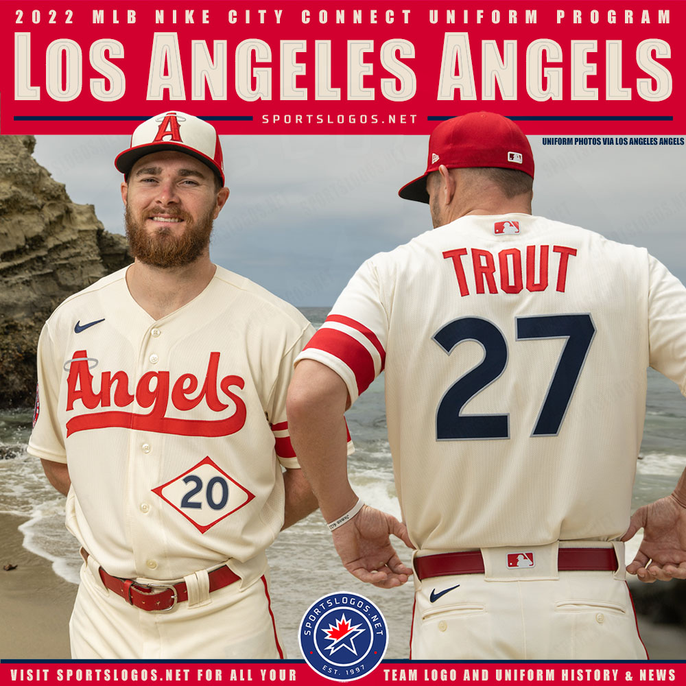
The Fighters have never had jerseys that I would consider great, although they're certainly unique. I was looking for a way to keep that individuality while restraining the set and remembered the Angels' City Connect jerseys, featuring a large stripe only on the left sleeve. So for Shohei's Japan team, I decided to adopt something from his first American team! The home, road, and third jerseys are essentially color swaps of each other, but the fourth is a throwback to the team's 1974 set, their first as the Fighters. I was awestruck by the excellent NH monogram and wanted to include it. It turns out, that was Nippon-Ham's logo at the time! So props to their design department for creating an amazing logo.
Overall, I think this Fighters set is a great combination of their iconic Hokkaido jerseys and a more traditional baseball aesthetic. I especially love the way the star nestles into each script, I would really love to wear one of those myself.
What do you all think? Comments of any kind are always appreciated. Tomorrow will be team number two, the Chunichi Dragons!
Last edited by QCS (11/03/2025 11:32 am)
- •
- Dan O'Mac
- All-Star
 Online!
- From: Green Bay, Wisconsin
- Registered: 5/22/2019
- Posts: 2,278
Re: Sky Redesigns Nippon Professional Baseball (Series Complete!)
I love the way you've tucked the top part of the staripe into the wordmark without going over a letter, yet still in the middle. And the stripe on only the one sleeve is really nice.
I'm not a huge fan of the blue NOB and number on front (NOF?) on the alternate, mostly because I don't care for the blue on black.

4x Alt Champion :: AltLB Champion Oklahoma City Bison - 2022 :: AltFL Champion New York Emperors - 2022 :: AltBA Champion Honolulu Kahunas - 2024-25 :: AltLB Champion Oklahoma City Bison - 2025

- ItDoesntMatter
- All-Star
Offline

- From: canon coast
- Registered: 5/18/2019
- Posts: 1,384
Re: Sky Redesigns Nippon Professional Baseball (Series Complete!)
great work on the ham fighters! I think changing the cap logo to an H makes a lot of sense, since it could stand for either hokkaido or ham fighters, and incorporating the star is a great touch. the uniforms are a lot of fun, too, and the unbalanced stripe makes them a lot cleaner while still feeling like the ham fighters. the throwback is great and the nh logo bangs on a cap. if I had one critique it'd be that the seams on the baseball are making the primary logo feel really cluttered; I wonder if there'd be a way to reduce the weight of them somehow. still, a fantastic start, and I'm definitely looking forward to the rest of the series (but only because you asked so nicely :P)
Last edited by ItDoesntMatter (10/30/2025 7:05 pm)


- QCS
- All-Star
Offline
- From: 🌌
- Registered: 5/18/2019
- Posts: 1,957
Re: Sky Redesigns Nippon Professional Baseball (Series Complete!)
I love the way you've tucked the top part of the staripe into the wordmark without going over a letter, yet still in the middle. And the stripe on only the one sleeve is really nice.
I'm not a huge fan of the blue NOB and number on front (NOF?) on the alternate, mostly because I don't care for the blue on black.
Glad you like them! I agree about the alt, but I wanted to keep the same split-color style as the home jersey. The visitor set has the extra "Hokkaido" in the wordmark to add black, but that wasn't available for the alt. I think the blue would be much more visible in real life.
great work on the ham fighters! I think changing the cap logo to an H makes a lot of sense, since it could stand for either hokkaido or ham fighters, and incorporating the star is a great touch. the uniforms are a lot of fun, too, and the unbalanced stripe makes them a lot cleaner while still feeling like the ham fighters. the throwback is great and the nh logo bangs on a cap. if I had one critique it'd be that the seams on the baseball are making the primary logo feel really cluttered; I wonder if there'd be a way to reduce the weight of them somehow. still, a fantastic start, and I'm definitely looking forward to the rest of the series (but only because you asked so nicely :P)
Thanks so much! I definitely see where you're coming from with the primary. I grabbed these seams from the Fighters' old logo but I think they could be cleaned up for sure. Just reducing the amount might accomplish the task.
Thanks for the feedback! The Dragons will be up soon.
- •
- QCS
- All-Star
Offline
- From: 🌌
- Registered: 5/18/2019
- Posts: 1,957
Re: Sky Redesigns Nippon Professional Baseball (Series Complete!)

Quick facts:
Founded: 1936
Field: Vantelin Dome Nagoya, Nagoya, Aichi
Central League Titles: 9
Japan Series Titles: 2
Owner: Chunichi Shimbun
Posting Fee: Akinori Otsuka, $300,000
The Chunichi Dragons are one of Japan's oldest teams, established as the Nagoya Club before eventually settling on Dragons. Their owner, Chunichi Shimbun, is one of Japan's most popular newspapers, and its name means "the middle of Japan", fitting for the team, as they're the only one in the region. They won the Japan Series in 1954, but not again until 2007, the longest drought in NPB history. Many Americans are likely familiar with the Dragons thanks to the Tom Selick movie Mr. Baseball, where an American first baseman gets traded to the Dragons and has to learn to be a team player.
The Dragons brand has fluctuated during their existence. Just about the only thing that's been consistent is the color blue and a Dodgers-style script. In the 1980s, the team went all-in on the Dodgers look, complete with red front numbers. To me, this is what I think of when I think of the Dragons, so the home uniform is basically a carbon copy of LA's current look.

The road uniform is a little different, trading Chunichi's current brush-style script for arched block lettering more reminiscent of the team's early '80s look. A new addition is the sleeve patch, which takes center stage on the third jersey: a dragon in the style of the D in the script, taken from this 2013 fan club jersey. In my opinion, it puts a Japanese spin on the Dodgers brand in a way that the Dragons can really own. The fourth jersey takes the team's history of navy into account, using a sublimated scale pattern for a unique look. Instead of the LA-style CD interlock, the script D is used as the cap logo here.
And that's Chunichi! With the home and road jerseys being so heavily inspired by the Dodgers, I wanted to take more chances with the alts. I really hope the Dragons end up using that fan club dragon D because it's a fantastic mark for the team.
What do you all think? Once again, all comments are appreciated. Up next will be my favorite team, the Hiroshima Toyo Carp!
Last edited by QCS (11/03/2025 11:33 am)
- •
- Steelman
- superadminguy
Offline
- From: The Wild West
- Registered: 5/19/2019
- Posts: 1,687
Re: Sky Redesigns Nippon Professional Baseball (Series Complete!)
Hokkaido Nippon-Ham Fighters
I think the Ham-Fighters are an excellent introduction to the series. I enjoyed your process of finding a new identity while honoring the past. You nailed it. The scaling of asymmetrical sleeve stripes is brilliant. I do agree with IDM on the baseball seams on the logo being a bit overpowering. Great set!
Chunichi Dragons
Dodgers West are a nice team, although perhaps a little too Dodgery. I am happy to see the weird bird gone. I'm feeling a bit of disconnect with the C in the cap logo with the rest of the set. The C shape is very western-y with the big serif but the rest of the set doesn't give that vibe. I'd be okay with the Dodgers-style script but I think the standard block numbers don't do anything to lift this set. Something a little bigger and bolder would do a lot imo, maybe something to match your new cap monogram The third jersey seems like it could be something special with the Dragon-D logo but falls short for me with no other black or special elements to tie it together. The fourth jersey is off-the-wall and fine as a fourth but doesn't flow with the rest of the set imo.
Just a few thoughts! Looking forward to more, and my Tigers!
AHS Admin. Creator of the THL, PUCH, WHA: Redux and Retroliga.