

- QCS
- All-Star
 Offline
- From: 🌌
- Registered: 5/18/2019
- Posts: 1,969
Re: Sky Redesigns Nippon Professional Baseball (Series Complete!)

Quick facts:
Founded: N/A
Field: Okinawa Cellular Stadium, Naha, Okinawa
Owner: N/A
The Ryukyu Turtles are the only fictional team in this series, representing Okinawa Prefecture and the entire Ryukyu Islands. A baseball team, known as the Ryukyu Blue Oceans, attempted to organize and enter NPB, but fell apart due to financial difficulties after the COVID-19 pandemic. The islands were previously ruled by the Ryukyu Kingdom before annexation by Japan in 1879. The Ryukyu name still holds tremendous value to the people of Okinawa and is used for their two current major sports, FC Ryukyu Okinawa of soccer and the Ryukyu Golden Kings of basketball. An Okinawa team could draw from locals as well as capitalize on the major U.S. military bases on the islands (a major source of contention from native Okinawans).
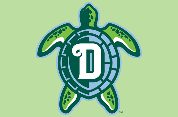
Following the trend of NPB teams named for animals, I considered two local marine animals as the nickname for Okinawa's team. The prefecture is home to both sea turtles and dugongs, but as the Dragons already use "D" in alphabetical abbreviations, Turtles was the better choice. The logo is a stylized turtle seen from above, similar to this Daytona Tortugas logo. I went for a unique double-green color scheme with a light tan representing the turtle's shell. This way, Ryukyu stands out from the other green teams in NPB.

Ryukyu's jerseys were a place for me to implement ideas that I hadn't yet in NPB, including a mascot character on the home jersey and a sand-colored road jersey like the Padres, referencing Okinawa's tropical nature. The third jersey is a bright green set with a Turtles script while the fourth jersey shows off Okinawa pride, placing the prefecture front and center.
It remains to be seen if the Blue Oceans' dream of a local NPB team ever reaches fruition, but they certainly have my support. Okinawa is a beautiful place and somewhere I would love to visit one day when I'm able, hopefully with a local team to call their own.
What do you all think? All comments are appreciated! Tomorrow will be the last team of the series, the Japanese national baseball team, Samurai Japan!


- Dan O'Mac
- Moderator
Offline

- From: Green Bay, Wisconsin
- Registered: 5/22/2019
- Posts: 2,360
Re: Sky Redesigns Nippon Professional Baseball (Series Complete!)
I genuinely love this set. The only thing I'm not sure of is the home having a turtle on the chest and on the cap. The Ryukyu script makes me very happy though.

5x Alt Champion :: AltLB Champion Oklahoma City Bison - 2022 :: AltFL Champion New York Emperors - 2022 :: AltBA Champion Honolulu Kahunas - 2024-25 :: AltLB Champion Oklahoma City Bison - 2025 :: AltFL Champion New York Emperors - 2025

- QCS
- All-Star
Offline
- From: 🌌
- Registered: 5/18/2019
- Posts: 1,969
Re: Sky Redesigns Nippon Professional Baseball (Series Complete!)
Dan O'Mac wrote:
I genuinely love this set. The only thing I'm not sure of is the home having a turtle on the chest and on the cap. The Ryukyu script makes me very happy though.
Thanks! I agree with you but I wanted to have the turtle on the jersey and it only made sense to keep it on the cap. The Ryukyu script is a favorite of mine as well.
- •
- QCS
- All-Star
Offline
- From: 🌌
- Registered: 5/18/2019
- Posts: 1,969
Re: Sky Redesigns Nippon Professional Baseball (Series Complete!)

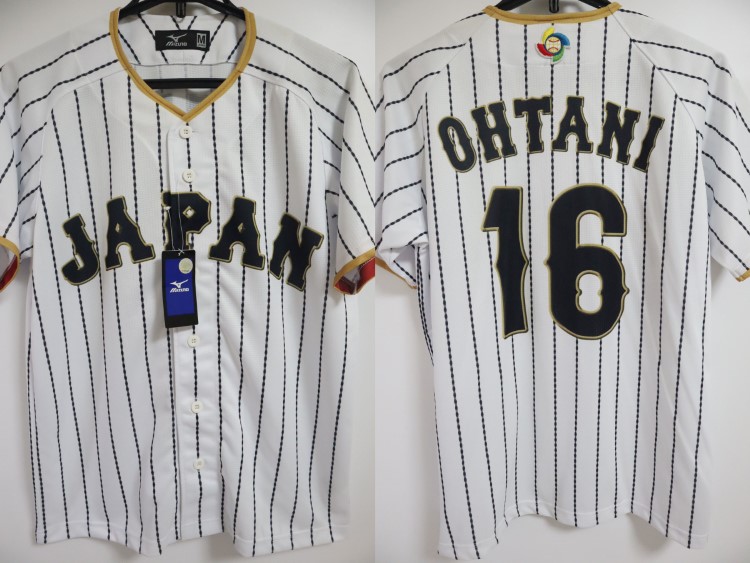
Quick Facts:
Founded: 1954
Asian Titles: 21
WBC Titles: 3
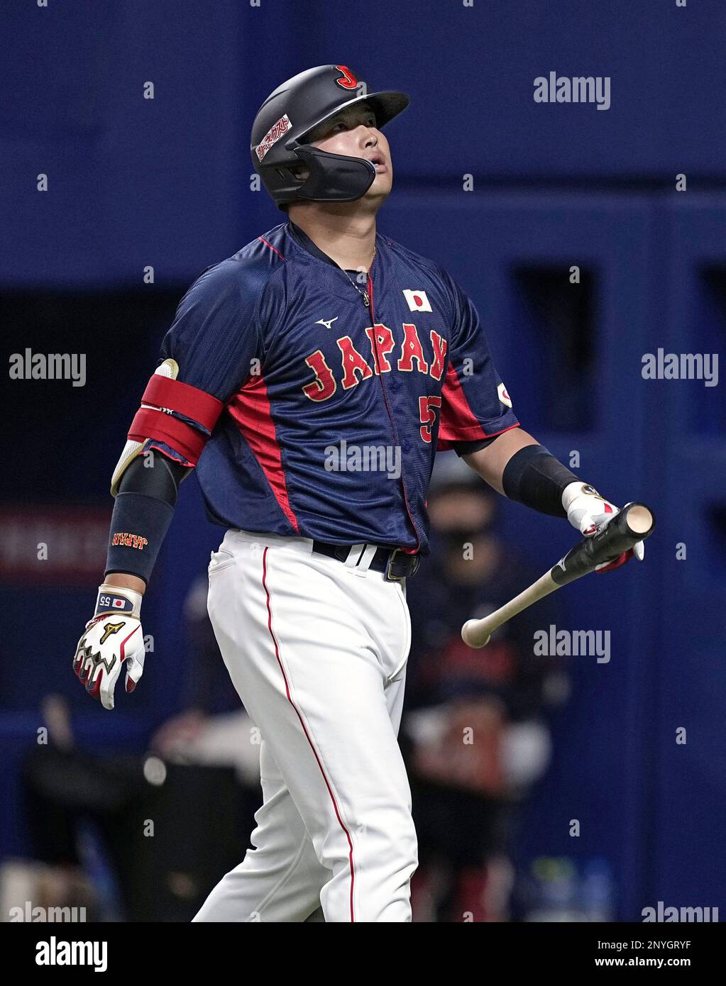
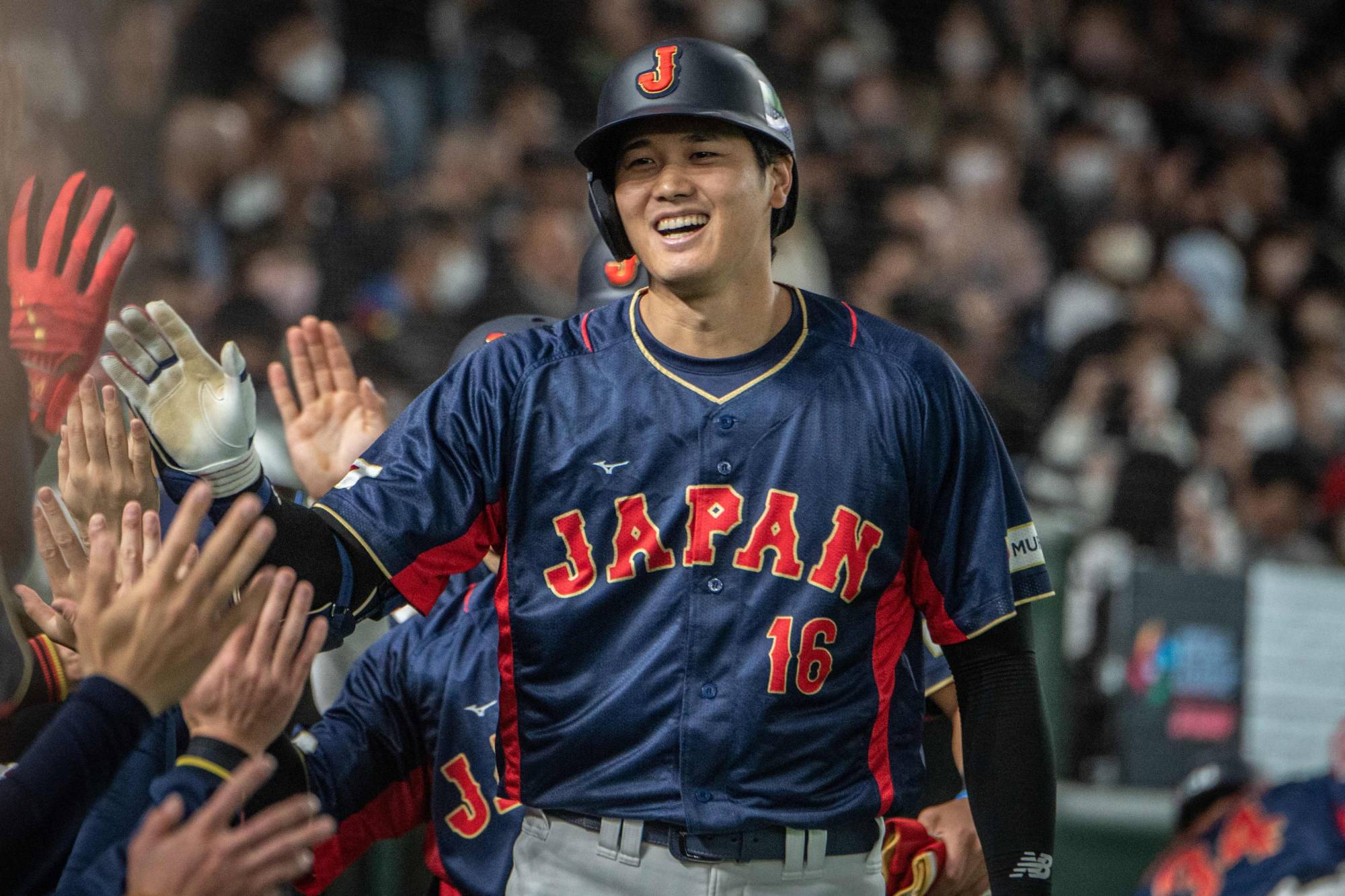
Japan's national baseball team, otherwise known as Samurai Japan, has been the world's best baseball team for quite a while. They have the most World Baseball Classic titles and are the reigning champs, taking down the USA in the finals for their third gold. Japan has a history of using blue in international sporting events such as soccer, rugby, and baseball. Samurai Japan seems to have settled in a bit of a holding pattern with navy/black, gold, and red, which have always kind of competed for attention with each other.
I think Japan peaked aesthetically with their 2017 set. Dark pinstripes, gold highlights, and a near-elimination of red. This is the direction I decided to go in and I completely cut out red from the primary home and road. The navy/black/gray has been consolidated into one off-black color and I've softened the gold as well.

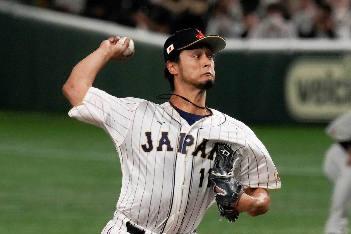
The home jersey is a near-replica of the 2017 set, just swapping the diamond-shaped pinstripes for regular ones. The cap logo is the J from the Japan wordmark in white, as opposed to ghosted or red. The road jersey is a basic black top with gray pants. Both home and road jerseys feature gold highlights on the sleeves and collar. The third jersey is a bit more out-there, bringing back red for an alternate look featuring black pinstripes and no white aside from the pants.
And with that, this series is complete! Thanks to everyone who commented and viewed my work. Glad to finally be able to say that I've completed something, haha. Feel free to leave any and all comments!
Last edited by QCS (11/21/2025 11:20 pm)
- •
- ItDoesntMatter
- All-Star
Offline

- From: canon coast
- Registered: 5/18/2019
- Posts: 1,456
Re: Sky Redesigns Nippon Professional Baseball (Series Complete!)
ventures: solid, classic baseball look. definitely reminds me of the yankees too. you really took it to another level with the changes you made; the rope pattern is such a great touch
pirates: this is another one with a weird logo. it almost reads like a C and an I to me, although I also kinda see a lowercase e for ehime in there? still, when it's based on an existing brand, it feels right. the colors are awesome; I love orange and green and it feels like the only choice for a team based around mandarin oranges. oh and I almost missed the secondary logo on the sleeves! holy banger
turtles: I love almost everything about this. the color scheme is great and the turtle logo is really well done. the only issue I have is the tan road uniform. I think the reason it works for the padres and not the turtles is that the padres' tan complements their shade of brown really well, but here it clashes with the green. if you want to try something different on the road, maybe a powder blue would work here? it might also look really bad, idk
samurai: not much to say here, but I definitely like the tweaks you made to the colors. it just feels like the japanese national baseball team. the red alt is nice, albeit maybe a little dark, but I think it works
all in all, just an absolutely stellar job from top to bottom. can't wait to see what you tackle next!


- Section30
- Moderator
Offline

- From: Minnesota
- Registered: 5/18/2019
- Posts: 2,860
Re: Sky Redesigns Nippon Professional Baseball (Series Complete!)
I like the decision to limit red to the third jersey for Samurai Japan. The home and road are really classy with just the navy and gold.


- Steelman
- superadminguy
Offline

- From: The Wild West
- Registered: 5/19/2019
- Posts: 1,715
Re: Sky Redesigns Nippon Professional Baseball (Series Complete!)
Yomiuri Giants: I think these simple updates look really nice. Super clean, classy set.
Chiba Lotte Marines: I like what you've done to differentiate them from the ChiSox. A good-looking black and white set just feels right for baseball. The red jersey gives a nice change and the wild fourth is pretty cool. I'm not personally a fan of staggered front logo/number in baseball, but I get it. I do wish the Chiba script wasn't quite so large, feels a little oversized compared to the Marines script.
Yokohama DeNA BayStars: Firstly, the team name is terrible and has a terrible IRL brand to match. So really anything you did was prob gonna be an improvement, however, I do think you did some cool things here. The new color scheme is fantastic. Beautiful combo with the gold. That feels like a significant change that should stick IRL. I think your cap logos are much stronger than the primary logo, but still feels better than their current "looks like a seafood brand" logo. The skewed star doesn't really do it for me, along with the floating text, but I think the shooting star look on the cap logos are really nice. The home and away unis are nice. The third is still growing on me. I think it works for the league but in a vacuum feels weird, ya know? I don't hate it though. Overall, good improvements, especially with a more clearly defined nautical direction. I think you could prob lean into that even more.
Tokyo Yakult Swallows: I'll preface my thoughts with, I think you're on the right track here. The navy is gorgeous but I think the green is too brightly hued for me. I'd prefer a more Kelly green with a little blue in it for balance. It could still be bright but less abrasive. I think what's bothering me is that there seems to be two competing styles with the logos and scripts, which isn't really your fault but worth noting. The new primary logo has a very modern almost graffiti-like element to it with hard angles, while the original S/Swallows logo is smooth and has soft edges. Granted the old logo is a total disaster, but I think you could help strengthen your direction here by choosing one or the other. I personally think the original Swallows mark with the little wings is nicer, where the new YS logo could be used only for an alternate jersey. However, if used in that way, it doesn't flow with the nice scripts, and perhaps a further point for me, the scripts don't flow with either the Swallows wordmark either. I think you should consider new scripts or do something to simplify which styles you're using here. Maybe leave the scripts to one of the alt jerseys? I really dislike the drop shadows. But I think drops could work if they were singular instead of floating shadows. I think the old Padres-style numbers look better with the scripts/Swallows logo but the SF Giants numbers can work too if they're soley paired with the hard-angled logo. That's basically it, lol. I really want to love the Swallows, just trying to attempt to describe what bothers me.

AHS Admin. Creator of the THL, PUCH, WHA: Redux and Retroliga.
- Steelman
- superadminguy
Offline
- From: The Wild West
- Registered: 5/19/2019
- Posts: 1,715
Re: Sky Redesigns Nippon Professional Baseball (Series Complete!)
Orix Buffaloes: So IRL I can't stand the Buffaloes look. So not really your fault if I hate this team. However, I think the black and gold combo is nice. I think the gold needs to be a bit brighter to stand out better on black. Probably somewhere between the current and the yellow gold you used on the fourth jersey. This team desperately needs to ditch some outlines. I'm surprised you didn't go down that route a bit more. Mostly bc the road uni looks so much cleaner. Personally I think you should start with the nice B cap logo and work down from there. This set feels unfinished to me. I really think they need a full makeover.
Rakuten Eagles: Overall I like what you did for them. The new E is nice, even if I don't really like the faux drop shadow throughout. I think a consistent stroke would feel better as it doesn't convey much extra motion imo. Solid set. And you know I'm a sucker for a throwback cream uniform. The old school E and Tuscan numbers are cool.
Fukuoka Hawks: I really like the striping. Can't go wrong with a green and gold baseball team. Great look. I think the new (old) logo works here. I don't totally love the numbers, but overall it's a nice set.
Oisix Albirex: Okay Japanese Mets, how you doin? Overall solid look. I don't see the N/A in the logo, not your fault, but could be improved upon. Good starting point for an expansion team. Also! So this fourth jersey is what the Orix Buffaloes should look like! Seriously. Swap that out for Orix and maybe go with an out of the box color for the 4th for Oisix?
Kufu Hayate Ventures: The braided rope striping is so good. It makes me not hate them for looking like the Yankees. Super clean set. I like them. Also like Ventures for a name.
Shikoku Mandarin Pirates: First of all, green and orange is a highly underrated color scheme. Excellent choice! I love the logo, but feel like it needs a stroke and a much deeper drop shadow. It gets lost on color/cap imo. Same goes for the word marks on the home and road, which I also like. Go heavy on the stroke and shadow to match the numbers and this set goes insanely hard.
Ryukyu Turtles: I like turtles. ![]() Fun logo, great script. I think the sand color is too dark, looks muddy against the greens. Maybe lighten that up. Overall nice set, feels like a modern expansion team which isn't a bad thing at all.
Fun logo, great script. I think the sand color is too dark, looks muddy against the greens. Maybe lighten that up. Overall nice set, feels like a modern expansion team which isn't a bad thing at all.
Samurai Japan: Overall good tweaks. I do wish there was a splash of red somewhere on the home/road. The alternate feels too dark, I think red/black/white would work better here.
Hell of series, Sky! You really did your research and I appreciate how you incorporated all of that into your choices and write-ups to allow the reader to follow along even if we didn't have a strong grasp of Japanese baseball design. Overall very impressive project!
AHS Admin. Creator of the THL, PUCH, WHA: Redux and Retroliga.