

- QCS
- All-Star
 Offline
- From: 🌌
- Registered: 5/18/2019
- Posts: 1,958
Re: Sky Redesigns Nippon Professional Baseball (Series Complete!)
Steelman wrote:
Hokkaido Nippon-Ham Fighters
I think the Ham-Fighters are an excellent introduction to the series. I enjoyed your process of finding a new identity while honoring the past. You nailed it. The scaling of asymmetrical sleeve stripes is brilliant. I do agree with IDM on the baseball seams on the logo being a bit overpowering. Great set!
Chunichi Dragons
Dodgers West are a nice team, although perhaps a little too Dodgery. I am happy to see the weird bird gone. I'm feeling a bit of disconnect with the C in the cap logo with the rest of the set. The C shape is very western-y with the big serif but the rest of the set doesn't give that vibe. I'd be okay with the Dodgers-style script but I think the standard block numbers don't do anything to lift this set. Something a little bigger and bolder would do a lot imo, maybe something to match your new cap monogram The third jersey seems like it could be something special with the Dragon-D logo but falls short for me with no other black or special elements to tie it together. The fourth jersey is off-the-wall and fine as a fourth but doesn't flow with the rest of the set imo.
Just a few thoughts! Looking forward to more, and my Tigers!
Thanks so much for the feedback! I agree with you on Chunichi (although I do want to note that the CD monogram I used is their real cap logo). I'll definitely do some revisions at the conclusion of the series!
Sorry for the delay, everyone! I was busy moving this past weekend (your favorite Charlottean is now a resident of Madison, Wisconsin!) and didn't have time to post. The Carp will be up soon!


- QCS
- All-Star
Offline
- From: 🌌
- Registered: 5/18/2019
- Posts: 1,958
Re: Sky Redesigns Nippon Professional Baseball (Series Complete!)

Quick facts:
Founded: 1949
Field: Mazda Zoom-Zoom Stadium Hiroshima, Hiroshima
Central League Titles: 9
Japan Series Titles: 3
Owner: Matsuda family (Mazda)
Posting Fee: Ramón Ramírez, $350,000
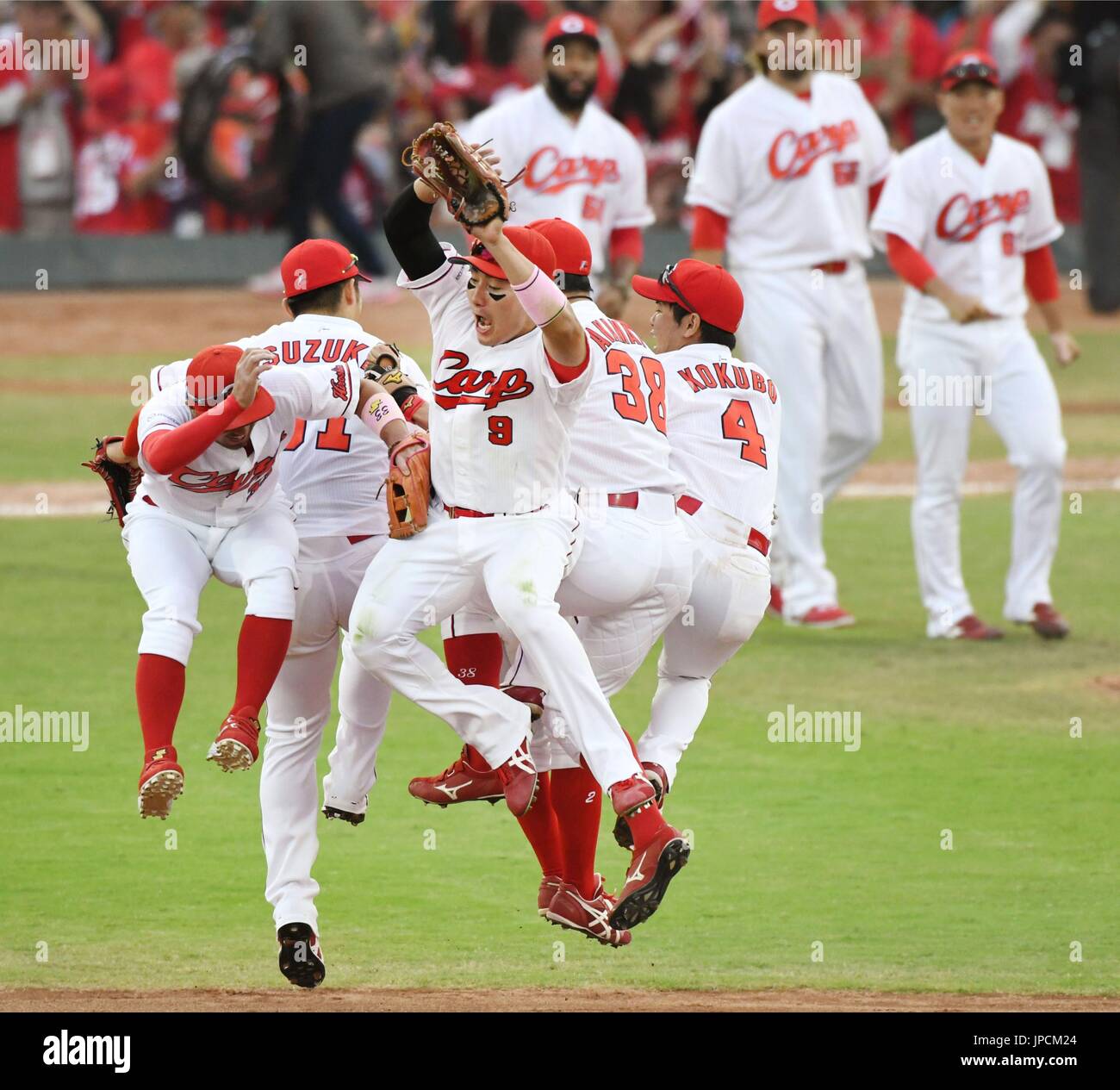
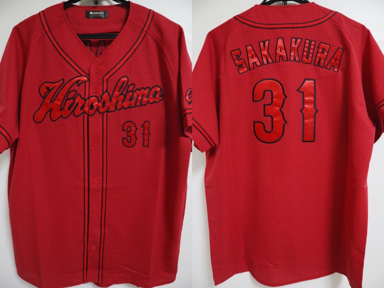
The Hiroshima Carp were founded in 1949 as a part of the reconstruction process after the devastating atomic bombing of the city at the end of World War II. The name Carp was chosen in honor of Hiroshima Castle and the koi fish that would climb its rapids. The team and city are inextricably tied together, and their second stadium, used for over 50 years, was literally across the street from the Atomic Dome. The Carp are the only NPB team to be privately owned, as the Matsuda family, founders of the Mazda car company, retained a majority share when they sold the company to Ford. That's where the "Toyo" part of the team's name comes from, as before 1984, Mazda was known as Toyo Kogyo.
Originally a primarily navy team, the Carp experimented with their look in the '50s, using a Cincinnati Reds-inspired set that would come to resemble the team's current uniforms. For a while, the team used an H as their cap logo, but in 1973, the team shifted to a red-focused look and introduced the wishbone-C cap logo and a gorgeous Hiroshima script. 2002 saw the debut of a matching Carp script, and the team settled into their current look in 2009.

I adore the Carp's 2009-2022 look. It just feels like baseball to me. I've been on-record stating that the team's road jersey from this era is my favorite baseball jersey of all time and I still agree with this claim. Unfortunately, the team decided to take a sledgehammer to it in 2023 and introduced a new road jersey with shiny red text on the red jersey base (and a home jersey with a koi-style stripe on the back! Shoutout to the RIBF!). I've taken the liberty of rectifying this mistake. The only other change I made was introducing a navy alternate, as the Carp buck the trend of wild alternates and stick with just their home and road sets. A simple color swap of the home jersey, this new alternate honors the team's origins with a navy cap, top, and socks.
There you have it! My favorite Japanese team with my favorite baseball jersey ever gets a very simple treatment. I think out of all of my designs, this is the one I'd most want to see adopted in real life, mostly because of how sad I am at what the Carp are currently wearing.
What do you all think? All comments are appreciated! Next we'll take our first of five trips to the Tokyo area with the Saitama Seibu Lions!
Last edited by QCS (11/03/2025 7:01 pm)
- •
- ItDoesntMatter
- All-Star
Offline

- From: canon coast
- Registered: 5/18/2019
- Posts: 1,384
Re: Sky Redesigns Nippon Professional Baseball (Series Complete!)
liking these last two! the dragons are very dodgers, but the road jersey with the block lettering (not to mention being blue) helps distinguish things a lot. the D-dragon is extremely cool, and the fourth is really neat, although I think I'd prefer it without the ghosted script and number. as for the carp, you didn't really have to do much with them, and I think you pretty much nailed it. would they mix and match the navy cap/socks with the primary jerseys? could be a fun look


- Dan O'Mac
- All-Star
Offline

- From: Green Bay, Wisconsin
- Registered: 5/22/2019
- Posts: 2,280
Re: Sky Redesigns Nippon Professional Baseball (Series Complete!)
First off, welcome to Wisconsin! I love Green Bay, but Madison is an amazing city.
I have fond memories of the Chunichi Dragons because of Mr. Baseball, so retaining much of the Dodgers look keeps them in line with what I remember. I'm digging the alternate, the sublimated pattern isn't over powering, and the script D is gorgeous.
The Carp is really good, and you've done more than enough to go with a red team and a wishbone C to distinguish them from the Cincinnati Reds with the navy. And I agree, the Hiroshima script is perfect, especially on a jersey.

4x Alt Champion :: AltLB Champion Oklahoma City Bison - 2022 :: AltFL Champion New York Emperors - 2022 :: AltBA Champion Honolulu Kahunas - 2024-25 :: AltLB Champion Oklahoma City Bison - 2025

- QCS
- All-Star
Offline
- From: 🌌
- Registered: 5/18/2019
- Posts: 1,958
Re: Sky Redesigns Nippon Professional Baseball (Series Complete!)
liking these last two! the dragons are very dodgers, but the road jersey with the block lettering (not to mention being blue) helps distinguish things a lot. the D-dragon is extremely cool, and the fourth is really neat, although I think I'd prefer it without the ghosted script and number. as for the carp, you didn't really have to do much with them, and I think you pretty much nailed it. would they mix and match the navy cap/socks with the primary jerseys? could be a fun look
Thanks a ton! I'll definitely take a look at the Dragons' set after I post all the teams. I think the Carp could totally mix and match! It could make for a fun throwback look with the navy-dominant accessories.
First off, welcome to Wisconsin! I love Green Bay, but Madison is an amazing city.
I have fond memories of the Chunichi Dragons because of Mr. Baseball, so retaining much of the Dodgers look keeps them in line with what I remember. I'm digging the alternate, the sublimated pattern isn't over powering, and the script D is gorgeous.
The Carp is really good, and you've done more than enough to go with a red team and a wishbone C to distinguish them from the Cincinnati Reds with the navy. And I agree, the Hiroshima script is perfect, especially on a jersey.
Thanks! The city is really nice and the weather hasn't made me want to die yet, so that's better than expected!
Glad you like the teams! I agree, I think the Carp really stand out from the Reds with all the navy, but someone on the Creamer boards requested a Twins-esque HC monogram so I'll give that a shot at the end.
The Lions will be up soon!
- •
- QCS
- All-Star
Offline
- From: 🌌
- Registered: 5/18/2019
- Posts: 1,958
Re: Sky Redesigns Nippon Professional Baseball (Series Complete!)

Quick facts:
Founded: 1949
Field: Belluna Dome, Tokorozawa (Saitama), Saitama
Pacific League Titles: 23
Japan Series Titles: 13
Owner: Seibu Railway
Posting Fee: Kazuhisa Makita, $500,000
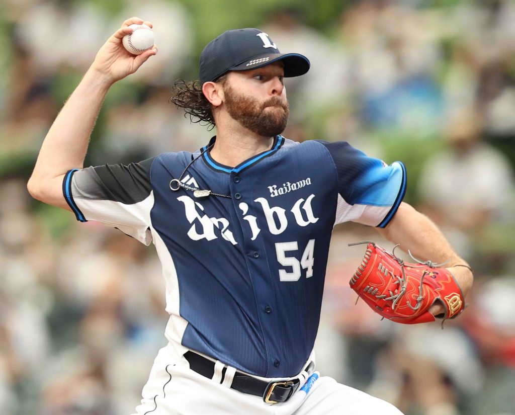
The Saitama Seibu Lions were founded as the Nishi-tetsu Clippers and based in Fukuoka, the largest city on the southern island of Kyushu and current home of the Hawks. After just one year, they changed their nickname to the Lions, which has stuck ever since. The Lions were struck with the Black Mist Scandal of 1969, which involved several star players fixing matches in collusion with the yakuza, much like America's Black Sox Scandal. The team was sold to Seibu Railway and moved to the western edge of the Tokyo area, a stadium just across the prefectural border in Saitama. The Lions went on a tear in the '80s and '90s, winning 8 Japan Series titles with a team nicknamed "Invincible Seibu".
The Lions added "Saitama" to their name in 2008, during a trend of NPB teams adding their home to their names (the Fighters, Eagles, and Swallows all did the same in the 2000s) and adopted a new look, replacing their Invincible Seibu-era set with a new blackletter look, seemingly inspired by their look from the early '60s. I like this brand for them, but I did want to make some tweaks. Notably, the team can't seem to decide if their secondary color is red or light blue. I decided on light blue to separate them from the Carp and Dragons and adjusted the primary logo to match.

I quite like the Lions' current home jerseys and chose to base the set around them. Light blue is very prominent, becoming a true secondary color, found in wordmarks, sleeve stripes, and the bill of the cap. I decided to go with the 2015-19 use of just "Saitama" on the away rather than the current Seibu with a small Saitama. The third is an Invincible Seibu throwback, complete with the classic Kimba the White Lion-inspired logo. I really love this set, even its funky away counterpart.
And that's the Lions! I really like their modern look and I think the switch to light blue really puts it all together. One of these days I'd love to get my hands on a throwback cap, too.
What do you all think? All comments are appreciated! Up next will be the reigning Central League champs, the Hanshin Tigers!
- •
- Steelman
- superadminguy
Offline

- From: The Wild West
- Registered: 5/19/2019
- Posts: 1,688
Re: Sky Redesigns Nippon Professional Baseball (Series Complete!)
The Carp are fantastic, no notes. Okay...one small tiny note: The Wishbone C logo on the Third batting helmet not having an outline bugs me since every other instance of it does have one. But yeah overall great brand. It's like the lovechild of the Reds and Braves. Also shoutout Zoom-Zoom stadium, what a name.
The Lions are also fantastic and I only have one note. The double blue is a good choice. The third jersey is gorgeous. The number set on the home and road should belong with the Dragons to fit with their monogram logo. It's the C/6 serif similarities. I think if the Lions had more of a Detroit Tigers or maybe Yankees style number set it would be a little cleaner. That's my only thought, overall great update for another solid looking team.
Looking forward to the Tigers!

AHS Admin. Creator of the THL, PUCH, WHA: Redux and Retroliga.
- QCS
- All-Star
Offline
- From: 🌌
- Registered: 5/18/2019
- Posts: 1,958
Re: Sky Redesigns Nippon Professional Baseball (Series Complete!)
The Carp are fantastic, no notes. Okay...one small tiny note: The Wishbone C logo on the Third batting helmet not having an outline bugs me since every other instance of it does have one. But yeah overall great brand. It's like the lovechild of the Reds and Braves. Also shoutout Zoom-Zoom stadium, what a name.
The Lions are also fantastic and I only have one note. The double blue is a good choice. The third jersey is gorgeous. The number set on the home and road should belong with the Dragons to fit with their monogram logo. It's the C/6 serif similarities. I think if the Lions had more of a Detroit Tigers or maybe Yankees style number set it would be a little cleaner. That's my only thought, overall great update for another solid looking team.
Looking forward to the Tigers!
Oops, good catch on the Carp! That's a mistake, I must've missed the outline when changing colors. Thanks for the heads up! Interesting note on the Lions' numbers, and looking at it, I think I agree. I'll adjust the numbers as well! Thanks for all the great feedback so far!
The Tigers will be up in just a bit!
- •
- QCS
- All-Star
Offline
- From: 🌌
- Registered: 5/18/2019
- Posts: 1,958
Re: Sky Redesigns Nippon Professional Baseball (Series Complete!)

Quick facts:
Founded: 1936
Field: Hanshin Koshien Stadium, Nishinomiya, Hyogo
Central League Titles: 7
Japan Series Titles: 2
Owner: Hanshin Electric Railway Co.
Posting Fee: Shintaro Fujinami, $650,000
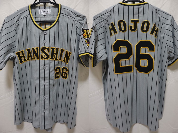
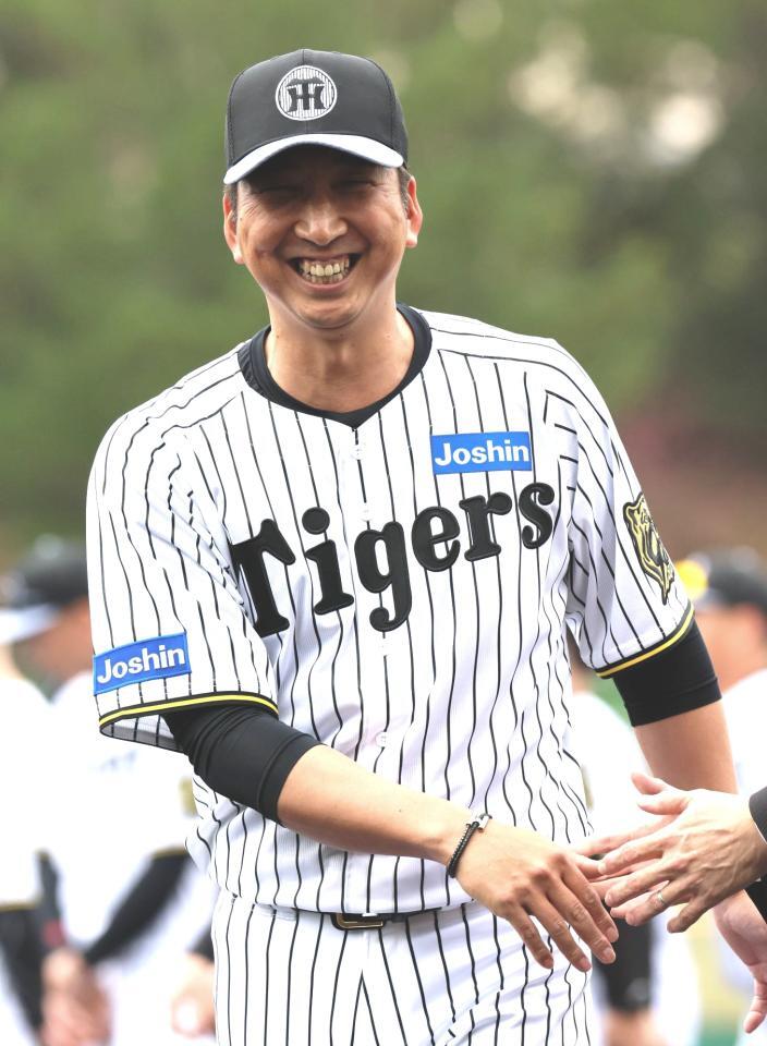
If the Yomiuri Giants are Japan's New York Yankees, then the Hanshin Tigers are the Boston Red Sox. Despite playing near Japan's second-largest city Osaka, the Tigers have seen very little success, with only 2 Japan Series titles to their name. Like the Red Sox, the Tigers were faced with a curse: the Curse of the Colonel. In celebration of the team's 1985 Central League title, fans resembling Tigers players jumped into Osaka's Dotonbori Canal. With nobody to represent first baseman Randy Bass, fans took a replica Colonel Sanders statue from a nearby KFC and threw it into the river. While the Tigers captured the '85 Japan Series, they would not repeat as champions until 2023, and many blame this on the Colonel, saying the team would never be successful until the statue was recovered. Most of the statue was retrieved in 2009, but his glasses and left hand still remain in the river.
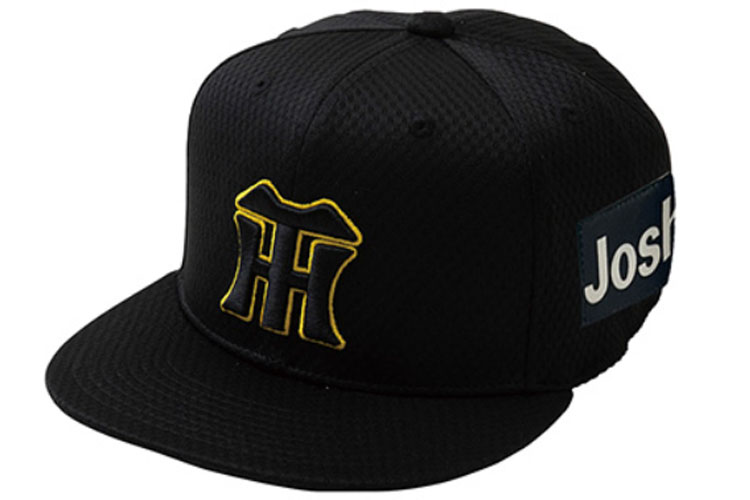
The Tigers' home stadium is also the host of the national high school baseball tournaments (known colloquially as "Koshiens"), forcing the team on a brutal road trip in the summer and relocate any home games to the Kyocera Dome Osaka, normally home of the Orix Buffaloes. The Tigers have an iconic look, adopting their current name in 1961 and the HT cap logo at the same time. I knew that not much, if anything, needed to change, so really all I did to the logos was adjust the shade of yellow to be slightly less bright.

Can't top near perfection! The Tigers' home and road uniforms are inspired by what they wore from 2022-2024. I love this set, from the pinstripes to the tiger sleeve patch to the gold and black trim. In 2025, the team celebrated their 90th anniversary with new jerseys inspired by the team's history. Unfortunately, I don't think these are very good, especially not the "ghosted" home cap. So, we revert to what they had before. In exchange for these traditional home and road looks, the alternates are more out-there. The Tigers have used black as their away color before, but I decided on a no-white third with simple striping. The fourth jersey is inspired by the Cincinnati Bengals' current look and the Tigers' previous attempts to capture tiger stripes in alternates. Included is an all-yellow cap with a black logo.
And that's the Tigers! The more I worked with this team, the more I came to love their aesthetics. I hope their 90th anniversary set goes away soon because they have one of the best looks in all of baseball.
What do you all think? All comments are appreciated! Our next team will be the Yankees of Japan, Tokyo's Yomiuri Giants!
- •
- Steelman
- superadminguy
Offline
- From: The Wild West
- Registered: 5/19/2019
- Posts: 1,688
Re: Sky Redesigns Nippon Professional Baseball (Series Complete!)
Ah yes, Ti-gers my beloved. Honestly no notes. I like the fourth jersey, it feels more professional than their other attempts...honestly that 2021 alternate is... wow. Great set!
AHS Admin. Creator of the THL, PUCH, WHA: Redux and Retroliga.