


- MyTeamIsDr.Pepper
- All-Star
 Offline
- Registered: 5/18/2019
- Posts: 932
Re: History of the National Football Association - 1974-75 Season
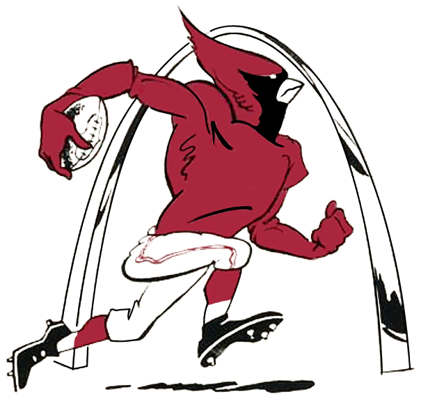
This a little better?


Follow the NFA here:
- NeoPrankster
- All-Star
Offline
- Registered: 2/09/2020
- Posts: 501
Re: History of the National Football Association - 1974-75 Season
Irish Lumberjack?
- MyTeamIsDr.Pepper
- All-Star
Offline
- Registered: 5/18/2019
- Posts: 932
Re: History of the National Football Association - 1974-75 Season
NeoPrankster wrote:
Irish Lumberjack?
What?
Follow the NFA here:
- •
- QCS
- All-Star
Offline

- From: 🌌
- Registered: 5/18/2019
- Posts: 1,895
Re: History of the National Football Association - 1974-75 Season
Yeah, that looks more natural. Good stuff!


- H-Town1141
- Starter
Offline

- Registered: 5/20/2019
- Posts: 161
Re: History of the National Football Association - 1974-75 Season
for something that detailed, I'd scale it back on the shadows, decrease the amount of colors, utilize black to your advantage, and change up the line-weights depending on what you want to be emphasized.. My suggestion would be to draw it out and then try to vectorize it if you want, or just scan it and leave it at that. It'll be more work, sure, but era-appropriate styling and historical techniques help add all the more realism to the project.
(for reference, think these:

 )
)
I l I K E t H I S
- ThisIsFine
- All-Star
Offline

- From: The Local Taco Bell
- Registered: 6/23/2019
- Posts: 951
Re: History of the National Football Association - 1974-75 Season
This a little better?
Maybe change his skin color from skin to white?
AHSylum Inmate

- NeoPrankster
- All-Star
Offline
- Registered: 2/09/2020
- Posts: 501
Re: History of the National Football Association - 1974-75 Season
Irish Lumberjack?
What?
I guess it was just the colors.
- Rugrat
- All-Star
Offline
- From: Displaced in PDX
- Registered: 4/17/2020
- Posts: 1,239
Re: History of the National Football Association - 1974-75 Season
Go Lumberjacks! #Chopemup


- MyTeamIsDr.Pepper
- All-Star
Offline
- Registered: 5/18/2019
- Posts: 932
Re: History of the National Football Association - 1974-75 Season
for something that detailed, I'd scale it back on the shadows, decrease the amount of colors, utilize black to your advantage, and change up the line-weights depending on what you want to be emphasized.. My suggestion would be to draw it out and then try to vectorize it if you want, or just scan it and leave it at that. It'll be more work, sure, but era-appropriate styling and historical techniques help add all the more realism to the project.
(for reference, think these)
I tried to recreate it using some of your tips. This look a little better? Was aiming toward the Oilers and Texans logo.
Follow the NFA here:
- •
- NeoPrankster
- All-Star
Offline
- Registered: 2/09/2020
- Posts: 501
Re: History of the National Football Association - 1974-75 Season
Nicely rendered!