

- Steelman
- superadminguy
 Offline
- From: The Wild West
- Registered: 5/19/2019
- Posts: 1,740
Re: World Baseball Softball Confederation by Sky
Good update for Kenya, def ties it all together.
I'm not super keen on Argentina. The design is nice but all the colors seem really washy together. I do think the blue jersey is a big improvement over the gray.
Finland looks great. I do agree with Dan on the blue NOB. But that's a really sharp look.

AHS Admin. Creator of the THL, PUCH, WHA: Redux and Retroliga.
- sky
- All-Star
Offline

- From: 🌌
- Registered: 5/18/2019
- Posts: 2,080
Re: World Baseball Softball Confederation by Sky
Dan O'Mac wrote:
The only thing I don't like with Finland is the NOB in light blue with the dark blue border. It's the only place in the entire set where the color pattern swaps between the front, number on back and NOB for their respective sets.
Good update for Kenya, def ties it all together.
I'm not super keen on Argentina. The design is nice but all the colors seem really washy together. I do think the blue jersey is a big improvement over the gray.
Finland looks great. I do agree with Dan on the blue NOB. But that's a really sharp look.
Thanks to both of you! Truth be told, I'm not sure why I went with light blue NOBs on the home jersey. Here it is flipped:

And as for Argentina, I think we'll have to agree to disagree. They became one of my favorite sets in this series.


- •
- sky
- All-Star
Offline
- From: 🌌
- Registered: 5/18/2019
- Posts: 2,080
Re: World Baseball Softball Confederation by Sky

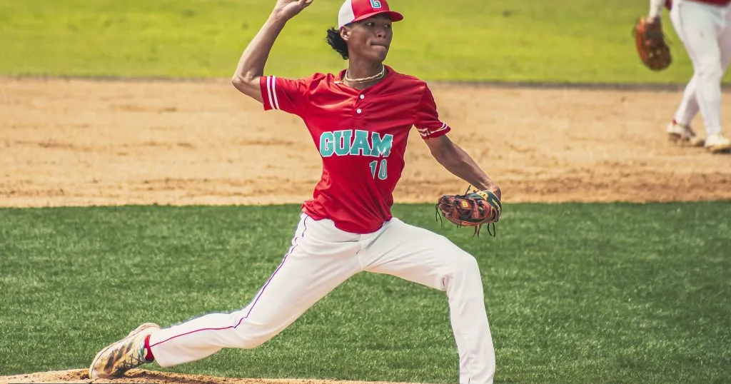
I really love Guam's bright and colorful set, so I kept it by and large the same here. At home is a more red-focused set, while the road set is powder blue. My main addition is double striping on the sleeves and pants, which has precedence in Guam's baseball history.
Last edited by sky (5/08/2026 11:50 am)
- •
- Dan O'Mac
- Moderator
Offline

- From: Green Bay, Wisconsin
- Registered: 5/22/2019
- Posts: 2,454
Re: World Baseball Softball Confederation by Sky
I absolutely love the old maroon and powder Phillies sets, and this immediately gives me those vibes (I completely understand the lighter red that the Phillies maroon, however). I really like the striping on it. I personally would want to toss it on the socks, but it's not needed.
Changing the NOB on Finland is definitely the right call.
As for Argentina, I do prefer the blue to the gray, but I feel the entire set falls near the bottom of the looks, in my opinion.

5x Alt Champion :: AltLB Champion Oklahoma City Bison - 2022 :: AltFL Champion New York Emperors - 2022 :: AltBA Champion Honolulu Kahunas - 2024-25 :: AltLB Champion Oklahoma City Bison - 2025 :: AltFL Champion New York Emperors - 2025

- Steelman
- superadminguy
Offline
- From: The Wild West
- Registered: 5/19/2019
- Posts: 1,740
Re: World Baseball Softball Confederation by Sky
Guam absolutely rips! Might be a new top fave in this series for me. I'd wear either of those jerseys!
AHS Admin. Creator of the THL, PUCH, WHA: Redux and Retroliga.
- ItDoesntMatter
- All-Star
Offline

- From: canon coast
- Registered: 5/18/2019
- Posts: 1,507
Re: World Baseball Softball Confederation by Sky
both new versions of palau are better. I think the process blue makes a bigger difference, and while I can definitely see the argument for white on the road jersey, the version without white matches both the flag and the striping better
the unique wordmark treatment for kenya is really nice. the striping is a little muddied, and I wonder if it could use some white in there to space it out, similar to the flag. I will say that while I understand why you went with a red-primary set, I feel like black would make that flag stroke stand out more than the red does (and also kenya feels more like a black team than a red team, but that's probably just me)
the blue top is absolutely the right way to go for argentina. not sure what you think didn't work about that but it's working for me. that script is an absolute banger. I agree with steel that the blue could use a touch more saturation, tho. I also feel like the sun on the cap is a little ... boring feels like not quite the right word but it's close enough. maybe you could combine it with the A from the script somehow?
finland was already great but I do think you've improved upon it. I like the sans-serif font better than the one they use, and the new script feels nicer as well. I also love the touches of using the coat of arms and "suomi" on the home jersey, even if those aren't your ideas
speaking of things that aren't your ideas, wow, guam looks incredible. you didn't have to do a whole lot here, but adding some striping on the sleeves is a small change that makes a big difference. I like that they've got two different caps, although I think I'd prefer the red cap with both jerseys, but it's still fun that they can mix and match there


- sky
- All-Star
Offline
- From: 🌌
- Registered: 5/18/2019
- Posts: 2,080
Re: World Baseball Softball Confederation by Sky
I absolutely love the old maroon and powder Phillies sets, and this immediately gives me those vibes (I completely understand the lighter red that the Phillies maroon, however). I really like the striping on it. I personally would want to toss it on the socks, but it's not needed.
Changing the NOB on Finland is definitely the right call.
As for Argentina, I do prefer the blue to the gray, but I feel the entire set falls near the bottom of the looks, in my opinion.
Thanks! I haven't put any stripes on socks because so many players don't wear them correctly that I don't want to balance the set around something that might not show. For fun, here's Guam with the Phillies' maroon:

I'm disappointed that you're not a fan of Argentina but I understand. Just a matter of taste.
Guam absolutely rips! Might be a new top fave in this series for me. I'd wear either of those jerseys!
Thanks so much! I agree, Guam had a really strong start, I just needed a little bit to push them over the edge to a great set.
both new versions of palau are better. I think the process blue makes a bigger difference, and while I can definitely see the argument for white on the road jersey, the version without white matches both the flag and the striping better
the unique wordmark treatment for kenya is really nice. the striping is a little muddied, and I wonder if it could use some white in there to space it out, similar to the flag. I will say that while I understand why you went with a red-primary set, I feel like black would make that flag stroke stand out more than the red does (and also kenya feels more like a black team than a red team, but that's probably just me)
the blue top is absolutely the right way to go for argentina. not sure what you think didn't work about that but it's working for me. that script is an absolute banger. I agree with steel that the blue could use a touch more saturation, tho. I also feel like the sun on the cap is a little ... boring feels like not quite the right word but it's close enough. maybe you could combine it with the A from the script somehow?
finland was already great but I do think you've improved upon it. I like the sans-serif font better than the one they use, and the new script feels nicer as well. I also love the touches of using the coat of arms and "suomi" on the home jersey, even if those aren't your ideas
speaking of things that aren't your ideas, wow, guam looks incredible. you didn't have to do a whole lot here, but adding some striping on the sleeves is a small change that makes a big difference. I like that they've got two different caps, although I think I'd prefer the red cap with both jerseys, but it's still fun that they can mix and match there
Thanks! I agree on Palau, the yellow on blue like the flag is my favorite. Here's Kenya with those changes you suggested:

I definitely like the striping more, but I think I prefer the red jersey.
Glad you like Finland and Guam! I'm disappointed but understand about Argentina. It's a set I really like, so I don't really want to make any more tweaks to it.
- •
- sky
- All-Star
Offline
- From: 🌌
- Registered: 5/18/2019
- Posts: 2,080
Re: World Baseball Softball Confederation by Sky

For the most part, I tried to avoid direct MLB copies, but for some reason, Cambodia's team uses almost identical Dodgers rip-offs, and that gave me a chuckle, plus it fit the nation's colors, so I decided to run with it. I made a new C logo in the style of the Dodgers' LA interlock and opted for a blue road jersey to separate the country from the Dodgers at least a little bit, which has since backfired on me, as the real team has introduced a blue road alternate in the time since I made this concept and am posting it. At least mine doesn't have gray highlights.
- •
- Steelman
- superadminguy
Offline
- From: The Wild West
- Registered: 5/19/2019
- Posts: 1,740
Re: World Baseball Softball Confederation by Sky
Dear God...I just saw those gray highlights for that new Dodgers jersey. Sheesh. Pretty funny though that you made this before they announced that.
Dodgers Lite...erm, I mean Cambodia looks good! Can't really go wrong with an iconic look. I do wonder if perhaps some kind of added red to the striping could help it separate from LA a bit since the blue jersey isn't as much of a departure as hoped.
I do really like the black jersey for Kenya but it feels like an alternate/third to me. The new striping is cool!
AHS Admin. Creator of the THL, PUCH, WHA: Redux and Retroliga.
- sky
- All-Star
Offline
- From: 🌌
- Registered: 5/18/2019
- Posts: 2,080
Re: World Baseball Softball Confederation by Sky
Dear God...I just saw those gray highlights for that new Dodgers jersey. Sheesh. Pretty funny though that you made this before they announced that.
Dodgers Lite...erm, I mean Cambodia looks good! Can't really go wrong with an iconic look. I do wonder if perhaps some kind of added red to the striping could help it separate from LA a bit since the blue jersey isn't as much of a departure as hoped.
I do really like the black jersey for Kenya but it feels like an alternate/third to me. The new striping is cool!
Thanks! Red striping for Cambodia is a great idea. Here's what that looks like:

- •