


- sky
- All-Star
 Offline
- From: 🌌
- Registered: 5/18/2019
- Posts: 2,062
Re: World Baseball Softball Confederation by Sky
Steelman wrote:
Ecuador and its updates are absolutely fantastic. I think the road gray is the way to go, but if you were expanding a full compliment of jerseys then the blue would also work great. Though I think if this were the case, go drop shadows on the white/gray and you could just go single outline no drop on the special blue for it to look a little better. I do like the open drop shadow look (ala Rangers) a lot though, but incongruent with the rest of the set. Minor quibbles though. Great set!
I think New Zealand looks sharp, they've always gone kinda no-nonsense imo so to me it works. Some Maori elements could be cool, again, maybe better suited for a third jersey situation. Good one.
Love the update to Aruba. I'm still not sold on Slovenia though I think the green and blue is the right direction. Something about that particular shade of green doesn't jive with me. I don't mind the stars on the jersey but they feel lost on the cap.
I really like the design of Palau but I think the blue jersey needs white outlines. I think the yellow/gold is dark enough to carry white. Would like to see outline on the cap logo too. Though I also wonder if black accents might work too, instead of white. There's a good base here, just might need a few tweaks to really pop!
I really like Sri Lanka! I think this was a great way to combine their super weird color palette (for sports, at least) and make it work well. SL is a surprisingly difficult combo to monogram (recently tried some concepts for my new project) so I like yours a lot. Also a much improved version of their script. Very good!
Thanks! Sri Lanka was a sleeper hit for me in this series, it's such an out-there look and I'm quite proud of how I've interpreted it.
Here's Palau with white outlines, I think it definitely helps:

I would be worried about visibility from far away. The P of the cap already starts to vanish at scale.
really liking the updates on ecuador. I prefer the blue to the gray personally but I think either of them is an improvement over the original
palau is much better with the bright colors! I think in lieu of adding white (or black) as steel suggested maybe just a slightly darker blue would work? right now everything is just a little too bright for me. the stripes are a lot of fun and are a really nice local touch
I almost wish sri lanka would lean into the flag colors a little more because they're so unique, but I think you did a fantastic job of incorporating them into their existing jersey design without being too over-the-top. the script is nice, and the cap logo is serviceable, if a little unexciting (but certainly better than theirs in any case). overall a solid look
Thanks! I agree that Sri Lanka's cap logo isn't really anything special, but like Steel said, S and L are sneakily tricky to work with together.
Here's Palau with the Carolina Panthers' blue, which I think really makes the set work. Thanks for the suggestion!


- sky
- All-Star
Offline
- From: 🌌
- Registered: 5/18/2019
- Posts: 2,062
Re: World Baseball Softball Confederation by Sky

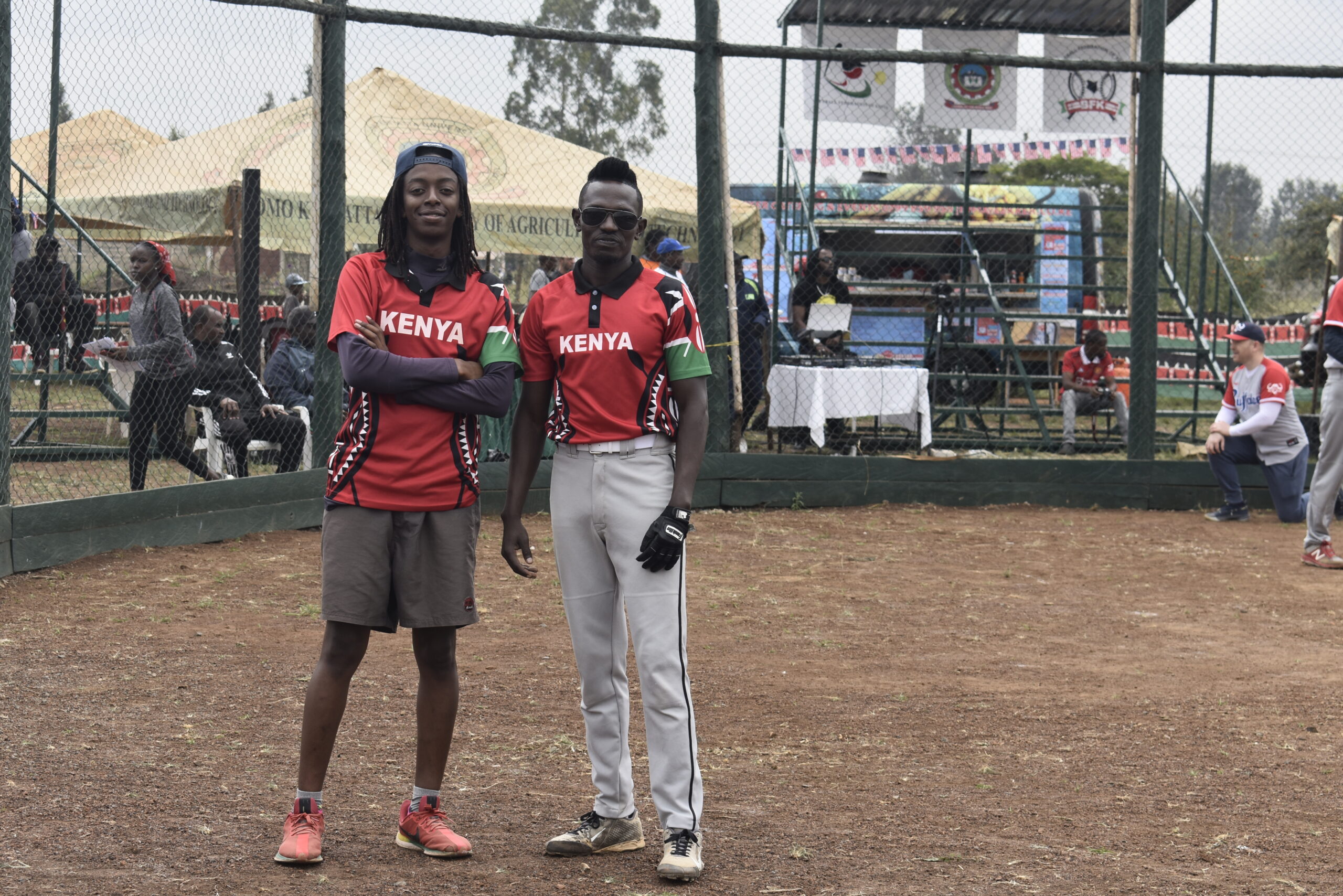
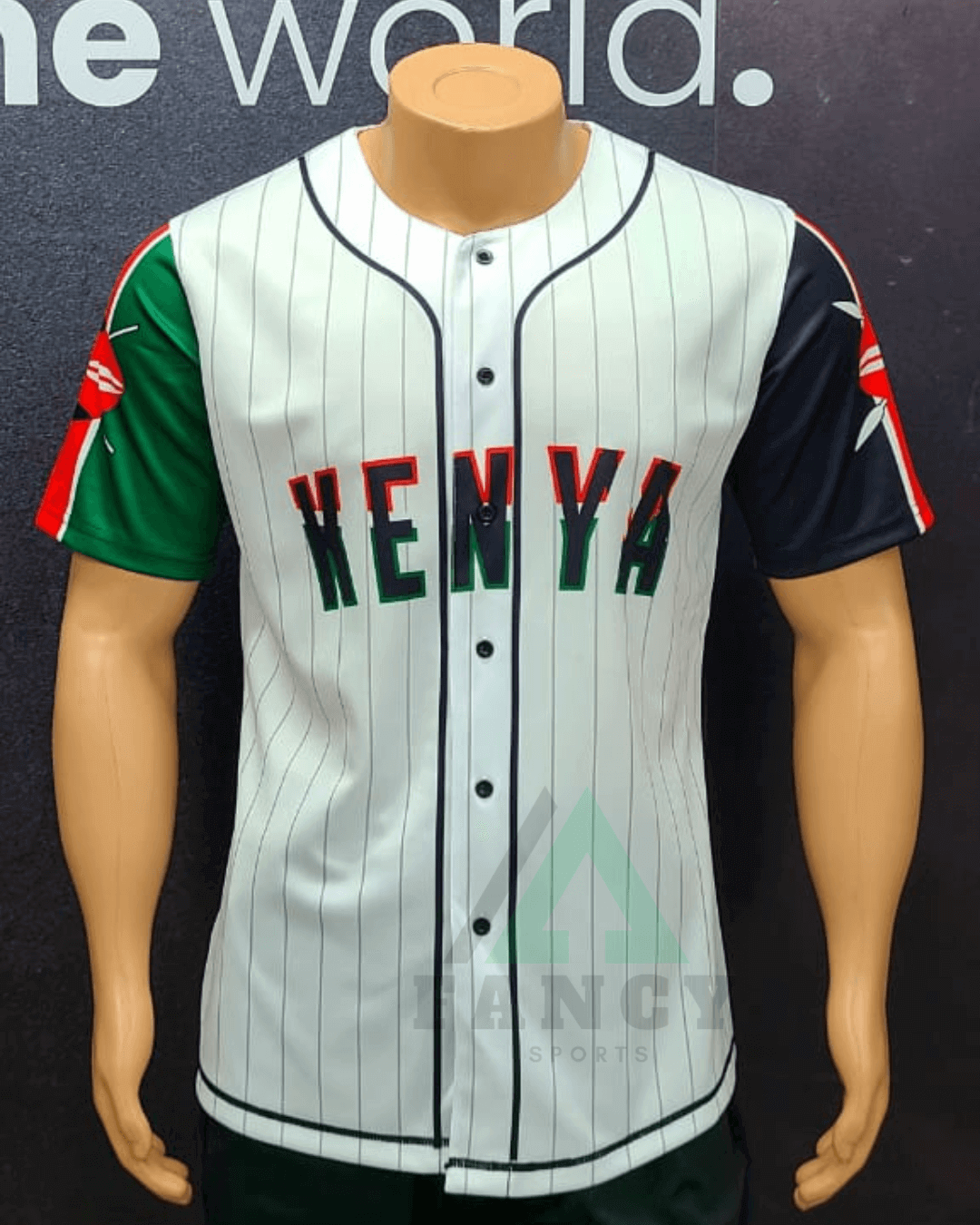
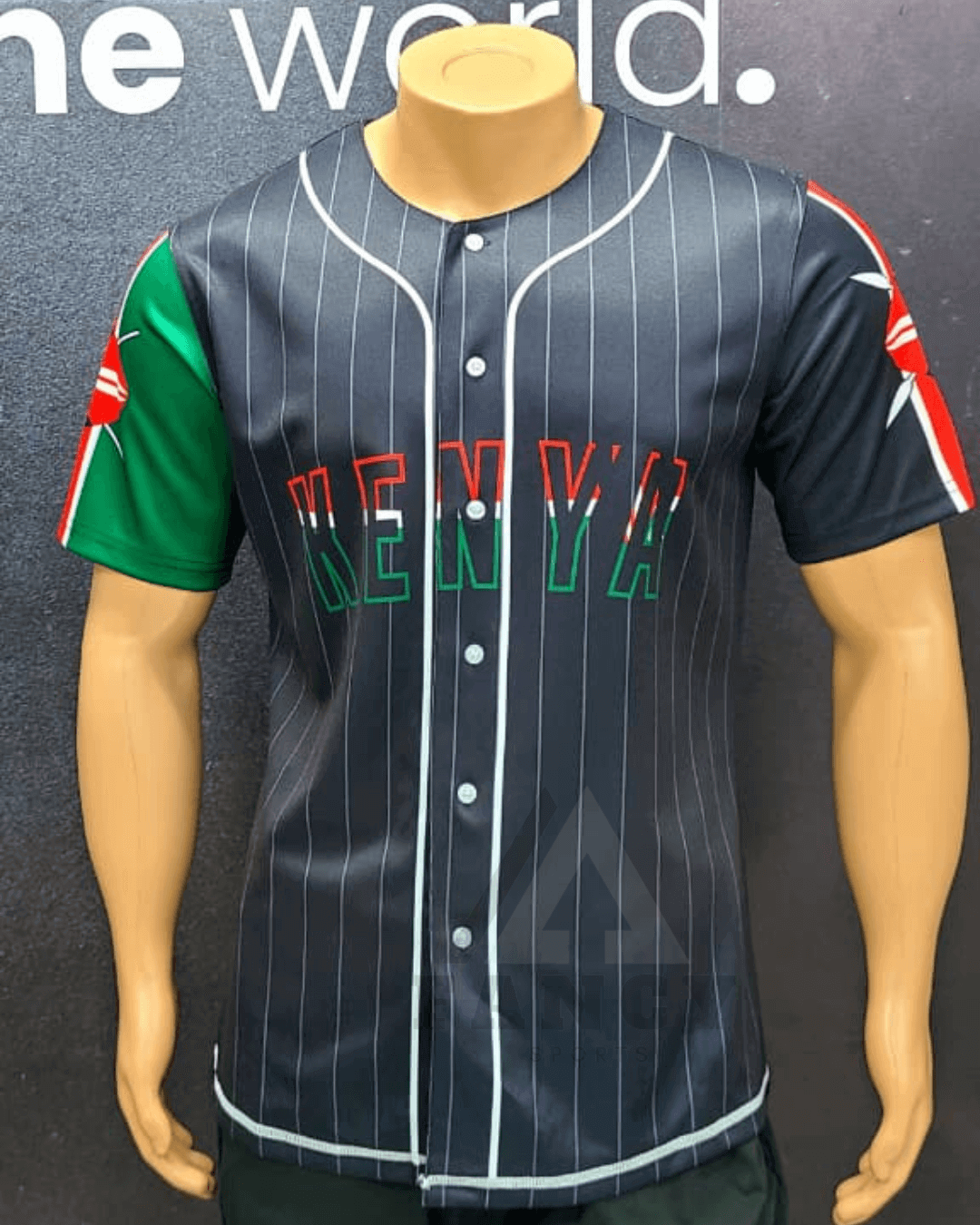
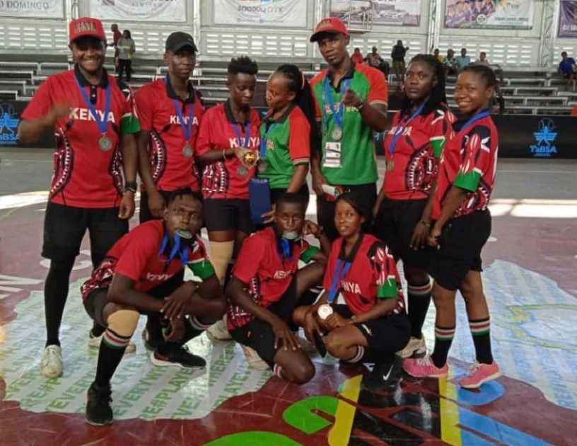
Today we finally return to the African continent with Kenya! Kenya's current set is pretty typical of African baseball, with flag-based symbology on the sleeves and side panels. As I already had teams with oversized flag sleeves and flag side panels, I decided to pivot here. My reference was this set, which I believe is a fashion jersey, but I'm not sure. The unique tricolor stroke on the wordmark spoke to me and became the dominant element of the set, along with black piping. Instead of a black road jersey I chose red, which is the primary color of Kenya's Baseball5 team.
- •
- Section30
- Moderator
Offline

- From: Minnesota
- Registered: 5/18/2019
- Posts: 2,893
Re: World Baseball Softball Confederation by Sky
That white jersey is beautiful! I really like the split outline colors on the wordmark


- Steelman
- superadminguy
Offline

- From: The Wild West
- Registered: 5/19/2019
- Posts: 1,736
Re: World Baseball Softball Confederation by Sky
Oh yeah I agree with Section, that white jersey is gorgeous. I think the red one is nice too but the outlines on the wordmark don't pop as well. Wondering if you increased the spacing just a bit to have a heavier stroke width just a tad on both if they would carry over better, but it's a fantastic look all round. Nice work.
While I do like the white outlines for Palau, I agree with you that the panther blue set really does look nice with that gold. The white outlines feel more "island" to me while the panther blue is giving a bit of Swedish vibes but is probably the cleaner look. I could go either way.

AHS Admin. Creator of the THL, PUCH, WHA: Redux and Retroliga.
- sky
- All-Star
Offline
- From: 🌌
- Registered: 5/18/2019
- Posts: 2,062
Re: World Baseball Softball Confederation by Sky
That white jersey is beautiful! I really like the split outline colors on the wordmark
Thank you!
Oh yeah I agree with Section, that white jersey is gorgeous. I think the red one is nice too but the outlines on the wordmark don't pop as well. Wondering if you increased the spacing just a bit to have a heavier stroke width just a tad on both if they would carry over better, but it's a fantastic look all round. Nice work.
While I do like the white outlines for Palau, I agree with you that the panther blue set really does look nice with that gold. The white outlines feel more "island" to me while the panther blue is giving a bit of Swedish vibes but is probably the cleaner look. I could go either way.
Thanks! Here's Kenya with thicker outlines. I think it helps a lot.

And yeah for Palau, I think to make a final decision I'd need to see real prototypes on a field
- •
- sky
- All-Star
Offline
- From: 🌌
- Registered: 5/18/2019
- Posts: 2,062
Re: World Baseball Softball Confederation by Sky

Argentina has recently shifted from a flag-based powder blue and yellow scheme to double-blue, a change that I can't say I'm a fan of. I've restored the elements of the old set, that being the color scheme and script wordmark, but I've tweaked the exact colors so that they clash less. One would think that a powder blue road jersey would make the most sense, but I found that just gold and white didn't work well enough together for a pleasing jersey. On the cap is the Sun of May, the sun on Argentina (and Uruguay)'s flag.
- •
- Dan O'Mac
- Moderator
Offline

- From: Green Bay, Wisconsin
- Registered: 5/22/2019
- Posts: 2,439
Re: World Baseball Softball Confederation by Sky
The thicker outline on Kenya was the right choice. Great update.
I don't care of the shade of blue with Argentina and the shade of gray together. I know you said the blue didn't work, so aside from saying "try yellow", I'm not sure where to go with that.

5x Alt Champion :: AltLB Champion Oklahoma City Bison - 2022 :: AltFL Champion New York Emperors - 2022 :: AltBA Champion Honolulu Kahunas - 2024-25 :: AltLB Champion Oklahoma City Bison - 2025 :: AltFL Champion New York Emperors - 2025

- sky
- All-Star
Offline
- From: 🌌
- Registered: 5/18/2019
- Posts: 2,062
Re: World Baseball Softball Confederation by Sky
The thicker outline on Kenya was the right choice. Great update.
I don't care of the shade of blue with Argentina and the shade of gray together. I know you said the blue didn't work, so aside from saying "try yellow", I'm not sure where to go with that.
Thanks! As for Argentina, personally I like the shade of gray a lot, but I can understand not liking it. Here's a version with a blue top:

- •
- sky
- All-Star
Offline
- From: 🌌
- Registered: 5/18/2019
- Posts: 2,062
Re: World Baseball Softball Confederation by Sky

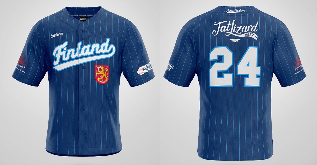
Finland has one of my favorite international baseball brands, with a unique bear logo and awesome jerseys with a pretty double blue color scheme. I've stayed true to that brand but elevated it, with a pinstriped home uniform that reads SUOMI while the navy road jersey features a unique Finland script. On the chest is the coat of arms of Finland, a feature I've kept consistent across the two uniforms by using the home jersey's placement.
- •
- Dan O'Mac
- Moderator
Offline
- From: Green Bay, Wisconsin
- Registered: 5/22/2019
- Posts: 2,439
Re: World Baseball Softball Confederation by Sky
The only thing I don't like with Finland is the NOB in light blue with the dark blue border. It's the only place in the entire set where the color pattern swaps between the front, number on back and NOB for their respective sets.
5x Alt Champion :: AltLB Champion Oklahoma City Bison - 2022 :: AltFL Champion New York Emperors - 2022 :: AltBA Champion Honolulu Kahunas - 2024-25 :: AltLB Champion Oklahoma City Bison - 2025 :: AltFL Champion New York Emperors - 2025