

- sky
- All-Star
 Offline
- From: 🌌
- Registered: 5/18/2019
- Posts: 2,062
Re: World Baseball Softball Confederation by Sky
Darknes wrote:
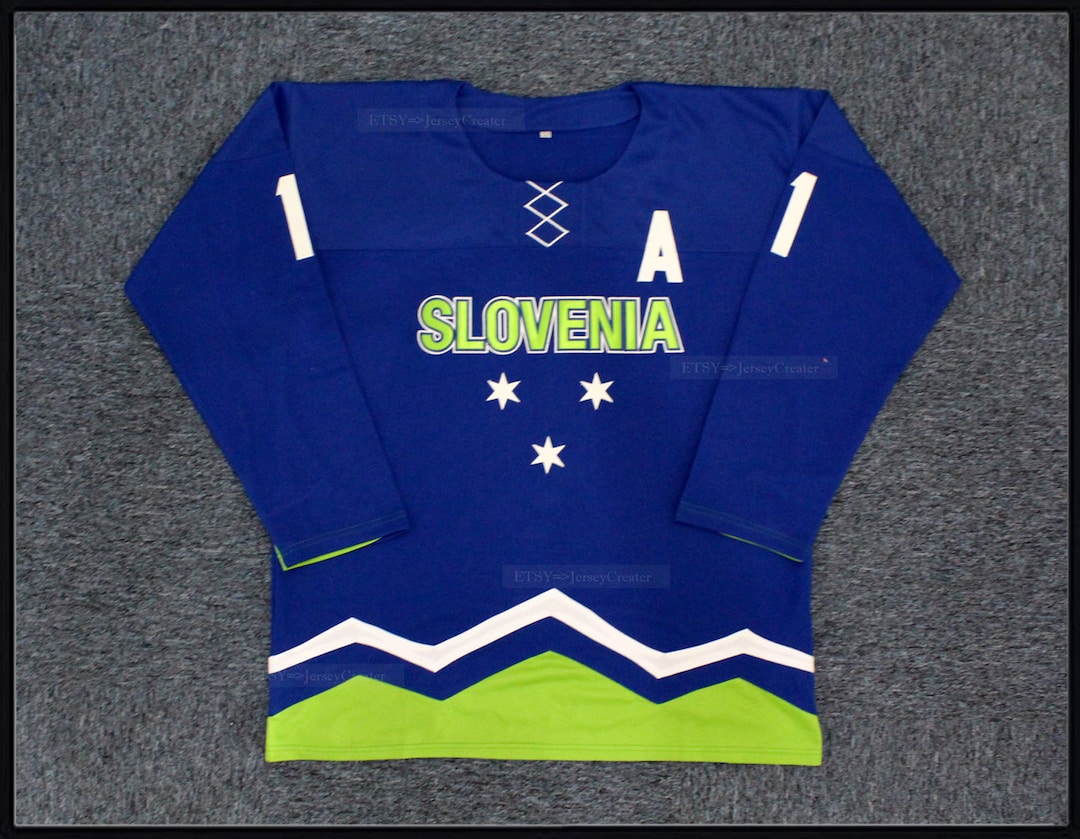
The Slovenians actually use that light green color on a few other national teams is the thing, I know their Hockey association uses it for certain. Plus the Blue they use is actually lighter than the current blue you have. If anything that should have been an excuse to use that color scheme to separate them from the litany of RWB teams.
Thanks! I had no idea - I purposefully avoided looking at other sports to try and carve a unique identity for these baseball teams, but it's left a gap in my knowledge. Here's Slovenia with green:

I didn't feel comfortable replacing colors in the coat of arms, so I isolated the three stars to use as the cap logo, based on this hockey jersey.
I haven't commented in awhile so I just hit a few that strike me. I like Ukraine update. I don't normally like sets that don't have congruent stripes but it seems to work.
In a vacuum I like the original wordmark style for Croatia but I actually really like your first version. Probably one of my favorites you've done in the series.
I liked the green and red hats for Bulgaria better. I think it better highlights a unique color scheme. Gray pants are a good addition.
Vietnam is nice. The Bahamas are nice too. Can't go wrong with teal pins. Wordmark is cool but I do agree with IDM, I wish the B was more closed.
Aruba is FUN! I love it. I do wish the shadow/stroke on the wordmark was just a tad heavier. It's super simple but Türkiye is really nice. Tiger striped Malaysia is super cool!
Thanks so much! The Croatia script is a font called Machinery Script, an excellent script font.
Here's Aruba with a thicker dropshadow on the wordmark:


- sky
- All-Star
Offline
- From: 🌌
- Registered: 5/18/2019
- Posts: 2,062
Re: World Baseball Softball Confederation by Sky

Ecuador has the unfortunate distinction of being the worst of the three teams that use the pan-Colombian colors, so they needed a different direction to stand out. While Colombia uses gold as a primary color, I decided to pivot to blue for Ecuador. The home jersey's defining feature is the red dropshadow, inspired by Ecuador's U12 team. Meanwhile, on the road, there's no white, which I referenced from this 2006 Ecuador set. My Ecuadorian friend endorse the look as something new for the nation while remaining Ecuador, which is exactly what I was going for.
- •
- sky
- All-Star
Offline
- From: 🌌
- Registered: 5/18/2019
- Posts: 2,062
Re: World Baseball Softball Confederation by Sky

New Zealand probably has the single strongest set of logos and wordmarks of any nation in WBSC, developed by Brandon Moore, Brian Gundell, and Dave Bishop as part of the Open Branding Project on SportsLogos.Net. I've traced my logoset from the Behance project directly, without any kinds of adjustments. Inspired by MJD7's 2023 take on the nation, I've opted for a no-nonsense set with only pinstripes as decoration. On the home jersey is Aotearoa, the Māori name for the North Island that has been adopted for the entire nation, while New Zealand is on the road jersey.
- •
- Dan O'Mac
- Moderator
Offline

- From: Green Bay, Wisconsin
- Registered: 5/22/2019
- Posts: 2,439
Re: World Baseball Softball Confederation by Sky
So Ecuador's white set feels significantly better with the blue numbers, yellow outline and red drop shadow that when put on blue, I feel it loses something. And, for the first time, I'd say I'd rather the road be gray to retain that treatment from the white without losing anything.
New Zealand on the other hand? Perfect. No notes.

5x Alt Champion :: AltLB Champion Oklahoma City Bison - 2022 :: AltFL Champion New York Emperors - 2022 :: AltBA Champion Honolulu Kahunas - 2024-25 :: AltLB Champion Oklahoma City Bison - 2025 :: AltFL Champion New York Emperors - 2025

- ItDoesntMatter
- All-Star
Offline

- From: canon coast
- Registered: 5/18/2019
- Posts: 1,500
Re: World Baseball Softball Confederation by Sky
I think I like all of the updates you made based on my most recent suggestions (except for the gray pants ;p) but only croatia feels like a significant improvement imo. the script feels more unique and the checkers feel more hrvatska
I also like the updates for slovenia better than your original, although I will say the full coat of arms works better as a jersey element than the three stars. the green definitely helps them stand out tho. I do wish it were a touch more saturated to help it pop off the white a little better
for ecuador I basically have the same critique as dan lol. the home set is fantastic but the road is missing something without that drop shadow. I think you could probably add a red drop shadow to the blue jersey without it having to make it gray, but maybe I'm wrong. oh and that script is fantastic
I love pretty much everything about the open branding new zealand look except for two things: "zlnd" (gross) and their uniform concepts, which I largely haven't liked. I think you've overcorrected here, though. your set looks good but I feel like you have such a good opportunity here to add some māori design elements, even if it's just a little bit of flair on traditional striping. it feels a little boring to be honest. that said I love the decision to go aotearoa at home and new zealand on the road and I'd love to see more teams go endonym/exonym like that
Last edited by ItDoesntMatter (4/30/2026 11:54 pm)


- sky
- All-Star
Offline
- From: 🌌
- Registered: 5/18/2019
- Posts: 2,062
Re: World Baseball Softball Confederation by Sky
So Ecuador's white set feels significantly better with the blue numbers, yellow outline and red drop shadow that when put on blue, I feel it loses something. And, for the first time, I'd say I'd rather the road be gray to retain that treatment from the white without losing anything.
New Zealand on the other hand? Perfect. No notes.
Thanks! Here's a version of Ecuador with a gray road set:

I think I like all of the updates you made based on my most recent suggestions (except for the gray pants ;p) but only croatia feels like a significant improvement imo. the script feels more unique and the checkers feel more hrvatska
I also like the updates for slovenia better than your original, although I will say the full coat of arms works better as a jersey element than the three stars. the green definitely helps them stand out tho. I do wish it were a touch more saturated to help it pop off the white a little better
for ecuador I basically have the same critique as dan lol. the home set is fantastic but the road is missing something without that drop shadow. I think you could probably add a red drop shadow to the blue jersey without it having to make it gray, but maybe I'm wrong. oh and that script is fantastic
I love pretty much everything about the open branding new zealand look except for two things: "zlnd" (gross) and their uniform concepts, which I largely haven't liked. I think you've overcorrected here, though. your set looks good but I feel like you have such a good opportunity here to add some māori design elements, even if it's just a little bit of flair on traditional striping. it feels a little boring to be honest. that said I love the decision to go aotearoa at home and new zealand on the road and I'd love to see more teams go endonym/exonym like that
Thanks so much! Here's Ecuador with a dropshadow on the road jersey:

I think I prefer it to the gray version.
As for New Zealand, I want to give it another go with Māori design elements, but I'm still researching. I'll definitely be back soon with an update! As for the endonym/exonym thing: I agree! There's one other country that does this by my count and in hindsight I should've done it for more teams.
- •
- sky
- All-Star
Offline
- From: 🌌
- Registered: 5/18/2019
- Posts: 2,062
Re: World Baseball Softball Confederation by Sky

For a reason I can't comprehend, Palau's baseball team uses black as the base of their jersey. With such a bright and bold flag, it seemed like a waste to dull it down with black to me. A fun and tropical script is the wordmark, while on the sleeves is a wave pattern inspired by Palauan story boards, an indigenous art form that carves stories directly into beams of bai, or traditional men's houses.
- •
- sky
- All-Star
Offline
- From: 🌌
- Registered: 5/18/2019
- Posts: 2,062
Re: World Baseball Softball Confederation by Sky

I think the bones of Sri Lanka's jerseys are worth building off of. I quite like the color distribution and use of maroon, green, and orange as accent colors based on the nation's flag. I have decided to replace the SL mark on the chest and cap with a new SL interlock on the cap and a Sri Lanka script which the team has worn previously.
- •
- Steelman
- superadminguy
Offline

- From: The Wild West
- Registered: 5/19/2019
- Posts: 1,736
Re: World Baseball Softball Confederation by Sky
Ecuador and its updates are absolutely fantastic. I think the road gray is the way to go, but if you were expanding a full compliment of jerseys then the blue would also work great. Though I think if this were the case, go drop shadows on the white/gray and you could just go single outline no drop on the special blue for it to look a little better. I do like the open drop shadow look (ala Rangers) a lot though, but incongruent with the rest of the set. Minor quibbles though. Great set!
I think New Zealand looks sharp, they've always gone kinda no-nonsense imo so to me it works. Some Maori elements could be cool, again, maybe better suited for a third jersey situation. Good one.
Love the update to Aruba. I'm still not sold on Slovenia though I think the green and blue is the right direction. Something about that particular shade of green doesn't jive with me. I don't mind the stars on the jersey but they feel lost on the cap.
I really like the design of Palau but I think the blue jersey needs white outlines. I think the yellow/gold is dark enough to carry white. Would like to see outline on the cap logo too. Though I also wonder if black accents might work too, instead of white. There's a good base here, just might need a few tweaks to really pop!
I really like Sri Lanka! I think this was a great way to combine their super weird color palette (for sports, at least) and make it work well. SL is a surprisingly difficult combo to monogram (recently tried some concepts for my new project) so I like yours a lot. Also a much improved version of their script. Very good!

AHS Admin. Creator of the THL, PUCH, WHA: Redux and Retroliga.
- ItDoesntMatter
- All-Star
Offline
- From: canon coast
- Registered: 5/18/2019
- Posts: 1,500
Re: World Baseball Softball Confederation by Sky
really liking the updates on ecuador. I prefer the blue to the gray personally but I think either of them is an improvement over the original
palau is much better with the bright colors! I think in lieu of adding white (or black) as steel suggested maybe just a slightly darker blue would work? right now everything is just a little too bright for me. the stripes are a lot of fun and are a really nice local touch
I almost wish sri lanka would lean into the flag colors a little more because they're so unique, but I think you did a fantastic job of incorporating them into their existing jersey design without being too over-the-top. the script is nice, and the cap logo is serviceable, if a little unexciting (but certainly better than theirs in any case). overall a solid look