


- Steelman
- superadminguy
 Offline
- From: The Wild West
- Registered: 5/19/2019
- Posts: 1,726
Re: World Baseball Classic by Sky
The updates for Australia and Canada are both improvements. Good stuff.
I agree with idm that I wish Brazil featured more green but also the set itself strikes me as very Brazilian with those fonts so I think you def got it right!

AHS Admin. Creator of the THL, PUCH, WHA: Redux and Retroliga.
- sky
- All-Star
Offline

- From: 🌌
- Registered: 5/18/2019
- Posts: 2,012
Re: World Baseball Classic by Sky
ItDoesntMatter wrote:
weirdly, red-heavy cuba feels odd to me. probably the altlb fan in me. in a vacuum, I like your original home set a lot, but I agree that the updated red-primary version feels better as a whole. I do prefer the gray pants to the red but it's not a bad look
the single-layer wordmark on italy is a big improvement. I see what you were going for on the placket piping but I think it would make more sense if it was single on both (or double on both, but I think the single makes more sense on this set). I will be a little contrarian and say that while I like the new cap logo in theory, I'm not sure I like it in practice. you've already got the flag on the sleeve, you don't have green or red anywhere else in the set, and the new I ends up looking too blocky, and for lack of a better word, childish. maybe the I from the script would work better?
korea is definitely a different look, but I like it. the light blue definitely helps them stand out. I do think this is the best case for white pants on the road yet, since the gray doesn't mesh well with the blue here. I'm also not sure the script works well with the number font, but overall, solid work
thank you for removing "kingdom of the" from the dutch set, and thank you also for leaning into the orange, it being such a unique color in the wbc. I'm not a huge fan of the NL logo, so I like the crown on the hat as well. really not much to complain about here
I'm with steel in that colombia feels a little unsatisfying but I'm not totally sure why. I think the outlines on the home wordmark are a bit too much. the sleeve stripes matching the flag are nice, but I'm not sure why the ones on the pants don't. I do like the choice of yellow as a unique primary color, tho
anything you did for great britain would be better than their awful current identity, but I'm not sure this is it. like steel, "britain" on the chest doesn't feel like the right choice, and the B on the cap certainly feels wrong (I'm awaiting the GB monogram). the font also feels a little too ornate, especially for the name and numbers
I really like the aboriginal-inspired striping on australia, but the rest of it feels a little ... uninspired, I guess. I don't particularly like the wordmark font, nor do I like the southern cross on the wordmark (although I think it works on the hat). maybe if the numbers matched the wordmark it'd feel a little more cohesive? idk. I do think the version without the front numbers is better
nicaragua is simple but solid. if I had one suggestion, it might be to match the blue on the jersey to the blue on the flag (although in my memory (and in wikipedia) the blue on the flag is a bit darker than how you've portrayed it, so it may actually be close)
the new shade of red for canada is definitely better, but it doesn't fix my biggest problem with the set, which is that the font you've chosen makes the wordmarks feel very crowded and kind of hard to read at home. that said, I much prefer maroon to black (I'm usually of the opinion that canada should be entirely or mostly red and white, so that's nice to see) and the 4 nations leaf is a great cap logo
brazil without any green is a little weird but looks nice. I would like to see a little bit of it somewhere but I don't have any immediate good ideas on how to accomplish that. incorporating more yellow into the set is definitely the right move, tho
hard to believe we're already almost at the home stretch! can't wait to see how you wrap this one up
Thanks for the detailed feedback! I really appreciate it.
I didn't go with the script I on the cap for Italy because I think it looks too much like a J. I agree that the execution on the cap logo could be stronger but I don't know how to do it.
Agreed on Colombia, I have no idea why I didn't go for matching stripes on the pants. Here's a fix.

Here's a new take on Britain, with a GB monogram placed on the cap and jersey. Placket striping with no front number a la the Athletics.

Fair enough for Canada. Here's a version with just red and white:

Not using green for Brazil was an intentional decision, historically the baseball team hasn't and I wanted to respect that history.
By the way, here's an updated Mexico with a fixed road jersey.

As for the homestretch... yeah... definitely the homestretch...
All of these Baseball sets are looking great! I find it interesting to see that Brazil doesn't use that Green in some capacity.
Thanks! I'm not sure why Brazil forgoes green in baseball, but I kinda dig it.
The updates for Australia and Canada are both improvements. Good stuff.
I agree with idm that I wish Brazil featured more green but also the set itself strikes me as very Brazilian with those fonts so I think you def got it right!
Thanks! Brazil's font is what the real team uses, so I can't take credit for that. Glad you're enjoying!


- •
- sky
- All-Star
Offline
- From: 🌌
- Registered: 5/18/2019
- Posts: 2,012
Re: World Baseball Classic by Sky

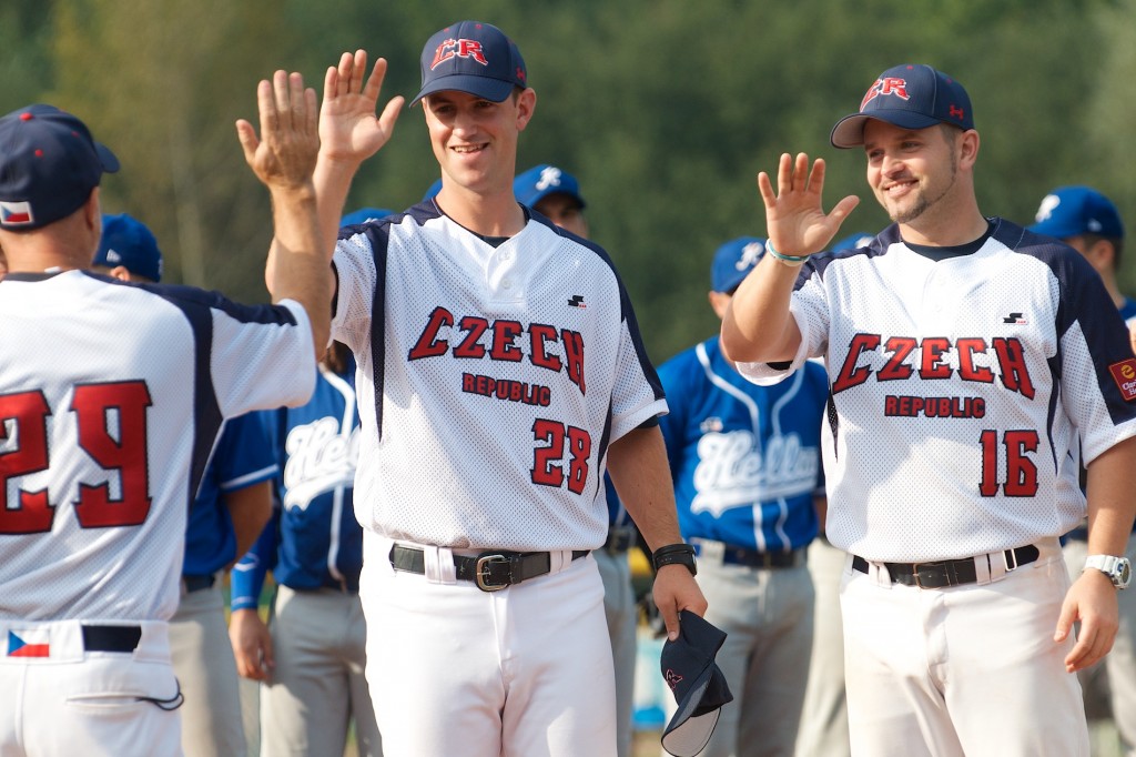
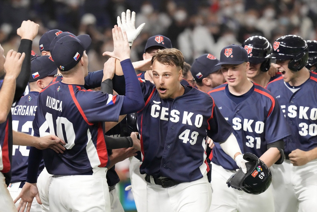
Czechia has garnered a reputation as a gritty, tough team made of electricians and plumbers, competing against the best in the world. Their performance in the 2023 WBC has gotten them a bit of a cult following in Japan. Despite ditching their previous Czech Republic wordmark in 2023, the team has kept a CR cap logo, even while the country switches its preferred English name to Czechia. I've kept Česko on the jersey but shifted to a much more traditional striping pattern to replace the color blocks of their current set.
- •
- sky
- All-Star
Offline
- From: 🌌
- Registered: 5/18/2019
- Posts: 2,012
Re: World Baseball Classic by Sky

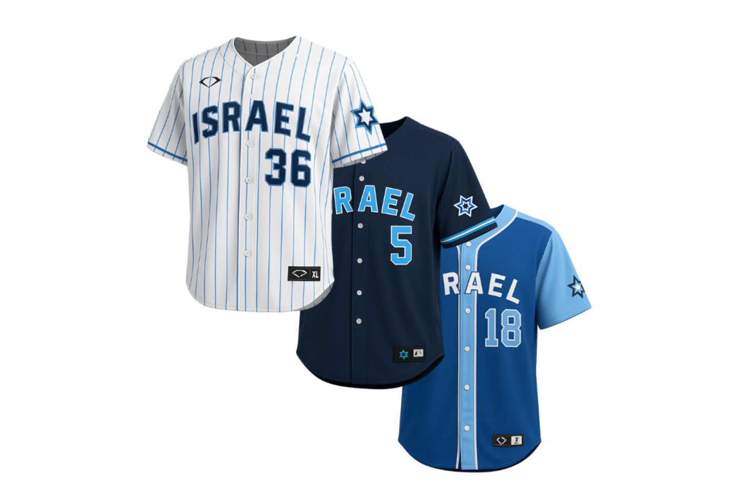
Prior to the 2026 WBC, Israel released a new look that I don't particularly care for (and looks quite a bit like Finland's). The Star of David's inconsistent applications don't work for me and I'm not sure why the home and road sets have different wordmarks. I do like the double-blue direction, however, so I stuck with that. I've grabbed the wordmark from the new baseball logo to use in place of the odd block hybrid, which is what they ended up doing in this year's WBC. I've also consolidated three blues into two and put the new Star of David logo on the caps.
- •
- sky
- All-Star
Offline
- From: 🌌
- Registered: 5/18/2019
- Posts: 2,012
Re: World Baseball Classic by Sky

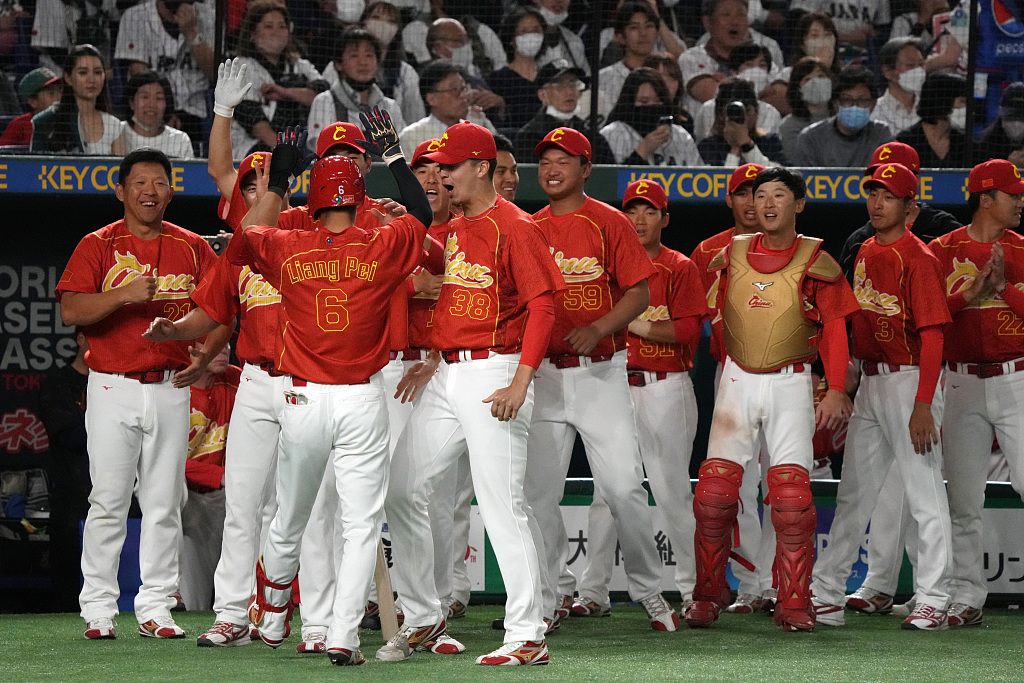
I'm a huge fan of the updated look China received in 2023. The dragon in the C is such a great touch that elevates the set to iconic status and much more Chinese-feeling than their previous Old English look, which wasn't bad, but felt like a bad fit. I've added thin stripes to the home uniform and overhauled the road uniform, ditching the piping and red-on-red lettering for a simple color swap of the home uniform.
- •
- sky
- All-Star
Offline
- From: 🌌
- Registered: 5/18/2019
- Posts: 2,012
Re: World Baseball Classic by Sky

Germany has the bones of a solid look, but it's too disjointed for my tastes. I've kept the angled "Deutschland" script, front numbers, and no-white cap logo, but unified it all with a fairy tale-inspired font, referencing the iconic Brothers Grimm. Naturally, the sleeve stripes reference Germany's Flag.
- •
- H-Town1141
- All-Star
Offline

- Registered: 5/20/2019
- Posts: 267
Re: World Baseball Classic by Sky
GERMANY
Germany has the bones of a solid look, but it's too disjointed for my tastes. I've kept the angled "Deutschland" script, front numbers, and no-white cap logo, but unified it all with a fairy tale-inspired font, referencing the iconic Brothers Grimm. Naturally, the sleeve stripes reference Germany's Flag.
Was gonna reply on the boards but it's more fun here bc I can be a little more direct. Think feedbacks.
Double outlines are a scourge, but I like the flag stripe a lot. I will say that I'd really like to see a black wordmark with gold outline on the home with solid red numbers, and you can just go black on the backc. Gold wordmark, red numbers on the away with gold on the back.
Also, I know Cinder when I see it, pal. Fantastic use of it here.
Also, Great Britain's numbers are throwing me. I think you could get away with a vintage block like Mcauliffe or pull more from british sporting history generally.
I l I K E t H I S
- sky
- All-Star
Offline
- From: 🌌
- Registered: 5/18/2019
- Posts: 2,012
Re: World Baseball Classic by Sky
Was gonna reply on the boards but it's more fun here bc I can be a little more direct. Think feedbacks.
Double outlines are a scourge, but I like the flag stripe a lot. I will say that I'd really like to see a black wordmark with gold outline on the home with solid red numbers, and you can just go black on the backc. Gold wordmark, red numbers on the away with gold on the back.
Also, I know Cinder when I see it, pal. Fantastic use of it here.
Also, Great Britain's numbers are throwing me. I think you could get away with a vintage block like Mcauliffe or pull more from british sporting history generally.
Thanks! I went with double outlines to try and keep that flag effect, but here's a version of Germany with your suggested changes.

Good call on Great Britain as well, I decided to go with numbers inspired by their greatest international sporting moment, the 1966 World Cup win.

- •
- sky
- All-Star
Offline
- From: 🌌
- Registered: 5/18/2019
- Posts: 2,012
Re: World Baseball Classic by Sky

South Africa has kept the same wordmark around since their WBC debut in 2006. I like it, it's unique and lends itself nicely to their SA cap logo, which separates them from the other green and gold team, Australia. The dropshadow on the wordmark becomes the foremost design element, as I've replicated it on the numbers. The biggest change is lightening the green to more of a kelly green, which TruColor says they wore in 2009.
- •
- H-Town1141
- All-Star
Offline
- Registered: 5/20/2019
- Posts: 267
Re: World Baseball Classic by Sky
Was gonna reply on the boards but it's more fun here bc I can be a little more direct. Think feedbacks.
Double outlines are a scourge, but I like the flag stripe a lot. I will say that I'd really like to see a black wordmark with gold outline on the home with solid red numbers, and you can just go black on the backc. Gold wordmark, red numbers on the away with gold on the back.
Also, I know Cinder when I see it, pal. Fantastic use of it here.
Also, Great Britain's numbers are throwing me. I think you could get away with a vintage block like Mcauliffe or pull more from british sporting history generally.Thanks! I went with double outlines to try and keep that flag effect, but here's a version of Germany with your suggested changes.
Good call on Great Britain as well, I decided to go with numbers inspired by their greatest international sporting moment, the 1966 World Cup win.
I am but a fool. I think the home back numbers and NOB need a gold outline too. Maybe the numbers also?
South Africa looks good, I'm struggling to come up with something that really needs fixing. The cap logo is meh, but maybe that's just because I'm comparing it to their perfect and beautiful and amazing rugby Springbok. Maybe lighter grey on the pants and darker green? but those don't feel like *necessary* changes
I l I K E t H I S