

- Steelman
- superadminguy
 Offline
- From: The Wild West
- Registered: 5/19/2019
- Posts: 1,726
Re: World Baseball Softball Confederation by Sky
I think The Netherlands look fantastic! Can't go wrong with a good orange and black color scheme. Super sharp set. The NL interlock is cool but the crown is also nice. Can't lose either way.
Columbia is okay. I don't really love it or hate it but I can't really pin down why. I think it would look cleaner with no outlines on the home or vice versa.
So as I mentioned on the Discord, I went down the rabbit hole of Great Britain vs United Kingdom, etc, and my takeaway as an American who also doesn't fully understand their logic (or lack thereof) is that I feel like Britain doesn't work by itself. If they were to go by Britain they'd just go by England? I think you have to stick with Great Britain. Otherwise the set is solid. I didn't like the Tuscan style lettering at first but it's growing on me. It didn't immediately strike me as "British" but the set looks really nice. If I were to suggest a different direction, an ornate GB monogram on the cap and jerseys would be the way to go imo, that way you can ditch the need for a wordmark altogether. But yeah, it's definitely better than their previous efforts so I think it's a "great" start!

AHS Admin. Creator of the THL, PUCH, WHA: Redux and Retroliga.
- sky
- All-Star
Offline

- From: 🌌
- Registered: 5/18/2019
- Posts: 2,020
Re: World Baseball Softball Confederation by Sky
Steelman wrote:
I think The Netherlands look fantastic! Can't go wrong with a good orange and black color scheme. Super sharp set. The NL interlock is cool but the crown is also nice. Can't lose either way.
Columbia is okay. I don't really love it or hate it but I can't really pin down why. I think it would look cleaner with no outlines on the home or vice versa.
So as I mentioned on the Discord, I went down the rabbit hole of Great Britain vs United Kingdom, etc, and my takeaway as an American who also doesn't fully understand their logic (or lack thereof) is that I feel like Britain doesn't work by itself. If they were to go by Britain they'd just go by England? I think you have to stick with Great Britain. Otherwise the set is solid. I didn't like the Tuscan style lettering at first but it's growing on me. It didn't immediately strike me as "British" but the set looks really nice. If I were to suggest a different direction, an ornate GB monogram on the cap and jerseys would be the way to go imo, that way you can ditch the need for a wordmark altogether. But yeah, it's definitely better than their previous efforts so I think it's a "great" start!
Thanks! With GB it definitely comes down to the very, very weird way they do sports there. Sometimes each country (England, Scotland, Wales, Ireland, Northern Ireland) gets its own team, sometimes they combine, sometimes they do something else entirely, it's really hard to square as an American. Just "England" doesn't feel right because the team could include Scottish, Welsh, or Northern Irish players, but at that point it would just be the United Kingdom... I'll give it a try with a GB monogram! I think that might be the best move.


- •
- sky
- All-Star
Offline
- From: 🌌
- Registered: 5/18/2019
- Posts: 2,020
Re: World Baseball Softball Confederation by Sky

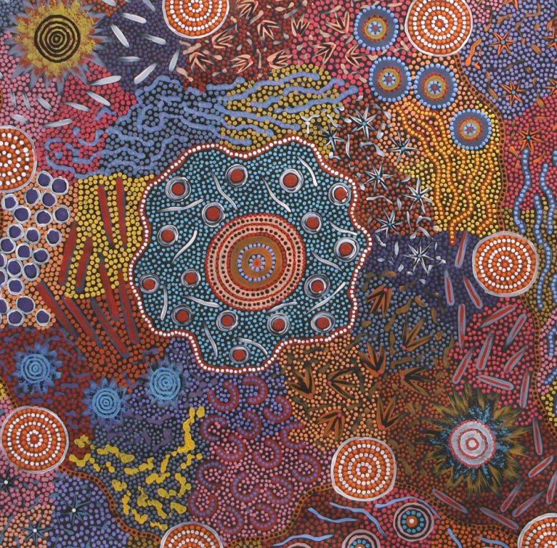
I think Australia's identity in the WBC is confused. The serifed wordmark and Aboriginal boomerang/diamond/sun clash with the sans serif, futuristic cap logo. I decided to align the logos in favor of the wordmark, adding the Southern Cross around the last A, just like the team's 2009-2017 wordmarks. The stripes are filled with circles of varying shapes and sizes, referencing those found in Aboriginal dot art. I love when Australian and New Zealander leagues have special jerseys referencing Indigenous art and I wanted to bring some of that pride and respect to the international stage.
- •
- sky
- All-Star
Offline
- From: 🌌
- Registered: 5/18/2019
- Posts: 2,020
Re: World Baseball Softball Confederation by Sky

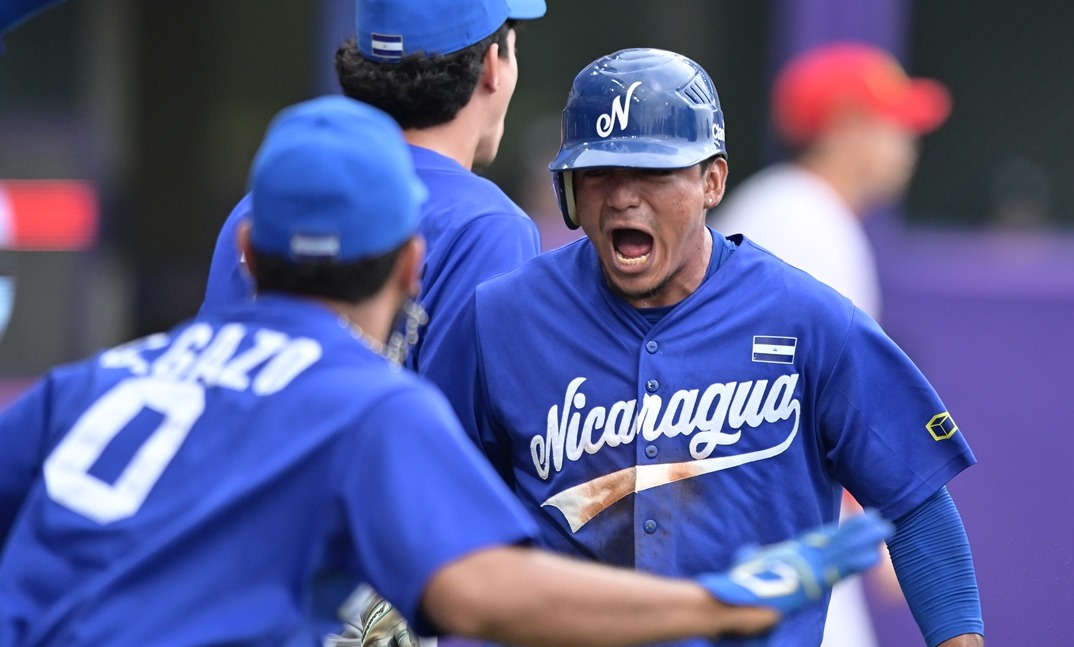
When you have a script as extravagant as Nicaragua's, you should go with something simple to let it shine. I did add a tiny bit of trim to the sleeves and pants, but I really don't think this set needs much to stand out. It's much better than the block they've used previously.
Last edited by sky (3/18/2026 11:13 am)
- •
- sky
- All-Star
Offline
- From: 🌌
- Registered: 5/18/2019
- Posts: 2,020
Re: World Baseball Softball Confederation by Sky

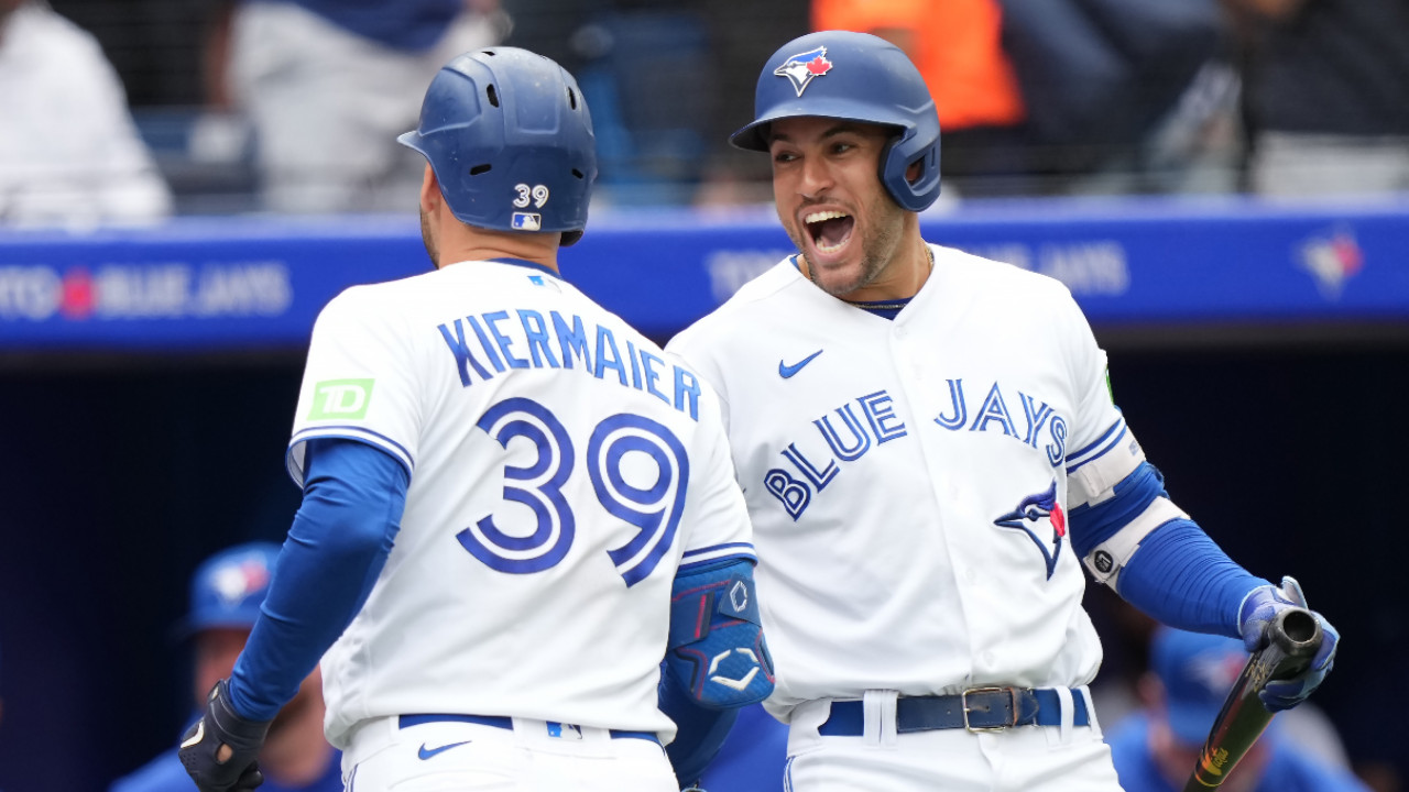
I don't care for Canada's WBC look, especially the disaster it was in 2023. I think the inline lettering is too Blue Jays (and the Jays do it much better) and the cap logo is extremely dated, especially with its inclusion of black, which isn't anywhere else in the set. I've never really liked Canada using black as its secondary sporting color, so I asked some Canadians in the AHS Discord server what color they'd like to see Canada use. NoE38 mentioned maroon and that felt very fitting. The cap logo is a simplified version of the NHL's 4 Nations Face-Off maple leaf, which I think is a stellar mark that Canada should use for everything. The thick sleeve striping is inspired by the Blue Jays' original look, which is emblematic of Canadian baseball to me.
- •
- Steelman
- superadminguy
Offline
- From: The Wild West
- Registered: 5/19/2019
- Posts: 1,726
Re: World Baseball Softball Confederation by Sky
I really like Australia. Obv very "A's" but it's a good look. The aboriginal art stripes are great. The only quibble I have is I wish the stars around the A in the wordmark were on the other side as it seems a little busy and unbalanced with the front number there as well. But otherwise fantastic!
Nicaragua looks great! Clean, simple, sharp.
I like the idea for Canada but I'm not sold on that particular shade combo. I think the colors need just a bit more contrast, probably a deeper/darker maroon. But the set itself is nice!
AHS Admin. Creator of the THL, PUCH, WHA: Redux and Retroliga.
- sky
- All-Star
Offline
- From: 🌌
- Registered: 5/18/2019
- Posts: 2,020
Re: World Baseball Softball Confederation by Sky
I really like Australia. Obv very "A's" but it's a good look. The aboriginal art stripes are great. The only quibble I have is I wish the stars around the A in the wordmark were on the other side as it seems a little busy and unbalanced with the front number there as well. But otherwise fantastic!
Nicaragua looks great! Clean, simple, sharp.
I like the idea for Canada but I'm not sold on that particular shade combo. I think the colors need just a bit more contrast, probably a deeper/darker maroon. But the set itself is nice!
Thanks! I agree that Australia is very busy on that side but I can't put it at the beginning of the word or else some stars will get cut off by the next letter. Instead, here's a version without front numbers, which I think solves the problem nicely:

For Canada, I couldn't find a deeper maroon I liked, so instead I brightened the red nicely. I think this is a much stronger set.

- •
- sky
- All-Star
Offline
- From: 🌌
- Registered: 5/18/2019
- Posts: 2,020
Re: World Baseball Softball Confederation by Sky

Brazil generally forgoes their famous green when it comes to international baseball. Generally, I like what they have going on, so I stuck with the same logos and wordmarks and just added matching yellow piping to the road jersey. Ironically, going with blue as a primary color helps them stand out in baseball, where Australia and South Africa have laid claim to green and gold.
- •
- Darknes
- Moderator
Offline
- From: South of Boston
- Registered: 5/18/2019
- Posts: 604
Re: World Baseball Softball Confederation by Sky
All of these Baseball sets are looking great! I find it interesting to see that Brazil doesn't use that Green in some capacity.


- ItDoesntMatter
- All-Star
Offline

- From: canon coast
- Registered: 5/18/2019
- Posts: 1,475
Re: World Baseball Softball Confederation by Sky
weirdly, red-heavy cuba feels odd to me. probably the altlb fan in me. in a vacuum, I like your original home set a lot, but I agree that the updated red-primary version feels better as a whole. I do prefer the gray pants to the red but it's not a bad look
the single-layer wordmark on italy is a big improvement. I see what you were going for on the placket piping but I think it would make more sense if it was single on both (or double on both, but I think the single makes more sense on this set). I will be a little contrarian and say that while I like the new cap logo in theory, I'm not sure I like it in practice. you've already got the flag on the sleeve, you don't have green or red anywhere else in the set, and the new I ends up looking too blocky, and for lack of a better word, childish. maybe the I from the script would work better?
korea is definitely a different look, but I like it. the light blue definitely helps them stand out. I do think this is the best case for white pants on the road yet, since the gray doesn't mesh well with the blue here. I'm also not sure the script works well with the number font, but overall, solid work
thank you for removing "kingdom of the" from the dutch set, and thank you also for leaning into the orange, it being such a unique color in the wbc. I'm not a huge fan of the NL logo, so I like the crown on the hat as well. really not much to complain about here
I'm with steel in that colombia feels a little unsatisfying but I'm not totally sure why. I think the outlines on the home wordmark are a bit too much. the sleeve stripes matching the flag are nice, but I'm not sure why the ones on the pants don't. I do like the choice of yellow as a unique primary color, tho
anything you did for great britain would be better than their awful current identity, but I'm not sure this is it. like steel, "britain" on the chest doesn't feel like the right choice, and the B on the cap certainly feels wrong (I'm awaiting the GB monogram). the font also feels a little too ornate, especially for the name and numbers
I really like the aboriginal-inspired striping on australia, but the rest of it feels a little ... uninspired, I guess. I don't particularly like the wordmark font, nor do I like the southern cross on the wordmark (although I think it works on the hat). maybe if the numbers matched the wordmark it'd feel a little more cohesive? idk. I do think the version without the front numbers is better
nicaragua is simple but solid. if I had one suggestion, it might be to match the blue on the jersey to the blue on the flag (although in my memory (and in wikipedia) the blue on the flag is a bit darker than how you've portrayed it, so it may actually be close)
the new shade of red for canada is definitely better, but it doesn't fix my biggest problem with the set, which is that the font you've chosen makes the wordmarks feel very crowded and kind of hard to read at home. that said, I much prefer maroon to black (I'm usually of the opinion that canada should be entirely or mostly red and white, so that's nice to see) and the 4 nations leaf is a great cap logo
brazil without any green is a little weird but looks nice. I would like to see a little bit of it somewhere but I don't have any immediate good ideas on how to accomplish that. incorporating more yellow into the set is definitely the right move, tho
hard to believe we're already almost at the home stretch! can't wait to see how you wrap this one up


.png?itok=M4sWteeo)