

- sky
- All-Star
 Offline
- From: 🌌
- Registered: 5/18/2019
- Posts: 2,020
Re: World Baseball Softball Confederation by Sky
Someone on the mothership wanted to see Cuba with a more red-heavy look, so here's that, plus a bonus with red pants.


- sky
- All-Star
Offline
- From: 🌌
- Registered: 5/18/2019
- Posts: 2,020
Re: World Baseball Softball Confederation by Sky

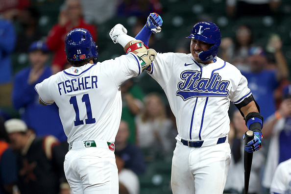
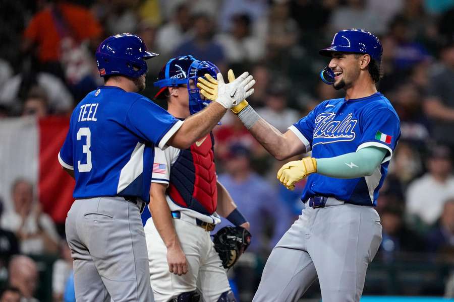
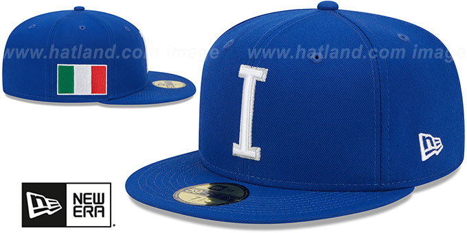
Perfect timing to do Italy, as last night they upset Team USA 8-6. Just like their soccer team, Italy's baseball team uses Savoy Blue as its primary color. I kept their really nice script, but ditched the double outline and blue script on the road. I've also swapped their simple block I for a slightly more complex look with the stem formed by the center white stripe of the Italian flag. Their double outlines are kept as the striping on the road jersey.
- •
- Dan O'Mac
- Moderator
Offline

- From: Green Bay, Wisconsin
- Registered: 5/22/2019
- Posts: 2,403
Re: World Baseball Softball Confederation by Sky
I like the more red-heavy Cuba look, and like the red pants.
As far as Italy, they feel red front numbers away from being the Dodgers. The I/flag is a really nice touch.

5x Alt Champion :: AltLB Champion Oklahoma City Bison - 2022 :: AltFL Champion New York Emperors - 2022 :: AltBA Champion Honolulu Kahunas - 2024-25 :: AltLB Champion Oklahoma City Bison - 2025 :: AltFL Champion New York Emperors - 2025

- sky
- All-Star
Offline
- From: 🌌
- Registered: 5/18/2019
- Posts: 2,020
Re: World Baseball Softball Confederation by Sky
Dan O'Mac wrote:
I like the more red-heavy Cuba look, and like the red pants.
As far as Italy, they feel red front numbers away from being the Dodgers. The I/flag is a really nice touch.
Thanks! I will say that there is a team that's basically a carbon copy of Dodgers, but not for a while.
- •
- sky
- All-Star
Offline
- From: 🌌
- Registered: 5/18/2019
- Posts: 2,020
Re: World Baseball Softball Confederation by Sky

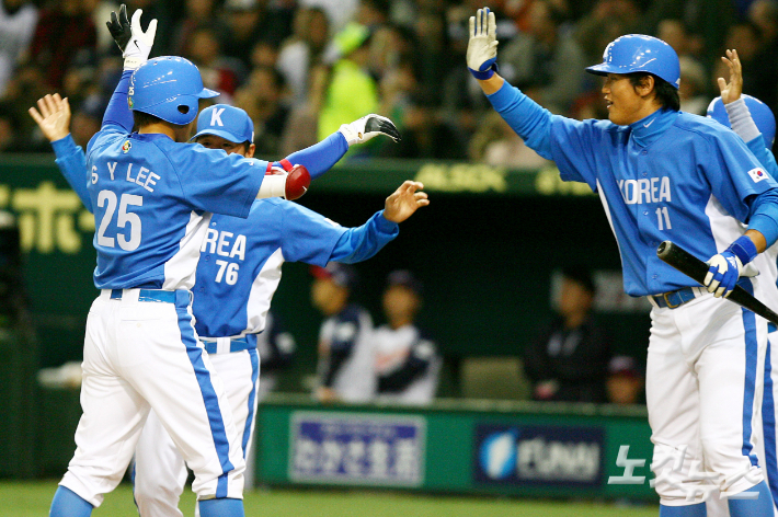
South Korea's look has shifted over time, currently using a navy and red scheme that, in my opinion, is too boring for the exciting, futuristic country it represents. I've returned to the 2006 middle blue and white scheme with racing stripes that feel fitting for the country's baseball aesthetic. This way Korea gets to keep its notable history but also gets set apart from the plethora of other blue and red teams.
- •
- Steelman
- superadminguy
Offline

- From: The Wild West
- Registered: 5/19/2019
- Posts: 1,726
Re: World Baseball Softball Confederation by Sky
Something about the Cuba set was bothering me but the request for a red heavy set cured it for me, so I think that's the clear winner. Red pants are also fun but feel more gimmicky than serious. Red set is solid though. I hate the #88 in baseball tho. Lol.
Italy looks really sharp. I do wonder about the single placket and outlines versus the double placket/outlines, feels like maybe it should be one or the other. (I'd vote for double) The I-flag is nice!
Korea looks good! I like the shoulder stripes and hate the side panels but like you said, it fits their style.

AHS Admin. Creator of the THL, PUCH, WHA: Redux and Retroliga.
- sky
- All-Star
Offline
- From: 🌌
- Registered: 5/18/2019
- Posts: 2,020
Re: World Baseball Softball Confederation by Sky
Something about the Cuba set was bothering me but the request for a red heavy set cured it for me, so I think that's the clear winner. Red pants are also fun but feel more gimmicky than serious. Red set is solid though. I hate the #88 in baseball tho. Lol.
Italy looks really sharp. I do wonder about the single placket and outlines versus the double placket/outlines, feels like maybe it should be one or the other. (I'd vote for double) The I-flag is nice!
Korea looks good! I like the shoulder stripes and hate the side panels but like you said, it fits their style.
Thanks! The idea with Italy is that it's the same stripe on both jerseys, as seen on the gray pants, but I don't think that came through. Glad you like the new Cuba and Korea sets!
- •
- sky
- All-Star
Offline
- From: 🌌
- Registered: 5/18/2019
- Posts: 2,020
Re: World Baseball Softball Confederation by Sky

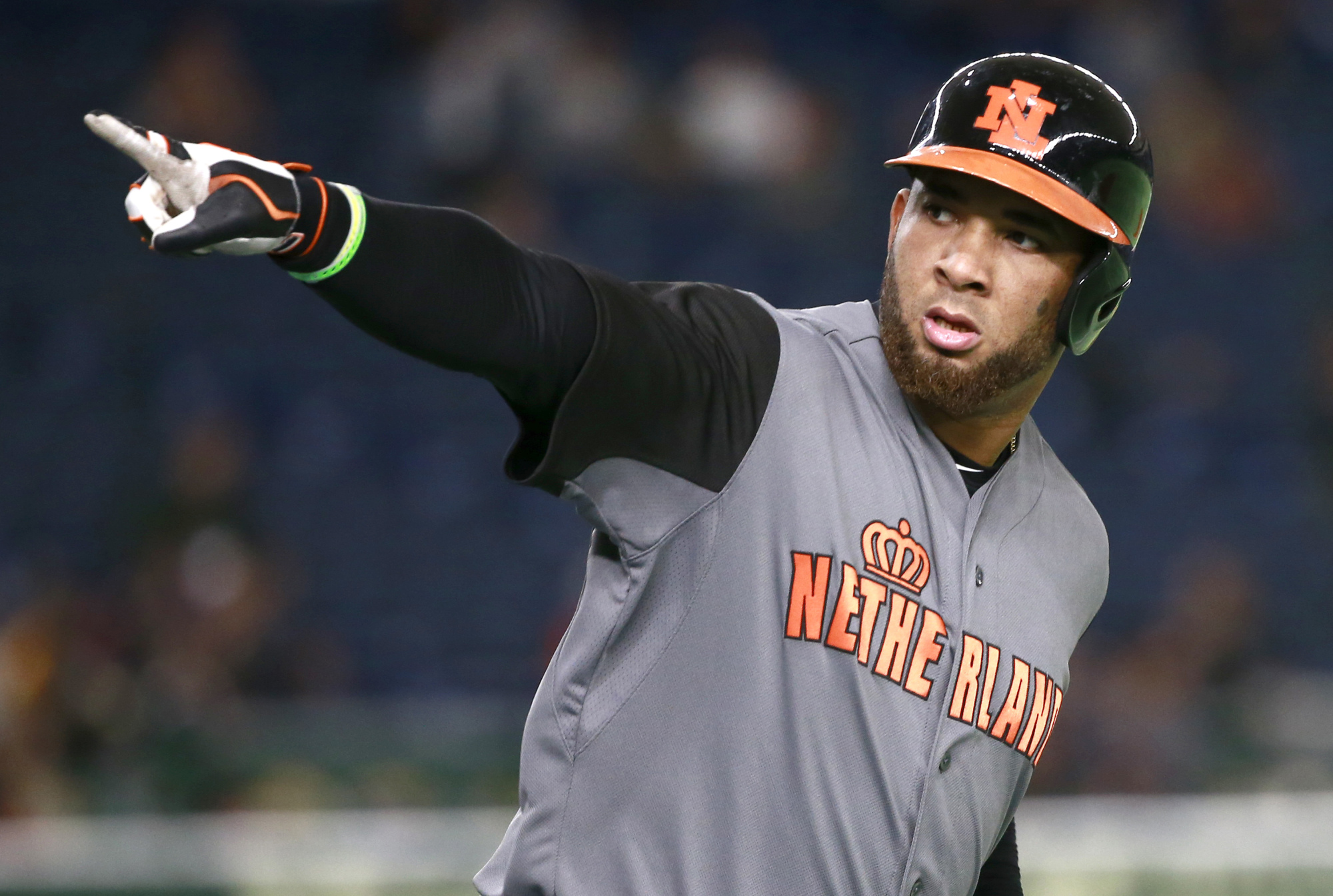
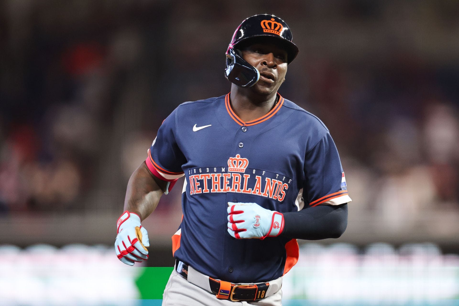
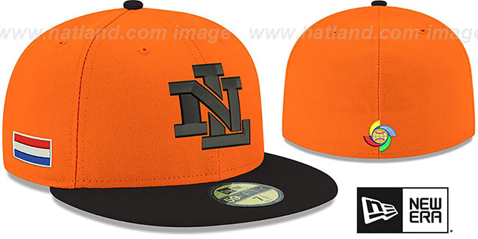
Generally, I like the Netherlands' WBC brand, but in 2023 they switched from black to navy, which I think is a downgrade. As quite literally the only country known for being orange, it baffles me that the Dutch don't go all the way. I kept the pinstripes from 2023 for a distinctive look, but the road uniform is primarily orange, with heavy inspiration from my favorite MLB team, the Orioles. I went back and forth on using the crown or NL interlock for the cap, but went with the crown for its distinctiveness among a crowd of letter logos.
- •
- sky
- All-Star
Offline
- From: 🌌
- Registered: 5/18/2019
- Posts: 2,020
Re: World Baseball Softball Confederation by Sky

I have no idea why Colombia decided to base their 2023 WBC set on the Red Sox's terrible first City Connects, but I'm going back to their old wordmark. The major change I've made is reducing red to just a trim color instead of the C on the cap. The sleeves are inspired by MJD7's set, which are themselves based on Colombia's flag.
- •
- sky
- All-Star
Offline
- From: 🌌
- Registered: 5/18/2019
- Posts: 2,020
Re: World Baseball Softball Confederation by Sky

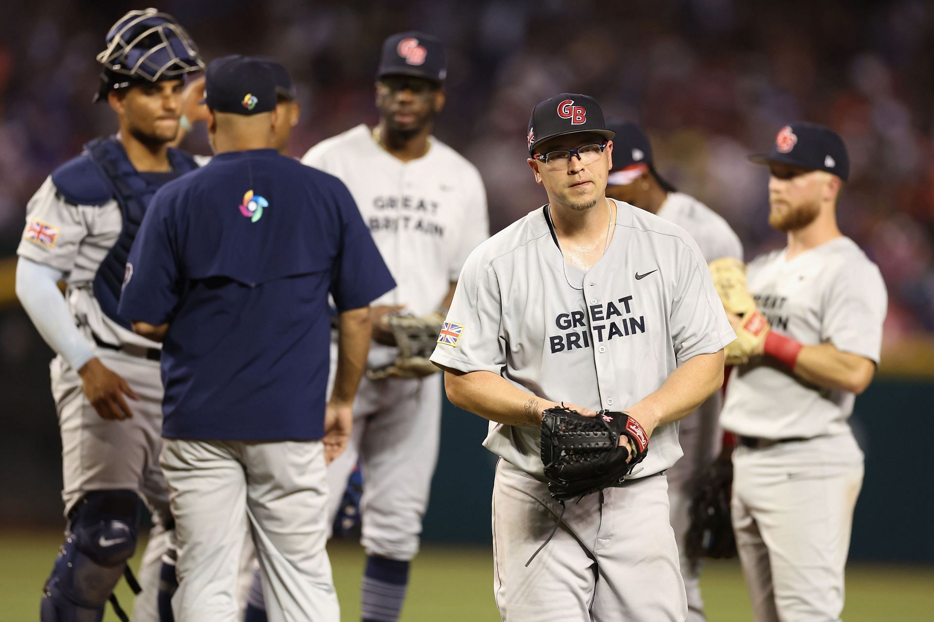
Great Britain's jerseys are boring to me. I don't really like their wordmark or cap logo, and I don't understand why they shifted to red for their road jerseys this year. I suppose it's better than the disastrous 2023 effort. I've redirected towards a more refined and classical look. An ornate wordmark is the star of the show, but the biggest change is dropping the "Great" part of the look. I can't say I fully understand why the team is "Great Britain" and not "United Kingdom", but I like "Britain" more than "Great Britain", anyway. Channeling the Red Sox, a single B is placed on the cap.
- •