


- Dan O'Mac
- Moderator
 Offline
- From: Green Bay, Wisconsin
- Registered: 5/22/2019
- Posts: 2,399
Re: World Baseball Classic by Sky
The updates for the US feel better. The "United States" word mark makes it feel generic, so I prefer the updated "USA" mark.
As for Mexico, no notes. I like it across the board, especially the emphasis on green.

5x Alt Champion :: AltLB Champion Oklahoma City Bison - 2022 :: AltFL Champion New York Emperors - 2022 :: AltBA Champion Honolulu Kahunas - 2024-25 :: AltLB Champion Oklahoma City Bison - 2025 :: AltFL Champion New York Emperors - 2025

- Steelman
- superadminguy
Offline

- From: The Wild West
- Registered: 5/19/2019
- Posts: 1,726
Re: World Baseball Classic by Sky
You knocked these updates out of the park! (lame pun fully intended)
Starting with Panama, yeah that's some tasty ish. Giving Braves/Nats but also just a really sharp look. Prob my favorite so far.
Primary green with red is such an underrated combo so I'm happy that you've leaned that direction with Mexico. It's a solid set!
Muuuuuuch better for USA! Fantastic improvements. It feels like a much more cohesive set. I do also prefer the USA set but even though you're not doing alternates, the cream United States set would be pretty bangin' for an alt jersey. I especially like the new number font, feels much more freedom.
I like the update for DR. I think the flat look with alternating colors suits this much better and also helps it stand more unique among the surplus of R/W/B.
Great work, Sky. Really cool to see you taking feedback and applying it to hone things even more. Keep it up!

AHS Admin. Creator of the THL, PUCH, WHA: Redux and Retroliga.
- sky
- All-Star
Offline

- From: 🌌
- Registered: 5/18/2019
- Posts: 2,008
Re: World Baseball Classic by Sky
Dan O'Mac wrote:
The updates for the US feel better. The "United States" word mark makes it feel generic, so I prefer the updated "USA" mark.
As for Mexico, no notes. I like it across the board, especially the emphasis on green.
You knocked these updates out of the park! (lame pun fully intended)
Starting with Panama, yeah that's some tasty ish. Giving Braves/Nats but also just a really sharp look. Prob my favorite so far.
Primary green with red is such an underrated combo so I'm happy that you've leaned that direction with Mexico. It's a solid set!
Muuuuuuch better for USA! Fantastic improvements. It feels like a much more cohesive set. I do also prefer the USA set but even though you're not doing alternates, the cream United States set would be pretty bangin' for an alt jersey. I especially like the new number font, feels much more freedom.
I like the update for DR. I think the flat look with alternating colors suits this much better and also helps it stand more unique among the surplus of R/W/B.
Great work, Sky. Really cool to see you taking feedback and applying it to hone things even more. Keep it up!
Thanks so much! I agree that the new USA set is a huge improvement. I think I might end up doing a few alternates for the winners of the WBC and I'm keeping a cream throwback in mind.


- •
- sky
- All-Star
Offline
- From: 🌌
- Registered: 5/18/2019
- Posts: 2,008
Re: World Baseball Classic by Sky

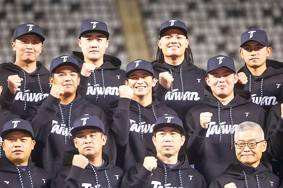
Taiwan, competing as Chinese Taipei, is another stalwart of the WBC. After a disappointing 2023, the team is facing another tough tournament, losing their captain in the first game of the WBC and in a killer pool with Japan, Korea, Australia, and a gritty Czechia. The 2023 Chinese Taipei look was excellent, I felt. All I needed to do was switch the font to a simple block and remove the strange pink baseball stitches from the logo.
I've also made a version with a proper Taiwan wordmark, as the "Chinese Taipei" compromise seems silly to me, although I understand why it happened. Initially I intended to go with a set based around the "Blue Sky with a White Sun" canton of the flag, but apparently that symbol is controversial in Taiwan due to its origin with the Kuomintang, so I simply made a new Taiwan wordmark with a script T cap logo.

- •
- sky
- All-Star
Offline
- From: 🌌
- Registered: 5/18/2019
- Posts: 2,008
Re: World Baseball Classic by Sky

Venezuela stands out in a sea of pan-Colombian colors in South America by using a beautiful maroon and gold. Unfortunately, in recent years, blue has started to become the dominant color, even being their primary trim and road jersey color this year. I've completely cut blue out of the picture here and focused on that gorgeous maroon. The jerseys use contrasting colors for a unique look that compliments their iconic colors.
- •
- Steelman
- superadminguy
Offline
- From: The Wild West
- Registered: 5/19/2019
- Posts: 1,726
Re: World Baseball Classic by Sky
I think Chinese Taipei is a solid look. I've never liked their CT logo, it gives GT to me, but that's not your fault. I would vastly prefer your Taiwan set. I too was recently reading about some of the politics and cultural issues involved over there so I get it. No quibbles either way.
Going back to maroon and gold for Venezuela is the way. Excellent choice. I think the set looks really good minus the super heavy strokes on the back numbers. Just seems inconsistent with the rest of the set but it's a really sharp look that they should use IRL.
AHS Admin. Creator of the THL, PUCH, WHA: Redux and Retroliga.
- Dan O'Mac
- Moderator
Offline
- From: Green Bay, Wisconsin
- Registered: 5/22/2019
- Posts: 2,399
Re: World Baseball Classic by Sky
Working with the existing CT feels like you did the best you could with something that isn't that great, and I far prefer the Taiwan wordmark, but understand why it's not used.
I agree with Steel that the stroke on the back numbers for Venezuela is a bit much. Know what I do like? That script. I don't know if that's something from you or standard, but that's stellar.
5x Alt Champion :: AltLB Champion Oklahoma City Bison - 2022 :: AltFL Champion New York Emperors - 2022 :: AltBA Champion Honolulu Kahunas - 2024-25 :: AltLB Champion Oklahoma City Bison - 2025 :: AltFL Champion New York Emperors - 2025
- ItDoesntMatter
- All-Star
Offline

- From: canon coast
- Registered: 5/18/2019
- Posts: 1,472
Re: World Baseball Classic by Sky
I like a lot of things about panama; that script is such an improvement over their current clunky block font. I like the idea of the striping more than I like the execution; I think if it's gonna work it needs to be thicker so that you can see what's going on. that said, the dr has already got red-white-and-blue asymmetrical-flag-inspired striping, so maybe it's too much overlap as it is? idk
I'm right there with you on leaning into the green for mexico but I think you've overcorrected; it doesn't feel like there's quite enough red in the set, especially on the green jersey. I'm not sure why the wordmark isn't treated the same as the cap logo and jersey number. or maybe even make them red with white outlines instead of the inverse?
the updates for the us are definitely improvements over the original. I do like the usa version better than the united states one, although I do like the idea of cream (and I wonder if we're gonna see it again somewhere...) oh and the new version of the dr is tasty
like everybody else said, I definitely prefer the taiwan set to the chinese taipei set (the T in the CT monogram has bugged me a lot more than the C; it looks like a gamma more than a T) but both are solid. I understand where you're coming from with the political aspects of ... all of that ... but I'd love to see that kuomintang sun on a cap, especially since you've got the flag on the sleeve anyway
rolling with the maroon and gold for venezuela is definitely the right move, and the color balance is great. I'm siding with steely dan about the stroke on the numbers, but I'll go one step further and say the font doesn't really feel like it fits with the script. the script is really flowy and sexy and then you've got this heavy, clunky font, and it just doesn't feel right to me (that said I will also totally understand if you picked that font exclusively because it supported the ñ character; I know the pain)
I do feel like I've picked a lot of nits here, but overall these have been fantastic, so keep it up!


- sky
- All-Star
Offline
- From: 🌌
- Registered: 5/18/2019
- Posts: 2,008
Re: World Baseball Classic by Sky
I think Chinese Taipei is a solid look. I've never liked their CT logo, it gives GT to me, but that's not your fault. I would vastly prefer your Taiwan set. I too was recently reading about some of the politics and cultural issues involved over there so I get it. No quibbles either way.
Going back to maroon and gold for Venezuela is the way. Excellent choice. I think the set looks really good minus the super heavy strokes on the back numbers. Just seems inconsistent with the rest of the set but it's a really sharp look that they should use IRL.
Thanks! Taiwan has a set with a Taiwan script (and a sneaky CT cap logo) but I've never had a problem with their current colors and striping, just the odd logo. Funnily enough, I think that if Taiwan had asked to be "Taiwan" instead of "China" (as in the Republic of) back when the compromise was made, they might've been able to get away with it.
Working with the existing CT feels like you did the best you could with something that isn't that great, and I far prefer the Taiwan wordmark, but understand why it's not used.
I agree with Steel that the stroke on the back numbers for Venezuela is a bit much. Know what I do like? That script. I don't know if that's something from you or standard, but that's stellar.
Thanks! The Venezuela script is not mine, it's what the team uses.
I like a lot of things about panama; that script is such an improvement over their current clunky block font. I like the idea of the striping more than I like the execution; I think if it's gonna work it needs to be thicker so that you can see what's going on. that said, the dr has already got red-white-and-blue asymmetrical-flag-inspired striping, so maybe it's too much overlap as it is? idk
I'm right there with you on leaning into the green for mexico but I think you've overcorrected; it doesn't feel like there's quite enough red in the set, especially on the green jersey. I'm not sure why the wordmark isn't treated the same as the cap logo and jersey number. or maybe even make them red with white outlines instead of the inverse?
the updates for the us are definitely improvements over the original. I do like the usa version better than the united states one, although I do like the idea of cream (and I wonder if we're gonna see it again somewhere...) oh and the new version of the dr is tasty
like everybody else said, I definitely prefer the taiwan set to the chinese taipei set (the T in the CT monogram has bugged me a lot more than the C; it looks like a gamma more than a T) but both are solid. I understand where you're coming from with the political aspects of ... all of that ... but I'd love to see that kuomintang sun on a cap, especially since you've got the flag on the sleeve anyway
rolling with the maroon and gold for venezuela is definitely the right move, and the color balance is great. I'm siding with steely dan about the stroke on the numbers, but I'll go one step further and say the font doesn't really feel like it fits with the script. the script is really flowy and sexy and then you've got this heavy, clunky font, and it just doesn't feel right to me (that said I will also totally understand if you picked that font exclusively because it supported the ñ character; I know the pain)
I do feel like I've picked a lot of nits here, but overall these have been fantastic, so keep it up!
Thanks! I agree on Panama. Having posted it I don't really love it. I might try it again. No idea why I didn't do that for Mexico. Only thing I can think of is that's how the real team did it. And yeah, you got me on the ñ, it didn't feel right to not have Acuña.
- •
- sky
- All-Star
Offline
- From: 🌌
- Registered: 5/18/2019
- Posts: 2,008
Re: World Baseball Classic by Sky

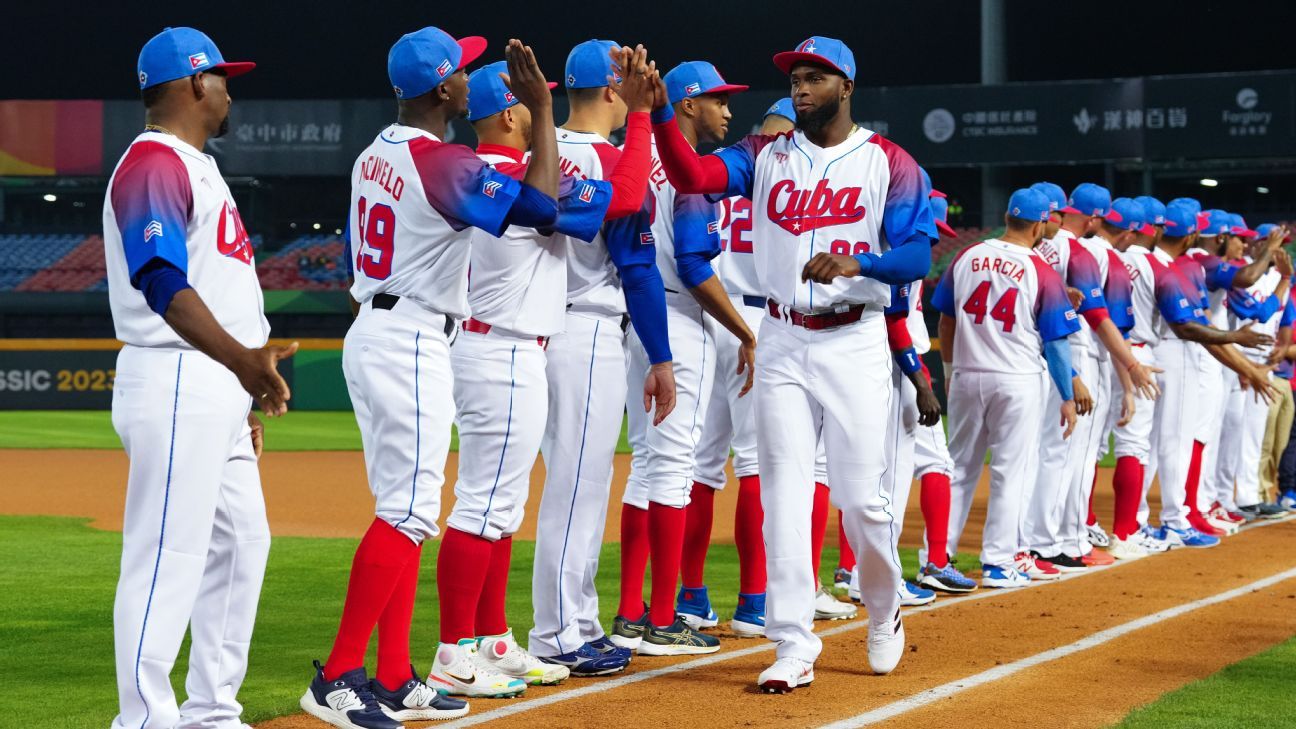
I like the new wordmark and cap logo Cuba received for the 2023 WBC. What I am not a fan of, however, is the blue to red gradient the team used on the sleeves of their white jersey and the road jersey as a whole. I know that red pants are a part of Cuba's international baseball history, but they're just a step too far for me. My Cuba set is kinda of half-blue half-red at home, but red is definitely the dominant road color.
- •