


- sky
- All-Star
 Offline
- From: 🌌
- Registered: 5/18/2019
- Posts: 2,080
Re: World Baseball Softball Confederation by Sky

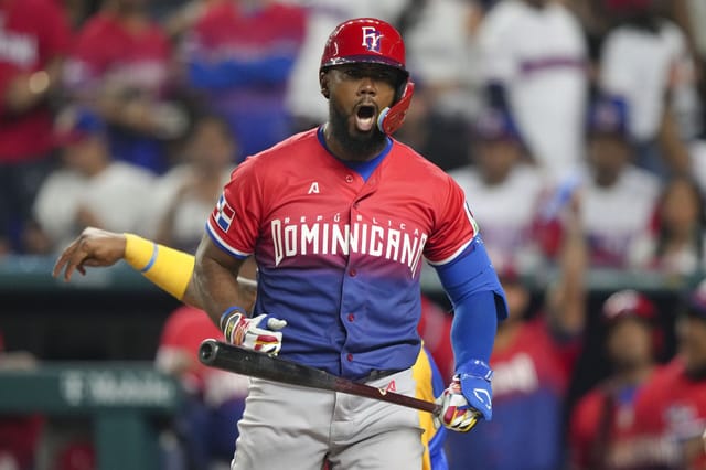
In 2023, the Dominican Republic went with a new wordmark, with sharp angles on the D and A and adding a small "REPÚBLICA" above it. I generally don't mind it, but I do prefer the classic block typeface they had before. I've basically combined the two, going with a block font but adding "REPÚBLICA" as well. The sleeve striping is inspired by MJD7's excellent WBC series, with the stripes reflected to reference the Dominican Republic's flag.
(A twofer today because my Japan concept is the same as in my NPB series. We're back to one a day tomorrow!)


- Steelman
- superadminguy
Offline

- From: The Wild West
- Registered: 5/19/2019
- Posts: 1,740
Re: World Baseball Softball Confederation by Sky
Japan looks great! If I had any quibble it might just be wishing the gold was slightly brighter to contrast better with the navy/black, as sometimes it feels a bit washy (felt the same in the NPB series, not sure if I brought it up before) but that's just a super minor one. But yeah, it's a great look!
DR kinda feels like a mashup of PR and USA but I think the striping is enough to make it stand out on its own. Curious if the alternated sleeve stripes also are matched on the pants? I do like the look overall.

AHS Admin. Creator of the THL, PUCH, WHA: Redux and Retroliga.
- ItDoesntMatter
- All-Star
Offline

- From: canon coast
- Registered: 5/18/2019
- Posts: 1,509
Re: World Baseball Softball Confederation by Sky
I definitely like the usa set better than the real-life version but I agree with steel that this one isn't *quite* doing it for me. the wordmark is so big that it wraps back around to feeling modern. if you're gonna go with "usa" on the front, I'd go with something shorter and wider, but why not spell out "united states"? it's the same number of characters as "san francisco" so don't tell me it's too long
don't really have anything to say about japan that I didn't say last time around, but this is definitely a good look for them.
the only real issue I have with the dr is that number font, where the outlines are running into each other, especially on the 3 there. makes what is otherwise a really clean look feel kinda muddy. other than that tho, I really like the inclusion of the full "república dominicana" on the wordmark and the stripes mimicking the flag is a really fun idea. here's a suggestion tho: why not play off the cap logo and go for a single-layer, split color kind of look? that feels like it would fit the brand and maybe separate them a little more from the pr and us teams. unless of course that makes them look like panama or cuba or something. god why are there so many red and blue teams


.jpg?itok=7Ml1iyD8)
- Dan O'Mac
- Moderator
Offline

- From: Green Bay, Wisconsin
- Registered: 5/22/2019
- Posts: 2,459
Re: World Baseball Softball Confederation by Sky
Okay, so the United States. I know what you're going for, but it just ended up boring and soulless in my opinion. The USA on the chest honestly feels too big, which is saying something for a three letter name. On the flip side, the cap is really nice, and I like that a lot. I also appreciate the flag being "backwards" on the right sleeve the way it's supposed to be displayed. It's a little thing, but nice.
Nothing to really say about Japan as we just saw it a couple months ago with your NPB redesign series, and it's a really nice looking set.
I like the Dominican Republic! I know it's a challenge with so many red/white/blue teams, and the royal and red work well. I like the white in the striping on the road as well, which makes sense it's there with the reasoning for the striping. I genuinely like what you did with the wordmark, blending two solid wordmarks to give a good look.

5x Alt Champion :: AltLB Champion Oklahoma City Bison - 2022 :: AltFL Champion New York Emperors - 2022 :: AltBA Champion Honolulu Kahunas - 2024-25 :: AltLB Champion Oklahoma City Bison - 2025 :: AltFL Champion New York Emperors - 2025

- sky
- All-Star
Offline
- From: 🌌
- Registered: 5/18/2019
- Posts: 2,080
Re: World Baseball Softball Confederation by Sky
Steelman wrote:
Japan looks great! If I had any quibble it might just be wishing the gold was slightly brighter to contrast better with the navy/black, as sometimes it feels a bit washy (felt the same in the NPB series, not sure if I brought it up before) but that's just a super minor one. But yeah, it's a great look!
DR kinda feels like a mashup of PR and USA but I think the striping is enough to make it stand out on its own. Curious if the alternated sleeve stripes also are matched on the pants? I do like the look overall.
Thanks! I definitely see what you're saying about Japan. I wanted the gold to be a more subtle trim on the home to let the pinstripes and unique font be the star of the show but it probably could do with a boost to its saturation. I hadn't considered alternating the pants stripes for DR but it's a great idea! I'll say that's canon, haha.
I definitely like the usa set better than the real-life version but I agree with steel that this one isn't *quite* doing it for me. the wordmark is so big that it wraps back around to feeling modern. if you're gonna go with "usa" on the front, I'd go with something shorter and wider, but why not spell out "united states"? it's the same number of characters as "san francisco" so don't tell me it's too long
don't really have anything to say about japan that I didn't say last time around, but this is definitely a good look for them.
the only real issue I have with the dr is that number font, where the outlines are running into each other, especially on the 3 there. makes what is otherwise a really clean look feel kinda muddy. other than that tho, I really like the inclusion of the full "república dominicana" on the wordmark and the stripes mimicking the flag is a really fun idea. here's a suggestion tho: why not play off the cap logo and go for a single-layer, split color kind of look? that feels like it would fit the brand and maybe separate them a little more from the pr and us teams. unless of course that makes them look like panama or cuba or something. god why are there so many red and blue teams
The reason I'm going with USA is because that's what the real team uses, but maybe a spelt-out United States could work on a throwback-type look, haha.
You have no idea how difficult it was to separate every single red and blue team. DR's unique feature is the gray road uniform, every other red/blue team has a colored top on the road. I can definitely give the split-color idea a try! I think it might make for a really cool look. Thanks!
Okay, so the United States. I know what you're going for, but it just ended up boring and soulless in my opinion. The USA on the chest honestly feels too big, which is saying something for a three letter name. On the flip side, the cap is really nice, and I like that a lot. I also appreciate the flag being "backwards" on the right sleeve the way it's supposed to be displayed. It's a little thing, but nice.
Nothing to really say about Japan as we just saw it a couple months ago with your NPB redesign series, and it's a really nice looking set.
I like the Dominican Republic! I know it's a challenge with so many red/white/blue teams, and the royal and red work well. I like the white in the striping on the road as well, which makes sense it's there with the reasoning for the striping. I genuinely like what you did with the wordmark, blending two solid wordmarks to give a good look.
Heard on the US! I'll give them another try. The letters are definitely too big. And while I've never liked the way the US reverses the flag on right sleeves, one of my goals with this series was to be respectful of each nation's culture, and that includes displaying the flag properly. Thanks for the feedback!
- •
- sky
- All-Star
Offline
- From: 🌌
- Registered: 5/18/2019
- Posts: 2,080
Re: World Baseball Softball Confederation by Sky

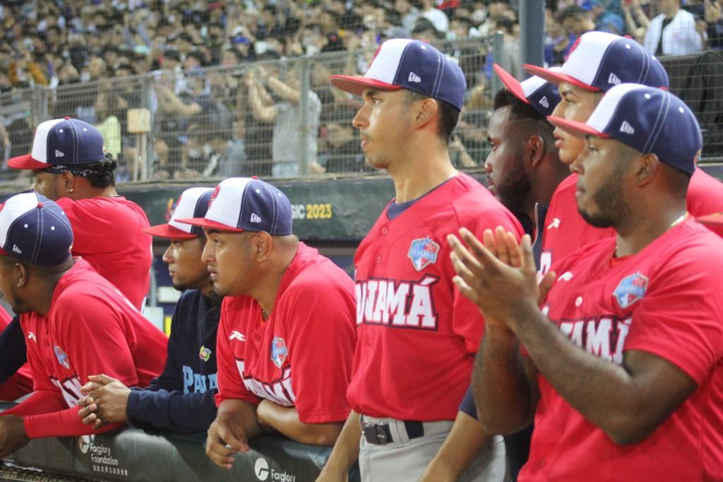
I really, really don't like Panama's current WBC set. A boring block font (that they keep white on white jerseys, by the way) replaced what was a really solid and classy look for the team previously. So, I've returned to the script and went for a balance of red and navy. Panama is one of a few teams that does have a different home and road cap, as I don't think the paneled cap with white works with gray pants. The striping is a little more out-there, alternating red and blue rectangles inspired by Panama's flag.
- •
- Dan O'Mac
- Moderator
Offline
- From: Green Bay, Wisconsin
- Registered: 5/22/2019
- Posts: 2,459
Re: World Baseball Softball Confederation by Sky
Another red/white/blue team? Who saw that coming! /sarcasm
This is a big upgrade from what they use in real life. The only things that I'm not a big fan of is the red P on the road cap and, I know this it nitpicky, but the squatchee on the road cap should match the brim. I think inverting the white and red would make that P nicer looking and in general if you have a different color brim you should have the squatchee match.
5x Alt Champion :: AltLB Champion Oklahoma City Bison - 2022 :: AltFL Champion New York Emperors - 2022 :: AltBA Champion Honolulu Kahunas - 2024-25 :: AltLB Champion Oklahoma City Bison - 2025 :: AltFL Champion New York Emperors - 2025
- sky
- All-Star
Offline
- From: 🌌
- Registered: 5/18/2019
- Posts: 2,080
Re: World Baseball Softball Confederation by Sky
Another red/white/blue team? Who saw that coming! /sarcasm
This is a big upgrade from what they use in real life. The only things that I'm not a big fan of is the red P on the road cap and, I know this it nitpicky, but the squatchee on the road cap should match the brim. I think inverting the white and red would make that P nicer looking and in general if you have a different color brim you should have the squatchee match.
Thanks! I went with the red cap logo to distinguish the team from other red and blue nations. I'm not sure why the button isn't red, that definitely should be.
- •
- sky
- All-Star
Offline
- From: 🌌
- Registered: 5/18/2019
- Posts: 2,080
Re: World Baseball Softball Confederation by Sky

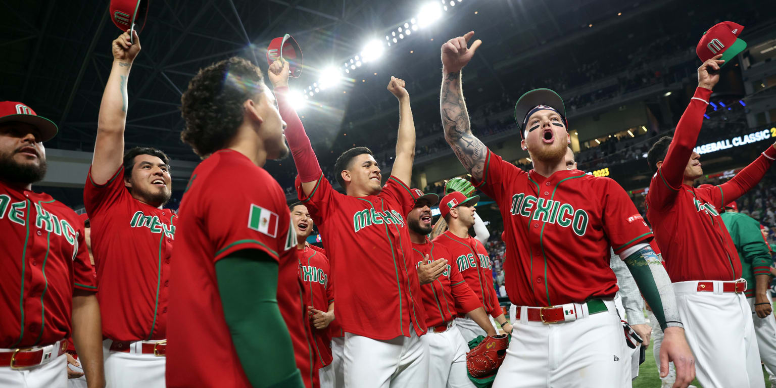
I really like Mexico's current logo set, I just don't understand why they opt for emphasizing red over their iconic green. I've shifted the focus back to green, with red trim on the home and red and white trim on the road. Not much else to say, Mexico has an iconic set of logos that do the talking, backed up by a color scheme unique to them in the WBC.
- •
- sky
- All-Star
Offline
- From: 🌌
- Registered: 5/18/2019
- Posts: 2,080
Re: World Baseball Softball Confederation by Sky
U.S.A.! So I get where you're going with this but I do have some quibbles. I think it's almost too plain/simple but I can get behind what you're trying to accomplish here. I like the big USA across the chest but that particular arch/skew doesn't do it for me. I think a more classically arched text that was less vertically tall would feel better imo. I also feel like the stroke on the numbers is thicker than the wordmark and I dislike that. I'd really like to see this set with a different serif set, for some reason the current isn't doing it for me. I think the cap looks great. I worry that it's too similar to PR but also there's only so many cap designs to go around. Part of the disconnect for me is the cap logo being flat while the rest of the set has thick strokes. Overall I think the set works but could really stand out with some minor tweaks.
I definitely like the usa set better than the real-life version but I agree with steel that this one isn't *quite* doing it for me. the wordmark is so big that it wraps back around to feeling modern. if you're gonna go with "usa" on the front, I'd go with something shorter and wider, but why not spell out "united states"? it's the same number of characters as "san francisco" so don't tell me it's too long
Okay, so the United States. I know what you're going for, but it just ended up boring and soulless in my opinion. The USA on the chest honestly feels too big, which is saying something for a three letter name. On the flip side, the cap is really nice, and I like that a lot. I also appreciate the flag being "backwards" on the right sleeve the way it's supposed to be displayed. It's a little thing, but nice.

Here's a new take on the US! A smaller USA wordmark and new numbers, both based on the cap logo for a more cohesive look. And, just for fun, here's a set with "United States" on the chest, complete with a cream home uniform inspired by the Giants.

here's a suggestion tho: why not play off the cap logo and go for a single-layer, split color kind of look? that feels like it would fit the brand and maybe separate them a little more from the pr and us teams.

I think this looks great! Excellent suggestion.
- •