

- Dan O'Mac
- All-Star
 Offline
- From: Green Bay, Wisconsin
- Registered: 5/22/2019
- Posts: 2,319
Re: North American Association of Football - NAAF
Love the Pittsburgh look, Wallflower. The stenciled numbers are such a great, perfect touch. Looking forward to the Expansion Draft.

5x Alt Champion :: AltLB Champion Oklahoma City Bison - 2022 :: AltFL Champion New York Emperors - 2022 :: AltBA Champion Honolulu Kahunas - 2024-25 :: AltLB Champion Oklahoma City Bison - 2025 :: AltFL Champion New York Emperors - 2025

- Steelman
- superadminguy
Offline

- From: The Wild West
- Registered: 5/19/2019
- Posts: 1,694
Re: North American Association of Football - NAAF
As a Pittsburgh purist IRL, the inclusion of orange hurts my soul. I just can't get behind orange in Pittsburgh. However, I appreciate that you tried something different. Overall I do like the identity. I think the oversized TV number stamps are a nice touch.

AHS Admin. Creator of the THL, PUCH, WHA: Redux and Retroliga.
- osctheg
- Starter
Offline
- Registered: 12/17/2019
- Posts: 58
Re: North American Association of Football - NAAF
I really like Pittsburgh. Orange and black is a strong color scheme and they definitely stand out from the crowd.

- Wallflower
- All-Star
Offline

- From: The True North
- Registered: 2/13/2020
- Posts: 1,657
Re: North American Association of Football - NAAF
Thanks, everyone for the comments! It seems like the heat-pressed idea panned out a lot better than I thought it would.
Stick - totally get the size, I think it's that size just to maintain the number size compared to the rest of the teams and maintain the regulation, but I may adjust them a little yet.
Steel - Haha, I was just looking for something unique, I honestly didn't even think that black and orange would be a problem for Pittsburgh, but now that you mention it I totally understand.
1965 Logo and Uniform Updates
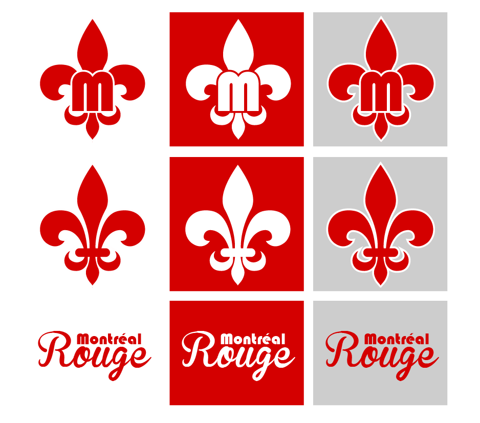
MONTREAL ROUGE
It was announced last offseason with the new ownership led by Alvon Martineau, the team would be refreshing the brand over the next few seasons. They ended up coming to a final decision on the brand earlier than expected and were ready to make the change this season.
For many years, the team had simply had a script logo for the team, so they wanted to create a proper logo to represent the team. They ended up with a simple fleur de lis with an “M” on top. A much more solid logo to really make the Rouge a much stronger brand.
They also decided to make some more heavy changes to the uniforms than some were not expecting. The new-look features the new logo on the classic red helmet. The home jersey is pretty much the same except for two thin white stripes, marking the first time the team has had striping on their red jersey. The red socks match the striping, while the silver pants remain, but with a new red and white stripe. The Roads use the same helmet, pants and socks, but the new jersey sees a vest style with red sleeves and a white jersey.
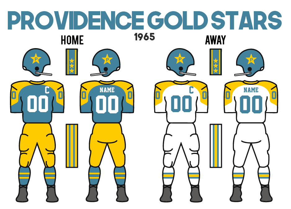
PROVIDENCE GOLD STARS
Following their 50th anniversary season that had the team put their 50-star logo on the helmet, the Gold Stars decided to maintain the additional star on each side of the helmet, except using the star with a “P” from their primary logo.
Once again would love to hear your thoughts!!


- •
- Dan O'Mac
- All-Star
Offline
- From: Green Bay, Wisconsin
- Registered: 5/22/2019
- Posts: 2,319
Re: North American Association of Football - NAAF
The Rouge are a great looking team. I could see the script being used in the future for a throwback or anniversary look, but they've made a big improvement, in my opinion. I like the red sleeves on the road look to make sure they still have a decent amount of red.
Providence made a solid choice, and the P-Star is perfectly cromulent.
5x Alt Champion :: AltLB Champion Oklahoma City Bison - 2022 :: AltFL Champion New York Emperors - 2022 :: AltBA Champion Honolulu Kahunas - 2024-25 :: AltLB Champion Oklahoma City Bison - 2025 :: AltFL Champion New York Emperors - 2025
- Stickman
- All-Star
Offline

- Registered: 5/21/2019
- Posts: 939
Re: North American Association of Football - NAAF
Awesome work on the Montreal Rogue! The logo is great, the new striping is a big upgrade, and the vest style for the away jersey (a style I normally don't care for) looks really good here! Big thumbs up for this one!
For the Providence Gold Stars, definitely the right call keeping the stars on the helmet!
Watching a league evolve over time is always a treat seeing the improvements made over time, definitely excited to see what comes next!


- Kingsfan11
- All-Star
Offline

- From: The French part of Canada
- Registered: 10/19/2020
- Posts: 575
Re: North American Association of Football - NAAF
I like the new look for the Rouge. The script logo was great and should come back someday (possibly in a throwback set like others have said) but this new logo is great. I like the uniforms as well.
Last edited by Kingsfan11 (8/18/2021 5:59 pm)


- QCS
- All-Star
Offline

- From: 🌌
- Registered: 5/18/2019
- Posts: 1,960
Re: North American Association of Football - NAAF
Big fan of all the new sets, a unique look for Pittsburgh and solid upgrades for Providence and Montreal. The M/FDL is really nice, the Rouge have one of the best brands in the NAAF for sure.


- ZO82
- All-Star
Offline
- From: Louisiana
- Registered: 5/18/2019
- Posts: 336
Re: North American Association of Football - NAAF
Hopefully, Montreal's new look will translate into a championship season.


- JamHeronArk
- All-Star
Offline

- From: Germany
- Registered: 5/27/2019
- Posts: 523
Re: North American Association of Football - NAAF
That new Rouge look is nice. It embodies 60s design well.
