
 1
1 - Gritty
- Moderator
 Offline
- From: Rocky Steps to Rocky Mountains
- Registered: 1/18/2020
- Posts: 1,776
St. Louis City SC joins the MLS
I posted this in my APL thread but figured the discussion would be better served over here. Here is St. Louis City SC. I actually kinda like it. I think it is pretty sharp. 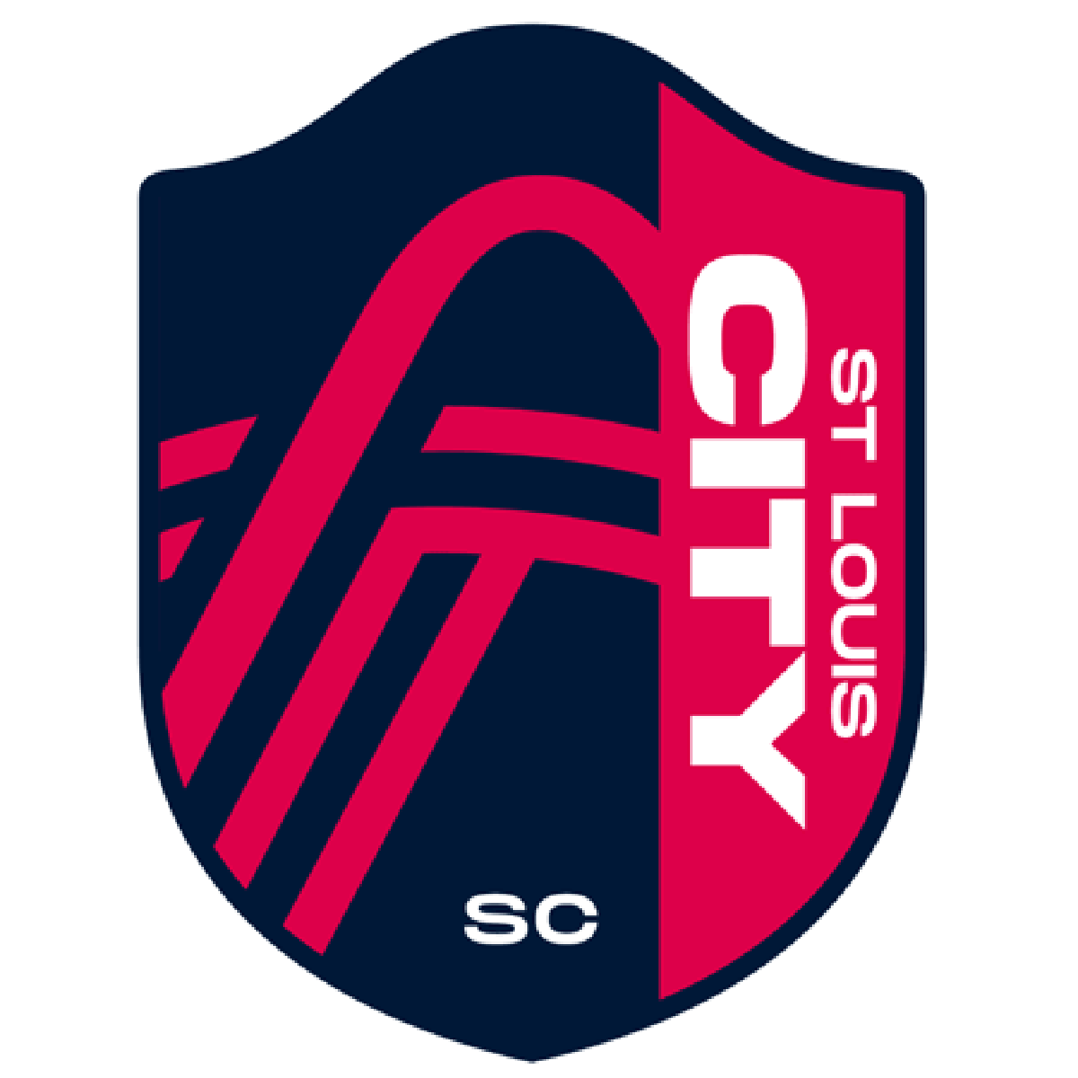
Here are the future expansion teams of the MLS. Sacramento is there old logo which I could see them using.![]()


Last edited by Gritty (8/13/2020 12:00 pm)
- Wallflower
- All-Star
Offline

- From: The True North
- Registered: 2/13/2020
- Posts: 1,655
Re: St. Louis City SC joins the MLS
I dig the St.Louis Logo a lot, the colours are very sharp.
Though the Name on the right side bugs me a little, idk why


- MyTeamIsDr.Pepper
- All-Star
Offline

- Registered: 5/18/2019
- Posts: 932
Re: St. Louis City SC joins the MLS
I know I commented on your thread Gritty but I'll go ahead and say something here too. Out of the last few expansion teams; Austin, Cincy, Charlotte, Miami, and Nashville, this might be the worst look yet. Charlottes reveal a few weeks back blows this out of the water. I think the name had some really good potential, I like St. Louis City but that crest is painful.


Follow the NFA here:
- ThisIsFine
- All-Star
Offline

- From: The Local Taco Bell
- Registered: 6/23/2019
- Posts: 954
Re: St. Louis City SC joins the MLS
I Think Sacramento could do with a new crest, or just removing all the shadows on their current one.
AHSylum Inmate

- Dan O'Mac
- All-Star
Offline

- From: Green Bay, Wisconsin
- Registered: 5/22/2019
- Posts: 2,285
Re: St. Louis City SC joins the MLS
Sacramento's has a really nice base, but I agree with the removal of shadows.
St Louis City SC is good, but it feels like it's missing something. I'd move the SC by the rest of the words, maybe the "Est. 202X" at the bottom if you still feel like you need something there.
Charlotte just works. I've come around. At first, I though the crown was missing something, now... I'm not sure.
I feel Austin did a good job using the space... but aside from that, I'm personally not a fan of the crest. And I can't point to why I feel like that.

4x Alt Champion :: AltLB Champion Oklahoma City Bison - 2022 :: AltFL Champion New York Emperors - 2022 :: AltBA Champion Honolulu Kahunas - 2024-25 :: AltLB Champion Oklahoma City Bison - 2025

- Steelman
- superadminguy
Offline

- From: The Wild West
- Registered: 5/19/2019
- Posts: 1,688
Re: St. Louis City SC joins the MLS
I kinda like the St. Louis crest. It feels a little too slick and I don't like how right-side weighted it feels, but I dig it.
As for the others: Austin still looks like a logo for a wellness center. I still am not thrilled with Charlotte. I hope Sacramento comes up with a new logo because I think the old one is bad.

AHS Admin. Creator of the THL, PUCH, WHA: Redux and Retroliga.
- Stickman
- All-Star
Offline

- Registered: 5/21/2019
- Posts: 939
Re: St. Louis City SC joins the MLS
Oh my... I have some thoughts...I actually feel like everything about this reveal is an abomination.
The name alone is awful. St. Louis City would have been great, (and even a potential nice tie-in to nearby rival Sporting Kansas City. Battle of the Cities, anyone?) why the unnecessary SC, (yes I know it stands for Soccer Club, although the Designer Speak also indicates that it stands for Soccer Capital.... which is so pretentious). So now will St. Louis City Soccer Club will be abbreviated to STLCSC? Eek, say that 5 times fast. I imagine for the most part, they'll just go by St. Louis City, (or STLC, which is still too long for an abbreviation), but it's still a miss for me. This is just as bad as New York City Football Club, or NYCFC, maybe worse.
The color scheme doesn't really feel inspired. I know it's supposed to represent the St. Louis city flag, which has red, blue on it, but how red and blue teams do we need? There are multiple teams already in MLS that utilize this scheme, why not try something different? What was wrong with the Saint Louis FC's blue and green look? Yeah it's a different team and the color scheme doesn't copy your city flag, but who really cares?
Frankly, Saint Louis FC also has a better crest too because the STLCSC crest is just... bad. The name being on the right side of the crest is weird, the SC being on the bottom looks completely disjointed from the St. Louis City part, and the design on the left part of the crest, I'm still not 100% if that is what I think that is. I think I see the Arch in there, that's nice. The weird lines I first thought were designed after the city flag, (which has lines that represent the Missouri and Mississippi rivers connecting) but no! If you look closely, STLCSC's lines are straight, the city flag's line are wavy, like actual rivers. If you were going to copy the flag's lines, why NOT use the wavy lines?! That actually is a cool design and it's recognizable enough to where people could figure it out on their own with minimum research.
I'd have taken out the arch, (or made it gold so that we could actually tell what it's supposed to be), put that stupid SC over to the right where the team name is to at least try to make it look connected, also move that word mark to the left part of the crest where it would make a little more sense, and made the river lines match the city flag, (since the city flag clearly was a big part of this team's design, which they've stated). Then you get a clear, recognizable, and still locally loyal crest instead of an abstract mess like this is.
For those who like this, I hope I don't offend you. Of course you're more than welcome to like this. It's just that I hate this and feel that this is one of the worst looking designs I've seen recently. If not for Chicago Fire being stupid enough to include a Latin Kings (violent crime gang in Chicago) reference on their logo, this would be my pick for easily being the worst crest in MLS.
EDIT: Since we're talking about the other newer logos, I'll throw my hat in. I still feel Charlotte FC needs something more on the crown part and there's a couple other issues, but it's overall pretty good. Austin FC's logo is a bit weird looking, but the color scheme is awesome. Sacramento I think should absolutely use their current logo, as it's a thing of beauty, (which of course means they'll change it).
Last edited by Stickman (8/13/2020 1:54 pm)


- QCS
- All-Star
Offline

- From: 🌌
- Registered: 5/18/2019
- Posts: 1,958
Re: St. Louis City SC joins the MLS
This is just awful. From the colors to the crest to the name, St. Louis failed on all levels. For all the crap CLTFC got, at least they have solid colors and a solid crest, St. Louis CITY Soccer Club (which is how they stylize it, which is dumb) has none of those. In addition to magenta (City Red) and navy (River Blue), they also have yellow (Energy Yellow) and gray (Arch Steel). How on earth are they going to get magenta and yellow to work together without clashing? The arch/river confluence thing is far too abstract to work well, having SC just floating on the bottom of the crest looks terrible, the vertical text is laughably bad, and where on earth is yellow? This is an easy bottom 3 crest in MLS, rivaled only by the Revs and Fire.
MLS' expansion teams have been very hit-or-miss lately, going back to 2018: LAFC is great, Cincinnati is disappointing, Miami is great, Nashville is awful, Austin is good, Charlotte is great, St. Louis CITY SC is impressively awful. Sac Republic will look good if they can keep their badge intact, I know MLS gets teams to change it slightly so they can own the trademark.


- Gritty
- Moderator
Offline
- From: Rocky Steps to Rocky Mountains
- Registered: 1/18/2020
- Posts: 1,776
Re: St. Louis City SC joins the MLS
One of my favorite things about this site is that we all can look at an identity and think completely different things. I just find it fascinating. I think it is an important lesson for me to remember that something that I make that I think works may not be everyone's cup of tea. For fun I did a VERY QUICK ranking of the crests of the MLS. I would love to see what everyone else things. These are not in order but rather in Tiers. 
- •
- QCS
- All-Star
Offline
- From: 🌌
- Registered: 5/18/2019
- Posts: 1,958
Re: St. Louis City SC joins the MLS
Hmm, I'll try that as well. I'm not going to make a graphic, but I'll just list it, from bottom to top.
29. Chicago Fire FC
28. St. Louis CITY Soccer Club
27. New England Revolution
26. Nashville SC
25. New York Red Bulls
24. FC Cincinnati
23. Houston Dynamo
22. Montreal Impact
21. San Jose Earthquakes
20. Toronto FC
19. Philadelphia Union
18. Colorado Rapids
17. Real Salt Lake
16. Sporting Kansas City
15. Seattle Sounders FC
14. DC United
13. Orlando City SC
12. New York City FC
11. Atlanta United FC
10. Los Angeles Galaxy
9. FC Dallas
8. Austin FC
7. Charlotte FC
6. Columbus Crew SC
5. Vancouver Whitecaps FC
4. Minnesota United FC
3. Inter Miami CF
2. Los Angeles FC
1. Portland Timbers