

- H-Town1141
- All-Star
 Offline
- Registered: 5/20/2019
- Posts: 275
Re: World Baseball Softball Confederation by Sky
sky wrote:
Ecuador and its updates are absolutely fantastic. I think the road gray is the way to go, but if you were expanding a full compliment of jerseys then the blue would also work great. Though I think if this were the case, go drop shadows on the white/gray and you could just go single outline no drop on the special blue for it to look a little better. I do like the open drop shadow look (ala Rangers) a lot though, but incongruent with the rest of the set. Minor quibbles though. Great set!
I think New Zealand looks sharp, they've always gone kinda no-nonsense imo so to me it works. Some Maori elements could be cool, again, maybe better suited for a third jersey situation. Good one.
Love the update to Aruba. I'm still not sold on Slovenia though I think the green and blue is the right direction. Something about that particular shade of green doesn't jive with me. I don't mind the stars on the jersey but they feel lost on the cap.
I really like the design of Palau but I think the blue jersey needs white outlines. I think the yellow/gold is dark enough to carry white. Would like to see outline on the cap logo too. Though I also wonder if black accents might work too, instead of white. There's a good base here, just might need a few tweaks to really pop!
I really like Sri Lanka! I think this was a great way to combine their super weird color palette (for sports, at least) and make it work well. SL is a surprisingly difficult combo to monogram (recently tried some concepts for my new project) so I like yours a lot. Also a much improved version of their script. Very good!Thanks! Sri Lanka was a sleeper hit for me in this series, it's such an out-there look and I'm quite proud of how I've interpreted it.
Here's Palau with white outlines, I think it definitely helps:
I would be worried about visibility from far away. The P of the cap already starts to vanish at scale.
really liking the updates on ecuador. I prefer the blue to the gray personally but I think either of them is an improvement over the original
palau is much better with the bright colors! I think in lieu of adding white (or black) as steel suggested maybe just a slightly darker blue would work? right now everything is just a little too bright for me. the stripes are a lot of fun and are a really nice local touch
I almost wish sri lanka would lean into the flag colors a little more because they're so unique, but I think you did a fantastic job of incorporating them into their existing jersey design without being too over-the-top. the script is nice, and the cap logo is serviceable, if a little unexciting (but certainly better than theirs in any case). overall a solid lookThanks! I agree that Sri Lanka's cap logo isn't really anything special, but like Steel said, S and L are sneakily tricky to work with together.
Here's Palau with the Carolina Panthers' blue, which I think really makes the set work. Thanks for the suggestion!
thought these guys got exploded
Last edited by H-Town1141 (5/25/2026 10:38 pm)
I l I K E t H I S
- sky
- All-Star
Offline

- From: 🌌
- Registered: 5/18/2019
- Posts: 2,085
Re: World Baseball Softball Confederation by Sky
Yeah, the Swiss flag is a big plus.
But this is a simple, no frills look.
Hahaha, thanks.
if I had a nickel for every team in one of your baseball series that decided to just rip off the dodgers, I'd have two nickels, which isn't a lot but it's weird that it's happened twice. I will say I definitely like them better with the red striping; it feels more like cambodia (and less like the dodgers) with that extra pop of color. I'm not sure I love the cap logo but there are only so many ways to design a C
honduras is fine, except for the gray pants. if you really can't bring yourself to go with white pants on the road, even blue pants would be better. otherwise, it's a solid look, and you've got yourself a nice script there
I'm conflicted about serbia, because on the one hand it looks nice, but on the other hand it doesn't really look like serbia without at least a little bit of blue, but on the other other hand you've totally justified every decision you've made here with the shield mark (which looks great on the cap btw). red and gold certainly helps them stand out amongst all the similar colors in the balkans tho
india looks nice but I do have a couple of qualms. the first is that it seems strange that the home has no powder blue on it, given that the uniform you based the set off was powder. I wonder what it would look like if the white in the striping was replaced with powder. second is that the old english doesn't really feel right to me and it dances uncomfortably close to colonialism imo. I don't think the devanagari-inspired script they currently use is the best but it does feel a lot more indian to me
I like switzerland a lot better without black. I really like the decision to go gray on the road with white accents; it would've been easy to do a red softball top but this feels more unique to them. I do wonder what it'd look like with a front number since the front feels a touch empty atm
Thanks! I agree with what you said about Honduras, but I'd committed to gray pants and wanted to stick to it. Here they are with blue road pants, however.

Glad you like Serbia! They were also a sleeper hit for me, but I'm a sucker for any kind of metallic gold.
I understand where you're coming from with India. I can't remember what my inspiration for the Olde English script was, but for what it's worth, my half-Indian boyfriend did approve, so I felt fine going with it. That said, I think I've got a better script here:

I like the script a lot more but the powder blue on the home striping isn't working for me.
Switzerland with front numbers looks great! Excellent suggestion.

thought these guys got exploded
Something like that, yeah


- •
- sky
- All-Star
Offline
- From: 🌌
- Registered: 5/18/2019
- Posts: 2,085
Re: World Baseball Softball Confederation by Sky

My Pakistan is heavily inspired by MJD7's take on the team in 2023, which itself was inspired by RoughRiders99's own take. The two most recent real-life sets are either too complicated or too simple in my opinion, so I've gone for a nice middle ground with an off-color sleeve. I've stuck with the unique dark green color the team has used lately.
- •
- Dan O'Mac
- Moderator
Offline

- From: Green Bay, Wisconsin
- Registered: 5/22/2019
- Posts: 2,467
Re: World Baseball Softball Confederation by Sky
Alright, aside from the fact I hate the one off-color sleeve as a design choice, I will say the execution is good. I like that the sleeve striping is inverted and obviously the focus for the set with the dark green is the right choice. I really like the treatment of the P with the crescent and star in the Pakistan wordmark as well, giving it a touch of flair. The same treatment of the P in the inverted colors on the cap doesn't seem as nice to me though, but not something that can really be fixed without going a) with a white border on the P giving it a ghost look, or b) giving the cap a white panel.

5x Alt Champion :: AltLB Champion Oklahoma City Bison - 2022 :: AltFL Champion New York Emperors - 2022 :: AltBA Champion Honolulu Kahunas - 2024-25 :: AltLB Champion Oklahoma City Bison - 2025 :: AltFL Champion New York Emperors - 2025

- sky
- All-Star
Offline
- From: 🌌
- Registered: 5/18/2019
- Posts: 2,085
Re: World Baseball Softball Confederation by Sky
Alright, aside from the fact I hate the one off-color sleeve as a design choice, I will say the execution is good. I like that the sleeve striping is inverted and obviously the focus for the set with the dark green is the right choice. I really like the treatment of the P with the crescent and star in the Pakistan wordmark as well, giving it a touch of flair. The same treatment of the P in the inverted colors on the cap doesn't seem as nice to me though, but not something that can really be fixed without going a) with a white border on the P giving it a ghost look, or b) giving the cap a white panel.
Thanks! We can try a ghosted cap logo, but it's not my favorite. A white paneled cap could work at home, but definitely not on the road.

- •
- sky
- All-Star
Offline
- From: 🌌
- Registered: 5/18/2019
- Posts: 2,085
Re: World Baseball Softball Confederation by Sky

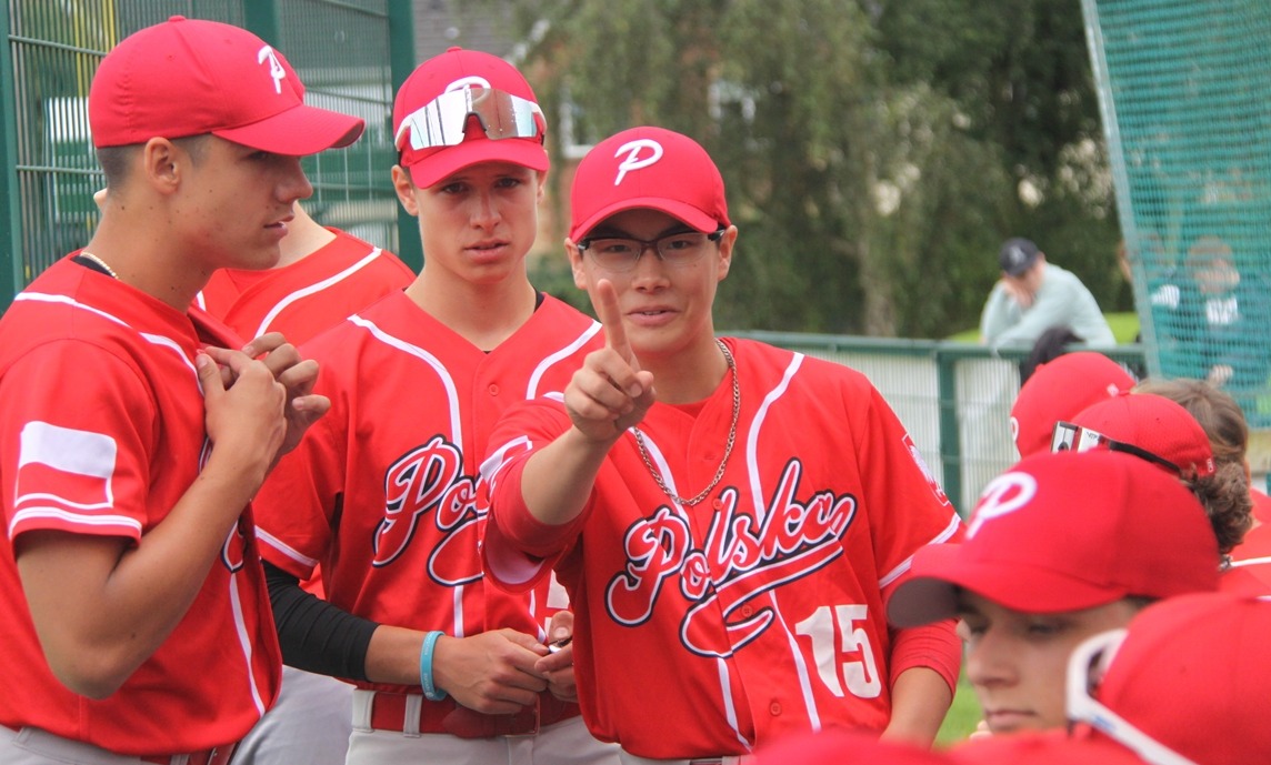
Poland is one of many, many teams that uses red and black. To give the team a unique identity, I decided to stick with the floating outline element the team currently uses. I did give the script a makeover and dropped the red-on-red script on the road jersey. Matching stripes finish the set.
- •
- sky
- All-Star
Offline
- From: 🌌
- Registered: 5/18/2019
- Posts: 2,085
Re: World Baseball Softball Confederation by Sky

Photos of Micronesia's baseball team seem to be completely missing online, so I was mostly on my own for this one. The set is heavily inspired by the flag of Micronesia, with a cap logo of an M surrounded by the stars of the flag. A simple but unique block font is used on the jersey. The road uniform is powder blue with white text, like the Royals' current powder alt. I didn't go with powder blue pants as there's no other color to use for the socks and head-to-toe powder blue wouldn't look great.
- •
- sky
- All-Star
Offline
- From: 🌌
- Registered: 5/18/2019
- Posts: 2,085
Re: World Baseball Softball Confederation by Sky

Korea released a new wordmark recently, so I've updated my set accordingly. Special thanks to MJD7 on CCSLC for providing me with the vector!
Last edited by sky (6/10/2026 9:48 pm)
- •
- sky
- All-Star
Offline
- From: 🌌
- Registered: 5/18/2019
- Posts: 2,085
Re: World Baseball Softball Confederation by Sky

Hong Kong's baseball team has a pretty cool look that, in my opinion, just need a bit of tweaking. I opted for a more classy-feeling font, which lent itself to a unique HK monogram inspired by this old mark. The region's use of navy, red, and gold set it apart, so I went with gold piping on both the home and road. As far as I can tell, having "China" on the jersey is a requirement, so I added front numbers to balance it out.
Last edited by sky (6/21/2026 6:17 pm)
- •
- sky
- All-Star
Offline
- From: 🌌
- Registered: 5/18/2019
- Posts: 2,085
Re: World Baseball Softball Confederation by Sky

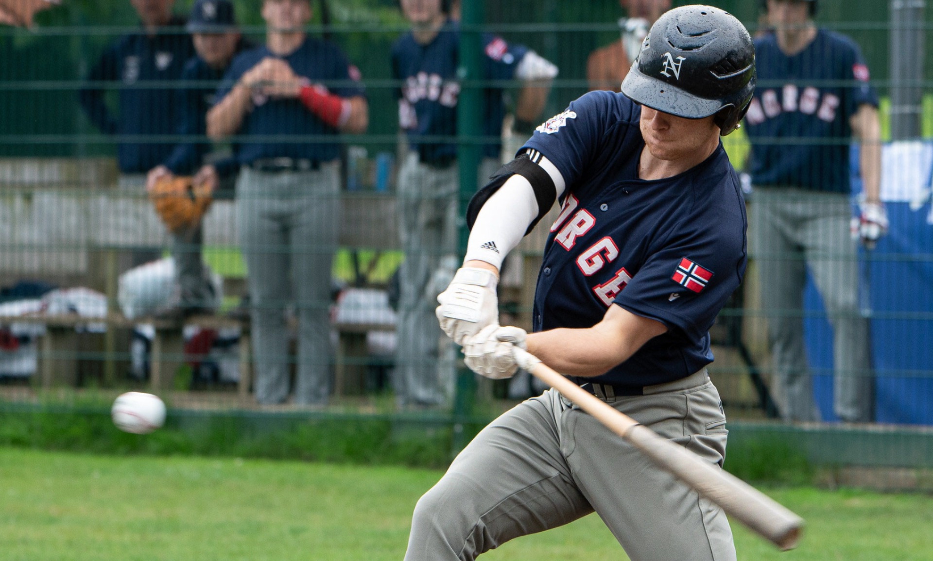
Norway's team has a set that I really like. The simple text, blackletter cap logo, and sparing use of red highlights was something that I kept in my rendition. I just added some since contrasting trim to help the red stand out more.
- •