


- sky
- All-Star
 Offline
- From: 🌌
- Registered: 5/18/2019
- Posts: 2,048
Re: World Baseball Softball Confederation by Sky
Dan O'Mac wrote:
I like the retention of the shield in the brand and moving it to a more logical place. The SM interlock is... okay. It's not bad, but it's not anything that blows me away. The wordmark being split is actually really nice for the color balance on the look.
Thank you! I really like the way the wordmark came out. I think the extra red on the wordmark is balanced nicely by the royal blue being the primary color elsewhere.


- sky
- All-Star
Offline
- From: 🌌
- Registered: 5/18/2019
- Posts: 2,048
Re: World Baseball Softball Confederation by Sky

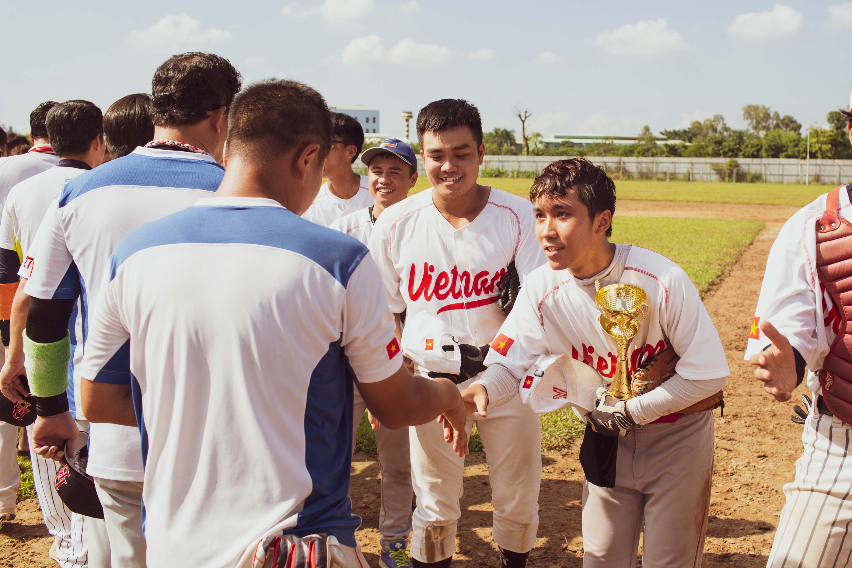
Vietnam is also a relative newcomer to the baseball scene, but managed to make it to the 2025 SEA Games in Thailand and even scored a win against Malaysia. The team's jerseys are mostly red and gold, but with small touches of navy. I scrapped the navy and gave the team a proper cap logo, the V of a new Vietnam script. The V flows nicely into the crossbar of the t as well. The road jersey uses white to help separate the team from their northern neighbors China.
- •
- Dan O'Mac
- Moderator
Offline

- From: Green Bay, Wisconsin
- Registered: 5/22/2019
- Posts: 2,428
Re: World Baseball Softball Confederation by Sky
That Vietnam script is gorgeous. I think scrapping the navy was a great choice in making the brand a clean and concise look. I think the front looks a bit overfilled with the number on the front and the way the underline curves down at the end. The underline is a better look with that wordmark, so I think the number should go.

5x Alt Champion :: AltLB Champion Oklahoma City Bison - 2022 :: AltFL Champion New York Emperors - 2022 :: AltBA Champion Honolulu Kahunas - 2024-25 :: AltLB Champion Oklahoma City Bison - 2025 :: AltFL Champion New York Emperors - 2025

- sky
- All-Star
Offline
- From: 🌌
- Registered: 5/18/2019
- Posts: 2,048
Re: World Baseball Softball Confederation by Sky
That Vietnam script is gorgeous. I think scrapping the navy was a great choice in making the brand a clean and concise look. I think the front looks a bit overfilled with the number on the front and the way the underline curves down at the end. The underline is a better look with that wordmark, so I think the number should go.
Thank you! Here's Vietnam without front numbers.

- •
- sky
- All-Star
Offline
- From: 🌌
- Registered: 5/18/2019
- Posts: 2,048
Re: World Baseball Softball Confederation by Sky

For an island nation with such an iconic and unique flag, the Bahamas' baseball uniforms are quite bland. Naturally, I made teal the dominant color. An Orioles-like script is on the chest, with Florida Marlins-style teal pinstripes on the home uniform.
- •
- ItDoesntMatter
- All-Star
Offline

- From: canon coast
- Registered: 5/18/2019
- Posts: 1,492
Re: World Baseball Softball Confederation by Sky
fiji feels much more like fiji in black imo. I especially like the way the logo pops off the cap
using the shield as a cap logo for sint maarten is a standout choice. I love the powder blue, but I will say that doing a horizontal blue-red split on a baseball jersey is a terrible idea :p all kidding aside, it's a good look on the whole. not related to the concept but does this team represent the whole island or does the french half have their own team?
vietnam is fantastic. the script is gorgeous, and removing the navy was definitely a good call. a couple suggestions to throw at you: the V looks nice on the cap, but I feel like they could get away with a star to mimic the flag. also, did you consider viet nam as two words on the script instead of one? given that it's what they use on their current uniforms and also how it's spelled locally
the bahamas are automatically nice just because of that color scheme and this would obviously be a huge upgrade over their current set. the thick striping on the sleeves and pants is a great look and the pins really work for them. I like the script but I'm not really a fan of the B in that font, which is a bit of a problem since it's the most prominent letter, but overall, still a great look


- sky
- All-Star
Offline
- From: 🌌
- Registered: 5/18/2019
- Posts: 2,048
Re: World Baseball Softball Confederation by Sky
fiji feels much more like fiji in black imo. I especially like the way the logo pops off the cap
using the shield as a cap logo for sint maarten is a standout choice. I love the powder blue, but I will say that doing a horizontal blue-red split on a baseball jersey is a terrible idea :p all kidding aside, it's a good look on the whole. not related to the concept but does this team represent the whole island or does the french half have their own team?
vietnam is fantastic. the script is gorgeous, and removing the navy was definitely a good call. a couple suggestions to throw at you: the V looks nice on the cap, but I feel like they could get away with a star to mimic the flag. also, did you consider viet nam as two words on the script instead of one? given that it's what they use on their current uniforms and also how it's spelled locally
the bahamas are automatically nice just because of that color scheme and this would obviously be a huge upgrade over their current set. the thick striping on the sleeves and pants is a great look and the pins really work for them. I like the script but I'm not really a fan of the B in that font, which is a bit of a problem since it's the most prominent letter, but overall, still a great look
Thanks so much!
The Sint Maarten team represents only the Dutch side. The French side doesn't have a baseball federation and isn't a member of the WBSC. Both nations have their own national football teams, however.
Here's Vietnam with your suggestions! Truth be told, when I was first doing my research, I referenced this team, which has "Vietnam" on the front, but is not the actual Vietnamese national team.

As for the Bahamas, I'll admit, the B is pure Orioles bias.
- •
- sky
- All-Star
Offline
- From: 🌌
- Registered: 5/18/2019
- Posts: 2,048
Re: World Baseball Softball Confederation by Sky

Ukraine is not highly rated, but have a really nice look that I stuck to. I based it mostly on when the Ukrainian team visited New York in 2022 to play against the NYPD and FD in charity games. The basic and clean "Ukraine" script with little trim to distract was really appealing to me. I combined that with the Ukrainian trident (tryzub) on the cap, again from those charity games in New York. The home uniform uses mostly blue, with the only yellow appearing on the Ukraine flag and cap.
- •
- sky
- All-Star
Offline
- From: 🌌
- Registered: 5/18/2019
- Posts: 2,048
Re: World Baseball Softball Confederation by Sky

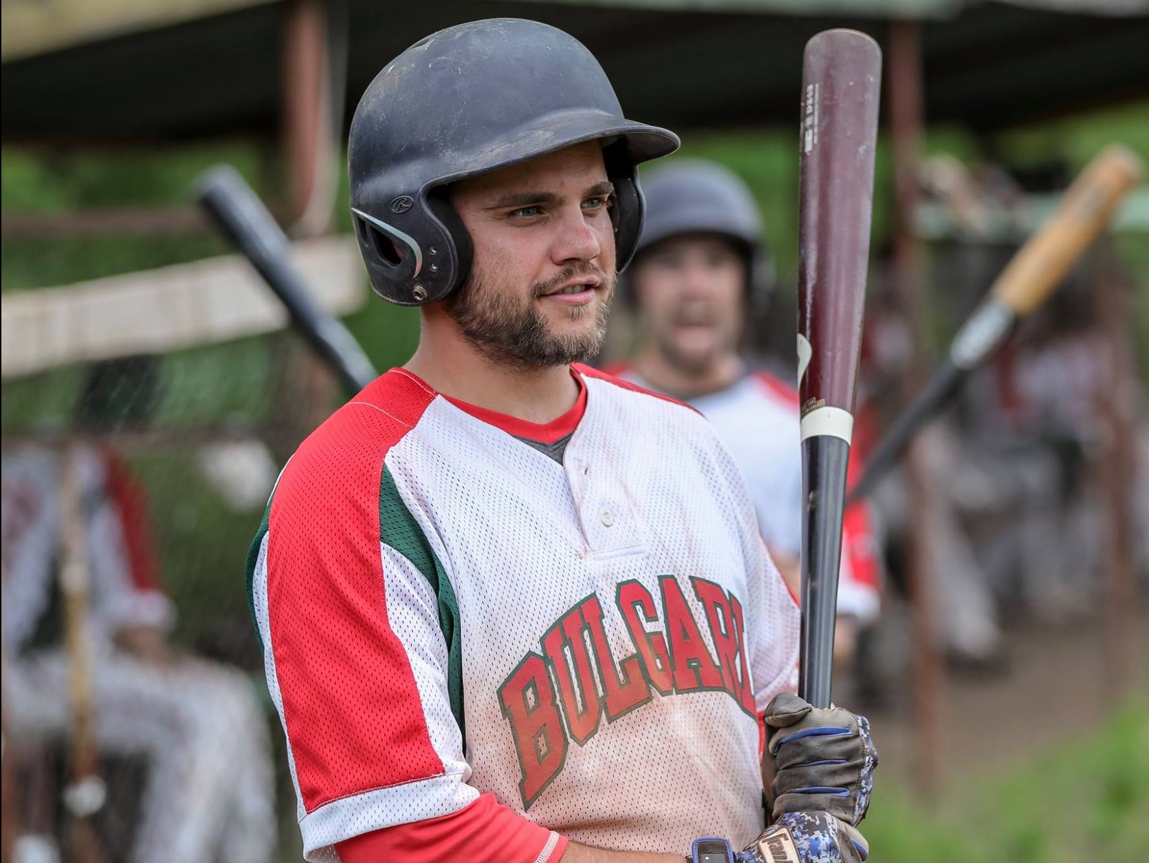
The third of three teams currently tied for last in the world, Bulgaria's distinct red and green look helps them stand out in Europe. These jerseys are my own interpretation of Bulgaria's current set, with racing stripes offset from the sleeves by a green and white stripe. I particularly like how the forest green looks on the red jersey.
- •
- Dan O'Mac
- Moderator
Offline
- From: Green Bay, Wisconsin
- Registered: 5/22/2019
- Posts: 2,428
Re: World Baseball Softball Confederation by Sky
It's hard to mess up something as simple as what you have for Ukraine, and you didn't mess it up. I like the tryzub on the hat as it brings a point of focus to make it less generic.
As far as Bulgaria goes... I have a personal dislike of single color racing stripes, but it's fine in this context.
5x Alt Champion :: AltLB Champion Oklahoma City Bison - 2022 :: AltFL Champion New York Emperors - 2022 :: AltBA Champion Honolulu Kahunas - 2024-25 :: AltLB Champion Oklahoma City Bison - 2025 :: AltFL Champion New York Emperors - 2025