

- sky
- All-Star
 Offline
- From: 🌌
- Registered: 5/18/2019
- Posts: 2,062
Re: World Baseball Softball Confederation by Sky
ItDoesntMatter wrote:
the updates look good! israel looks much better this way, and while I still don't like that wordmark for spain, it definitely fits better in this set. I'm not sure the green does much for palestine, but having it there does feel more like them. greece I could go either way on; I think there's value in the more subtle approach but going all out certainly looks good too
I love the pistons-y racing stripes on the philippines; that's a fun look that they can make their own. the script is also a banger, but I simply cannot see those tittles, especially on the gray. they need something to make them stand out more. I also feel like the hat could use more red but maybe that's just me
Thanks! Here's a version of the Philippines with a red stroke around the stars to help visibility. I also removed the white in the racing stripes as per a request on CCSLC.


- sky
- All-Star
Offline
- From: 🌌
- Registered: 5/18/2019
- Posts: 2,062
Re: World Baseball Softball Confederation by Sky

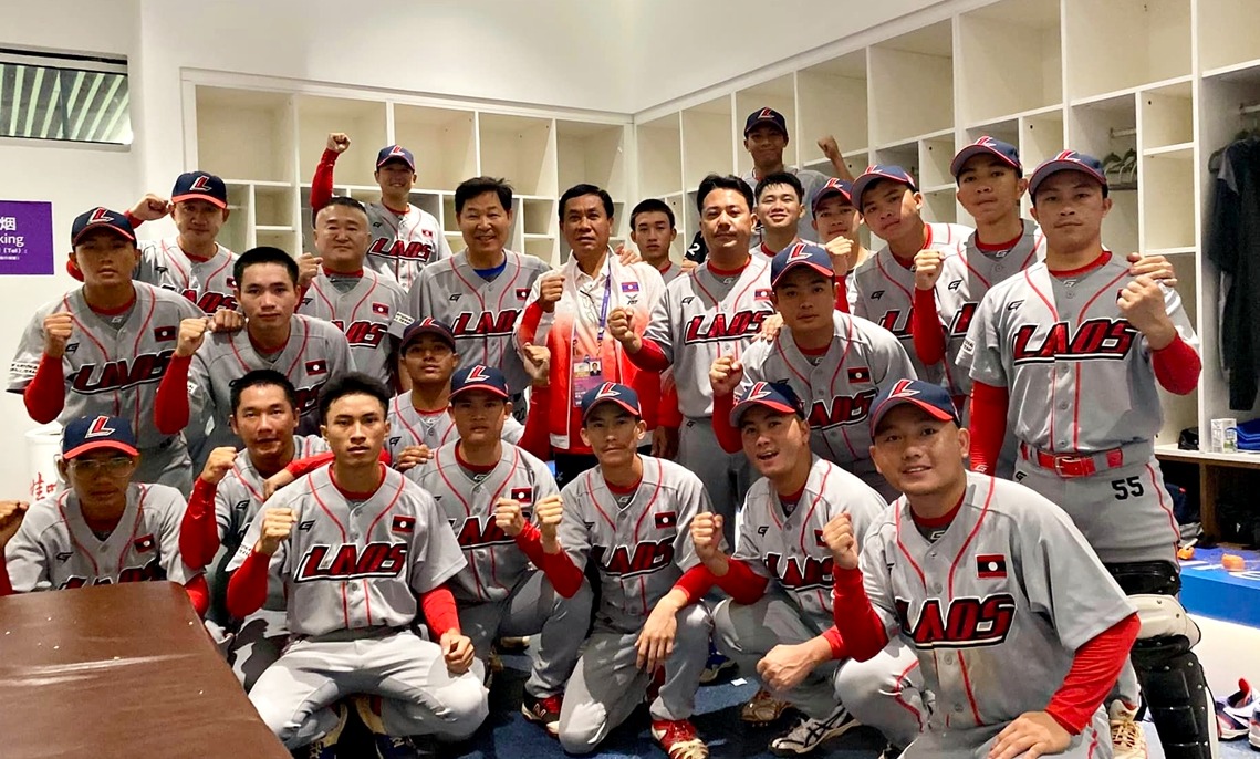
Laos uses a really awesome and unique sci-fi-esque wordmark with a white dropshadow/underline. I've recreated that with a slightly different font but otherwise left the uniforms nearly the same. I've also removed the white outline on the cap to match the wordmark's treatment.
- •
- sky
- All-Star
Offline
- From: 🌌
- Registered: 5/18/2019
- Posts: 2,062
Re: World Baseball Softball Confederation by Sky

Fiji is another of the three teams currently tied for last in the world. I quite like their use of a large, arched wordmark so I kept that around. I've revised the colors to drop black and go for a double-blue scheme inspired by Fiji's tropical locale and gorgeous water. For the cap logo, I grabbed the rendition of a Fijian drua, a sailing canoe important in Fijian culture, from the country's Olympic committee logo.
- •
- sky
- All-Star
Offline
- From: 🌌
- Registered: 5/18/2019
- Posts: 2,062
Re: World Baseball Softball Confederation by Sky

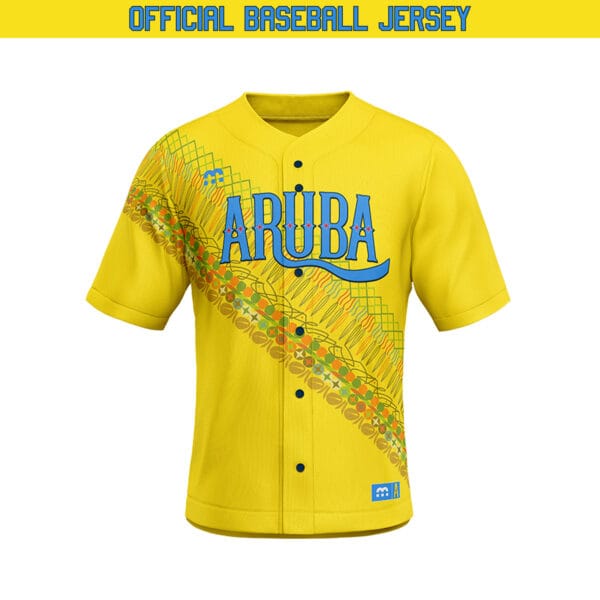
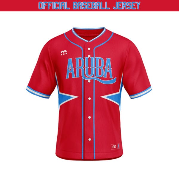
Aruba's real-life jerseys are a trip, with three jerseys with completely different designs. I've chose to base my set on the powder blue jersey with gold and navy. The road set doesn't use any white. The red stars inside the wordmark is the four-pointed star from the Aruba flag. This is one of the craziest sets I've got but I think it fits the island nation.
- •
- Dan O'Mac
- Moderator
Offline

- From: Green Bay, Wisconsin
- Registered: 5/22/2019
- Posts: 2,439
Re: World Baseball Softball Confederation by Sky
That Laos wordmark is really cool and unique in a good way. I like that you let that shine with their set.
Fiji feels really nice with the double blue, and going with the drua is a nice way to not just do a letter, but also keep it very locally relevant. I could go with that lighter blue going even lighter to match the flag still, but I'm not against the current shade.

5x Alt Champion :: AltLB Champion Oklahoma City Bison - 2022 :: AltFL Champion New York Emperors - 2022 :: AltBA Champion Honolulu Kahunas - 2024-25 :: AltLB Champion Oklahoma City Bison - 2025 :: AltFL Champion New York Emperors - 2025

- ItDoesntMatter
- All-Star
Offline

- From: canon coast
- Registered: 5/18/2019
- Posts: 1,500
Re: World Baseball Softball Confederation by Sky
the updates to the philippines are definitely an improvement. the stars are visible now, and I like how the new racing stripes match the flag
laos is a lot of fun! I really like the way you've modernized their wordmark, but apart from that, I think you were right in that they didn't really need much tweaking
I do like fiji with the double blue but it does feel a bit strange to move away from the black and blue scheme that they're so well known for in rugby. I'll echo dan that the drua is a really nice cap logo. this is also another case where, especially if you're gonna stick with the light blue road jersey, I'd really like to see white pants
aruba is definitely interesting, and it's fun to finally see a team you have to tone down! the bones are good but imo the triple piping on the home is a little too much. I think I'd rather see those just be the two blues, as it would match the road better and there's already a lot of gold present in the wordmark and number. if you ever do alternates that yellow one they have now would be a fun one to come back to


- Dan O'Mac
- Moderator
Offline
- From: Green Bay, Wisconsin
- Registered: 5/22/2019
- Posts: 2,439
Re: World Baseball Softball Confederation by Sky
As for Aruba, picking the blue with pins was the right choice to base everything on for a good uniform. I don't mind the triple piping, it's not my favorite design, but it fits well with the team, and it's not egregiously bad or anything. I personally don't like the powder blue caps with the all powder blue set. I think I'd prefer that cap to be dark and swap the white's cap to dark if you're only doing one cap for each.
5x Alt Champion :: AltLB Champion Oklahoma City Bison - 2022 :: AltFL Champion New York Emperors - 2022 :: AltBA Champion Honolulu Kahunas - 2024-25 :: AltLB Champion Oklahoma City Bison - 2025 :: AltFL Champion New York Emperors - 2025
- sky
- All-Star
Offline
- From: 🌌
- Registered: 5/18/2019
- Posts: 2,062
Re: World Baseball Softball Confederation by Sky
That Laos wordmark is really cool and unique in a good way. I like that you let that shine with their set.
Fiji feels really nice with the double blue, and going with the drua is a nice way to not just do a letter, but also keep it very locally relevant. I could go with that lighter blue going even lighter to match the flag still, but I'm not against the current shade.
Thanks!
the updates to the philippines are definitely an improvement. the stars are visible now, and I like how the new racing stripes match the flag
laos is a lot of fun! I really like the way you've modernized their wordmark, but apart from that, I think you were right in that they didn't really need much tweaking
I do like fiji with the double blue but it does feel a bit strange to move away from the black and blue scheme that they're so well known for in rugby. I'll echo dan that the drua is a really nice cap logo. this is also another case where, especially if you're gonna stick with the light blue road jersey, I'd really like to see white pants
I actually didn't know that Fiji was known for blue and black, so here's a version with those colors.

aruba is definitely interesting, and it's fun to finally see a team you have to tone down! the bones are good but imo the triple piping on the home is a little too much. I think I'd rather see those just be the two blues, as it would match the road better and there's already a lot of gold present in the wordmark and number. if you ever do alternates that yellow one they have now would be a fun one to come back to
As for Aruba, picking the blue with pins was the right choice to base everything on for a good uniform. I don't mind the triple piping, it's not my favorite design, but it fits well with the team, and it's not egregiously bad or anything. I personally don't like the powder blue caps with the all powder blue set. I think I'd prefer that cap to be dark and swap the white's cap to dark if you're only doing one cap for each.
Agreed on both counts! Here's Aruba with simplified home striping and a navy road cap.

- •
- sky
- All-Star
Offline
- From: 🌌
- Registered: 5/18/2019
- Posts: 2,062
Re: World Baseball Softball Confederation by Sky

Sint Maarten, one of the constituent countries of the Kingdom of the Netherlands, currently wears jerseys with a big "SINT MAARTEN" logo on the front, using a container shape taken from the country's coat of arms. I took inspiration from this logo for my set, which uses a split-color style highlighted by powder blue. The cap logo is a custom SM interlock inside the shield shape. The road uniform is a simple white-for-powder blue color swap.
- •
- Dan O'Mac
- Moderator
Offline
- From: Green Bay, Wisconsin
- Registered: 5/22/2019
- Posts: 2,439
Re: World Baseball Softball Confederation by Sky
I like the retention of the shield in the brand and moving it to a more logical place. The SM interlock is... okay. It's not bad, but it's not anything that blows me away. The wordmark being split is actually really nice for the color balance on the look.
5x Alt Champion :: AltLB Champion Oklahoma City Bison - 2022 :: AltFL Champion New York Emperors - 2022 :: AltBA Champion Honolulu Kahunas - 2024-25 :: AltLB Champion Oklahoma City Bison - 2025 :: AltFL Champion New York Emperors - 2025