

- sky
- All-Star
 Offline
- From: 🌌
- Registered: 5/18/2019
- Posts: 2,048
Re: World Baseball Softball Confederation by Sky
Section30 wrote:
I actually really like the Tiger striped sleeves for Malaysia, it's different but still works for some reason.
I agree, I really like how it works.


- sky
- All-Star
Offline
- From: 🌌
- Registered: 5/18/2019
- Posts: 2,048
Re: World Baseball Softball Confederation by Sky

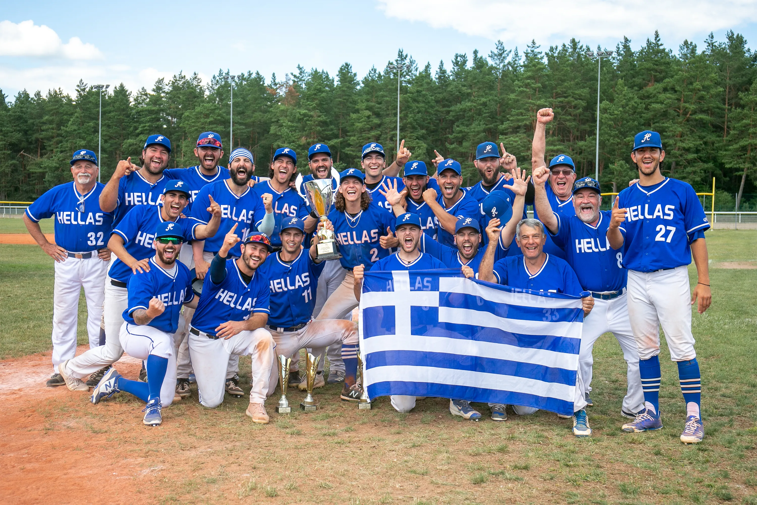
Greece has always had a close association with classical style as the birthplace of Western Civilization. With that in mind, I took their current set as a base and made some tweaks. I kept the unique script H but replaced the curved block wordmark with a serifed font that I have a soft spot for, Arpona. The striping is equally simple, just off-color stripes placed directly at the ends of the sleeves and the pants. However, if you look closer, you'll see a sublimated meandros pattern (à la my alma mater USC), an immediately recognizable symbol of Greek art and architecture.
- •
- sky
- All-Star
Offline
- From: 🌌
- Registered: 5/18/2019
- Posts: 2,048
Re: World Baseball Softball Confederation by Sky

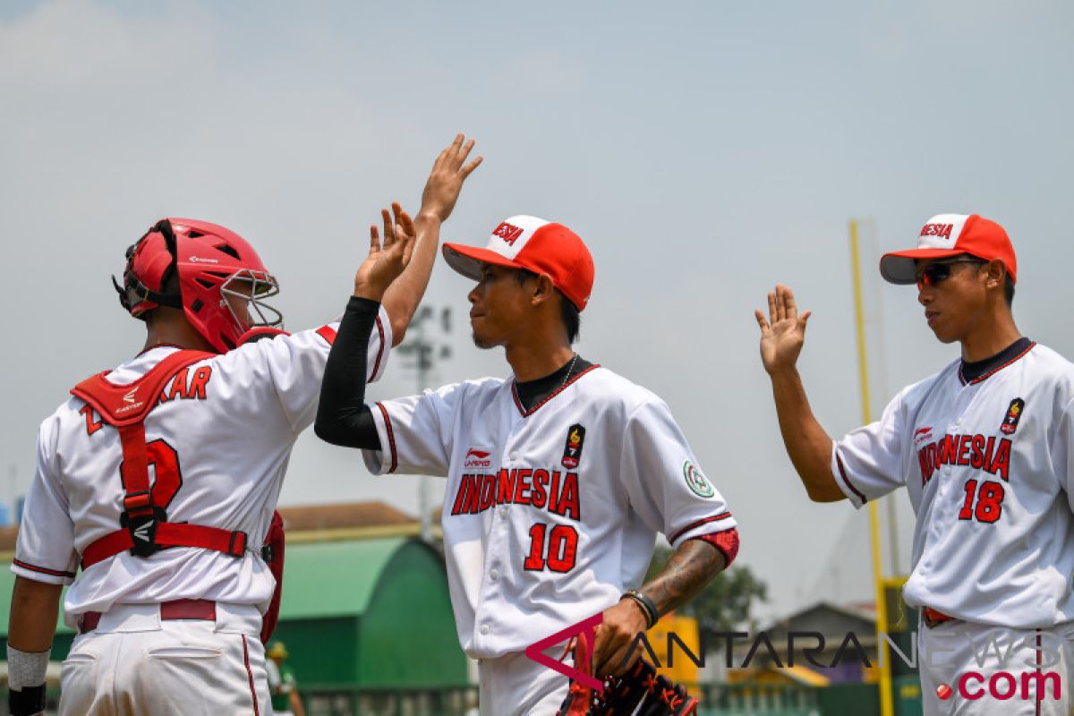
Indonesia's current set is very simple. The black and red is fine but it looks a lot like their Southeast Asia rivals Singapore, who are ranked above Indonesia and therefore got "first crack" at red and black. I pivoted the direction and took some influence from the Indonesian women's team, specifically the Tuscan-style lettering. Truthfully, I don't remember why I added gold instead of going just red and white, but I think it looks quite sharp. The curving stripes are inspired by the curved blade of the kris, a Javanese dagger that represents heroism, martial prowess, and power.
- •
- sky
- All-Star
Offline
- From: 🌌
- Registered: 5/18/2019
- Posts: 2,048
Re: World Baseball Softball Confederation by Sky

Türkiye has the unfortunate distinction of being one of three teams currently tied for last in the world at 83. Almost as a reflection of that, I decided to follow the team's current direction and go with a very simple set. As one of very few teams that is actually just a single color and white, the highlight of this set is the large wordmark and the star + crescent logo on the cap and chest.
- •
- sky
- All-Star
Offline
- From: 🌌
- Registered: 5/18/2019
- Posts: 2,048
Re: World Baseball Softball Confederation by Sky

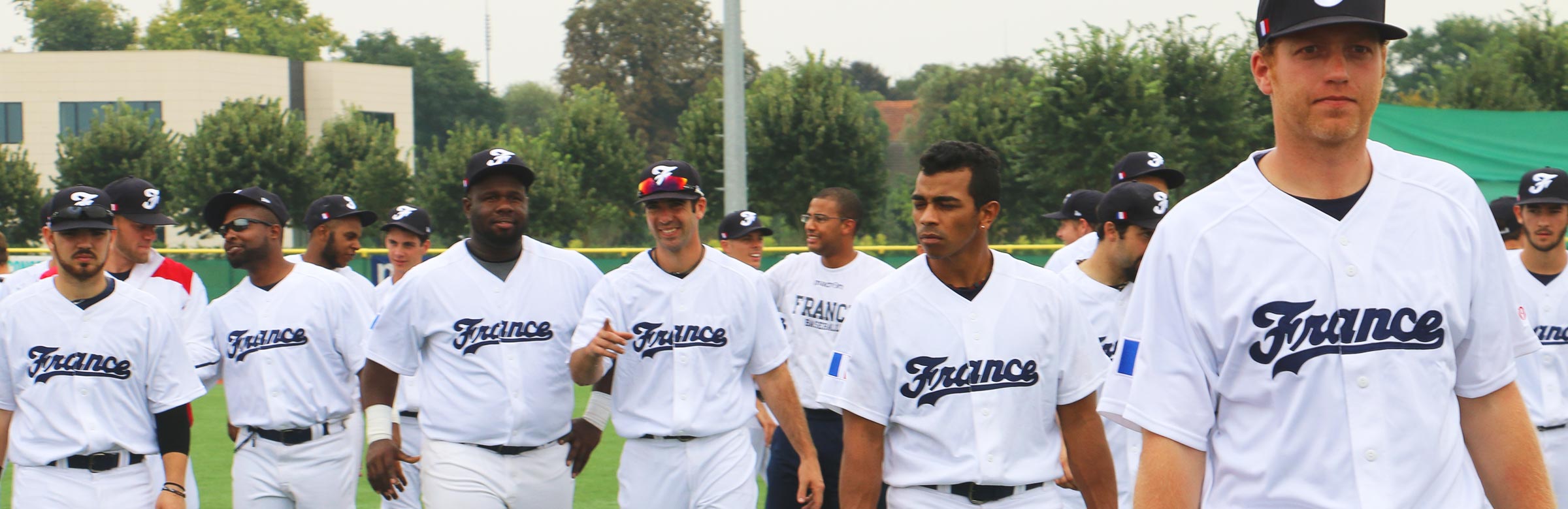
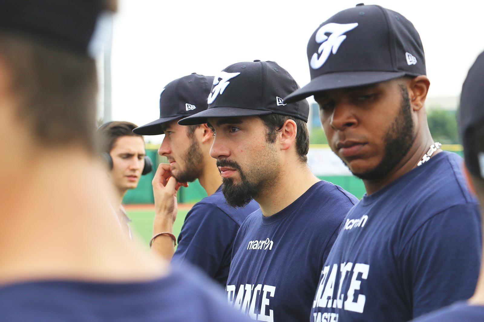
France has participated in the WBC in the past but failed to make the 2026 edition. For some strange reason I have a deep fondness for their odd wordmark and deep navy, so I kept the set mostly the same. My biggest change is going with a "fashionable" number font. The large racing stripes sans sleeves is a trademark of the French team that felt very fitting.
- •
- Dan O'Mac
- Moderator
Offline

- From: Green Bay, Wisconsin
- Registered: 5/22/2019
- Posts: 2,428
Re: World Baseball Softball Confederation by Sky
I've been behind on commentary, but I have to say I really like France. It feels really good, and I like how those racing stripes work.
Indonesia is a lot of fun, in a good way. And the tiger striping on Malaysia's sleeves is actually really nice and will help set them apart.
As for Greece, I think I'd like the meandros to be a touch more visible, but wouldn't be upset if it isn't.

5x Alt Champion :: AltLB Champion Oklahoma City Bison - 2022 :: AltFL Champion New York Emperors - 2022 :: AltBA Champion Honolulu Kahunas - 2024-25 :: AltLB Champion Oklahoma City Bison - 2025 :: AltFL Champion New York Emperors - 2025

- ItDoesntMatter
- All-Star
Offline

- From: canon coast
- Registered: 5/18/2019
- Posts: 1,492
Re: World Baseball Softball Confederation by Sky
hard to believe we're already almost at the home stretch! can't wait to see how you wrap this one up

you seem to have bitten off more than I could chew, lmao. here goes:
the updates/tweaks you posted are nice for the most part, but I feel like great britain is still not there yet. I'm finding it hard to see the G in the monogram, and I don't think either font you've found works well with it (especially the world cup one, which is just the complete opposite vibe). as boring as it is, maybe just a block font would bring it together?
czechia is nice. I'm not a huge fan of the font (here or on the louisville spirits) but the rest of it is solid. it does feel weird for them to have a CR logo when they use česko on the front and don't even use czech republic in english anymore, but hey they dug that hole for themselves
I like the double blue for israel; as much as they seem like they should be a royal blue and white team there are definitely enough of those already. I like the color balance on the home but I'm not a fan of the flipped blues on the road. really dig the way this version of the star looks on the hat tho
china bangs. that's about all I've got to say here. the only thing is - and as much as I don't want to reopen this can of worms - that shade of red seems a little too orange to me. I think a brighter, redder red would make it pop that much harder
I like your take on germany a lot, and while I like H's version, I think the black>red>yellow scheme works better than the black>yellow>red, and I like the double outlines, sue me. the font also feels very german without being super stereotypically so
as a noted drop shadow enjoyer, I like south africa a lot. the brighter green looks great and helps distinguish them from australia. I'm not sure the giants' font was the *best* choice given how tall and skinny the wordmark is but it doesn't look *that* out of place
spain feels a little off to me. turning the flag into the batterman chest stripe is fun and stands out, but I'm not sure the blackletter jives with it. maybe something a little more in the style of their current wordmark would fit better? obviously not exactly their current wordmark, bc that's pretty awful. leaning into the gold was a good call tho
malaysia's look is definitely unique, and I like the pop of red in the piping. I do wish there was drop shadow on the home numbers to match the script. the tiger stripes are a bit much for me personally but I like the idea and I think that could be something fun for them to build an identity around
adding some black for palestine was absolutely the right play here. this is another one where I find myself wanting for some green somewhere but at the same time I think that'd be one color too many. as it is, it's a solid set and I like the double headspoon, which we haven't seen much
I like the direction for romania, although it does all end up looking a little cluttered with the pinstripes and the double outlines, but it certainly stands out. it's not my favorite, but it works well enough, and the script is nice
the font for greece is really nice, but I agree with dan that I feel like the meandros needs to stand out a bit more. would it be too much to make it the whole stripe? other than that, tho, love a good simple, no-nonsense set like this
indonesia isn't what I was expecting but I really like it! the curvy stripes are really unique but having that connection to the culture makes it super cool. the tuscan lettering doesn't necessarily feel indonesian to me but I feel like it works here nonetheless. great stuff
turkey is super basic but I do really like that script, the T especially. the star and crescent patches give them one unique thing, and I'm glad you went with it on the hat instead of another letter. I do wonder if it needs the ghosted circle on the cap tho
the navy for france feels nice, and while part of me wants to see some red in there, I'm not sure where you could reasonably put it without ruining everything. the F is a lot of fun, but the rest of the wordmark doesn't fit with it at all. I much prefer the version in that first link where it actually feels cohesive. otherwise, I like this a lot
hard to believe there are still so many countries to go! I'll try to pop in here more often so my posts aren't the length of a city block when I get around to them :p


- sky
- All-Star
Offline
- From: 🌌
- Registered: 5/18/2019
- Posts: 2,048
Re: World Baseball Softball Confederation by Sky
you seem to have bitten off more than I could chew, lmao. here goes:
the updates/tweaks you posted are nice for the most part, but I feel like great britain is still not there yet. I'm finding it hard to see the G in the monogram, and I don't think either font you've found works well with it (especially the world cup one, which is just the complete opposite vibe). as boring as it is, maybe just a block font would bring it together?
czechia is nice. I'm not a huge fan of the font (here or on the louisville spirits) but the rest of it is solid. it does feel weird for them to have a CR logo when they use česko on the front and don't even use czech republic in english anymore, but hey they dug that hole for themselves
I like the double blue for israel; as much as they seem like they should be a royal blue and white team there are definitely enough of those already. I like the color balance on the home but I'm not a fan of the flipped blues on the road. really dig the way this version of the star looks on the hat tho
china bangs. that's about all I've got to say here. the only thing is - and as much as I don't want to reopen this can of worms - that shade of red seems a little too orange to me. I think a brighter, redder red would make it pop that much harder
I like your take on germany a lot, and while I like H's version, I think the black>red>yellow scheme works better than the black>yellow>red, and I like the double outlines, sue me. the font also feels very german without being super stereotypically so
as a noted drop shadow enjoyer, I like south africa a lot. the brighter green looks great and helps distinguish them from australia. I'm not sure the giants' font was the *best* choice given how tall and skinny the wordmark is but it doesn't look *that* out of place
spain feels a little off to me. turning the flag into the batterman chest stripe is fun and stands out, but I'm not sure the blackletter jives with it. maybe something a little more in the style of their current wordmark would fit better? obviously not exactly their current wordmark, bc that's pretty awful. leaning into the gold was a good call tho
malaysia's look is definitely unique, and I like the pop of red in the piping. I do wish there was drop shadow on the home numbers to match the script. the tiger stripes are a bit much for me personally but I like the idea and I think that could be something fun for them to build an identity around
adding some black for palestine was absolutely the right play here. this is another one where I find myself wanting for some green somewhere but at the same time I think that'd be one color too many. as it is, it's a solid set and I like the double headspoon, which we haven't seen much
I like the direction for romania, although it does all end up looking a little cluttered with the pinstripes and the double outlines, but it certainly stands out. it's not my favorite, but it works well enough, and the script is nice
the font for greece is really nice, but I agree with dan that I feel like the meandros needs to stand out a bit more. would it be too much to make it the whole stripe? other than that, tho, love a good simple, no-nonsense set like this
indonesia isn't what I was expecting but I really like it! the curvy stripes are really unique but having that connection to the culture makes it super cool. the tuscan lettering doesn't necessarily feel indonesian to me but I feel like it works here nonetheless. great stuff
turkey is super basic but I do really like that script, the T especially. the star and crescent patches give them one unique thing, and I'm glad you went with it on the hat instead of another letter. I do wonder if it needs the ghosted circle on the cap tho
the navy for france feels nice, and while part of me wants to see some red in there, I'm not sure where you could reasonably put it without ruining everything. the F is a lot of fun, but the rest of the wordmark doesn't fit with it at all. I much prefer the version in that first link where it actually feels cohesive. otherwise, I like this a lot
hard to believe there are still so many countries to go! I'll try to pop in here more often so my posts aren't the length of a city block when I get around to them :p
I've been behind on commentary, but I have to say I really like France. It feels really good, and I like how those racing stripes work.
Indonesia is a lot of fun, in a good way. And the tiger striping on Malaysia's sleeves is actually really nice and will help set them apart.
As for Greece, I think I'd like the meandros to be a touch more visible, but wouldn't be upset if it isn't.
Thanks both of you for the feedback! I'm on vacation in San Francisco right now so I don't have access to my computer to make all the edits suggested, but I can post some edits that people on CCSLC also suggested.
Agreed on Israel, here's a version with the blues flipped on the road (and fixed Hebrew text).

Blackletter was definitely the wrong call for Spain with the SOX stripes. Here's a new version with their real-life wordmark.

Palestine with a touch of green added:

Personally, I really like the subtlety of the meandros stripe on Greece, but here it is with the pattern as the full stripe:

- •
- sky
- All-Star
Offline
- From: 🌌
- Registered: 5/18/2019
- Posts: 2,048
Re: World Baseball Softball Confederation by Sky

My Philippines concept is an amalgamation of a few ideas the team has used across their existence. The script is inspired by their current set, the racing stripes by this set used in the 2000s, and the gold stars as tittles in the Is by their current logo.
Last edited by sky (4/09/2026 5:01 pm)
- •
- ItDoesntMatter
- All-Star
Offline
- From: canon coast
- Registered: 5/18/2019
- Posts: 1,492
Re: World Baseball Softball Confederation by Sky
the updates look good! israel looks much better this way, and while I still don't like that wordmark for spain, it definitely fits better in this set. I'm not sure the green does much for palestine, but having it there does feel more like them. greece I could go either way on; I think there's value in the more subtle approach but going all out certainly looks good too
I love the pistons-y racing stripes on the philippines; that's a fun look that they can make their own. the script is also a banger, but I simply cannot see those tittles, especially on the gray. they need something to make them stand out more. I also feel like the hat could use more red but maybe that's just me