

- Slapshot Kirby
- Starter
 Offline
 - From: Ohio
- Registered: 5/20/2019
- Posts: 97
Re: North American Association of Football - NAAF
I must say as a Royals fan, that Ottawa's new primary actually looks pretty cool, and the uniforms are also looking good in terms of updates! The updates to the other teams so far also look pretty snazzy!
Also, this is admittedly a premature question, but do any real life video game companies exist in the NAAF universe? For when the 1980s comes around, there is the possibility of an NAAF video game or two? I apologize if you haven't thought of that yet, but it was something I was admittedly curious about as a gamer myself.
Anyhoo, I'm looking forward to the rest of the team updates, especially the former WFU teams!
- Wallflower
- All-Star
Offline

- From: The True North
- Registered: 2/13/2020
- Posts: 1,645
Re: North American Association of Football - NAAF
Slapshot Kirby wrote:
I must say as a Royals fan, that Ottawa's new primary actually looks pretty cool, and the uniforms are also looking good in terms of updates! The updates to the other teams so far also look pretty snazzy!
Also, this is admittedly a premature question, but do any real life video game companies exist in the NAAF universe? For when the 1980s comes around, there is the possibility of an NAAF video game or two? I apologize if you haven't thought of that yet, but it was something I was admittedly curious about as a gamer myself.
Anyhoo, I'm looking forward to the rest of the team updates, especially the former WFU teams!
I'm glad you like the Royals new look, I am very happy with how that team came out, it's one of my personal favourite brands in the NAAF.
I mean I have thought about it, but I am not really sure. I have always been a little uncertain about how much irl stuff is included. I think especially for companies and brands. I guess I like when I can create my own brand to build the world around, but there is only so far you can go with that. I'm now always sure how far the world strays from our reality one, especially when the countries, cities, and political landscape is based on our world. I think it's like going to be a HYBRID....I guess that's the theme here, where there may be some companies from our world, but also will have our own versions as well. I'm still working out the kinks on that really. But as for video games specifically, I mean of course I have thought about it and I'm sure once they are a thing, doing cover athletes and that stuff will be fun.


- •
- Wallflower
- All-Star
Offline
- From: The True North
- Registered: 2/13/2020
- Posts: 1,645
Re: North American Association of Football - NAAF
1970 Brand Changes Part 4
To round out the current NAAF redesigns, the final 3 teams made the biggest changes to their uniforms and logos.
Halifax Mariners
Ever since the Mariners arrived in Atlantic Canada, the team has certainly carried the remnants of the Worcester Athletics through their branding. While the team initially wanted to honour the old club by keeping the famous cream in the brand along with the new blue, Owner Elliot Hudson has never quite felt right about the look. His uncertainty was a big reason the team had already changed their look ahead of the 1966 season. Finally, with the opportunity to work with Patterson Athletics, he could have a brand that felt like its own brand for the city of Halifax.
Logos: The first big change is that the team is dropping the cream from the colour scheme, and in its place, promoting the orange introduced on their 1966 logo to their secondary colour. The logo reflects this change with all the cream changed to white and the blue ring around the logo changed to orange. The team also introduces a new anchor mark for their secondary logo.
Uniforms: The uniforms see a significant overhaul. The home jerseys stay blue, with 2 orange stripes surrounding a single white stripe on the sleeve cuffs. The anchor is also on the sleeve with the numbers moving to the shoulders. The team also introduces an orange stroke around the white numbers. The roads take a similar design but with several colours swapped. While there was some discussion about the team moving on from the “heart” patch on the jerseys honouring the original owner, Richard Paul, ultimately Elliot Hudson wanted to keep it. However, the patch is now coloured to match the colour scheme and the font is changed to match the Mariners’ brand.
Field: While there were sweeping changes to the brand, the field at Atlantic Stadium does not change.
Long Island Raiders
The Raiders have had the same look since they rebranded to the Raiders in 1955. Last season, the team introduced a throwback to the team’s original green and white look. Owner, Wayne Tillman was very fond of that design and he wanted to go back to it, but also felt that the current brand had been so iconic with the team’s recent success. In the end, the team at Patterson Athletics came up with a meld of both.
Logos: The team’s new logo, brings back the classic crossed swords. The outline of Long Island is replaced with an oval behind the swords with “LI” and “Raiders” inscribed on it. The years 1919 and 1922 are also on the logo which are the years the original Raiders were founded and the current franchise, the original Hartford Maroons/Hawks, was founded respectfully. The other change sees the team adjust the green of their brand to stand out as more green than black.
Uniforms: The new uniforms mix the old with the new. The helmet remains the same, with the new swords on the side. The new jersey features the old design’s 4 stripes but with the maroon coming through underneath. The design was one of the more challenging designs to get right technically, but Tillman was willing to help make it happen, even if it required a little more money. The road has a similar design, but most details remain green with the numbers and names in maroon. 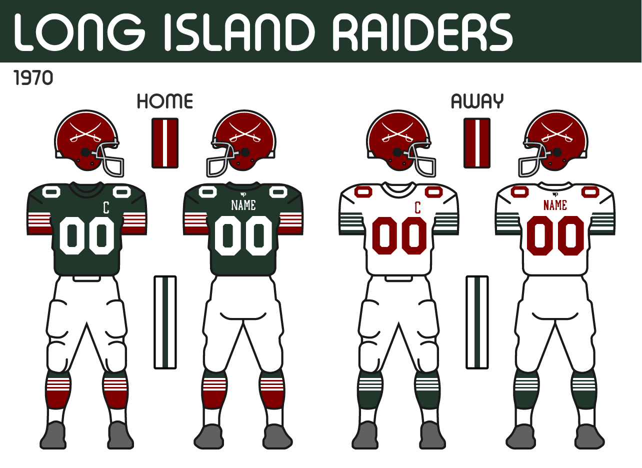
Field: The new field sees the swords placed at midfield, replacing their anniversary logo from last season. While the endzones get “Raiders” with the new font. 
Providence Gold Stars
Finally, the Providence Gold Stars round out the bunch. As the team takes the opportunity to evolve their design in hopes of some new luck.
Logos: The logo remains pretty similar to their previous one, but the new anchor is now just a single colour. The shape of the anchor is based on the anchor on the Rhode Island flag. The team also is making a change with their font, going to a block font that is often seen on ships. 
Uniforms: The new uniforms are a bit tamer compared to what the Gold Stars are used to, but it’s a fresh look. The new home uniform features the new font on the numbers and captain patch. The two stripe pattern they had started with the previous set returns but is now applied to the sleeves. The biggest change comes with the removal of the yoke that the team has had for many years. In its place are a pair of gold stars on the shoulders. The helmet maintains the 3 stars on the front to signify the pre-NAAF 3 McCallister Cups the team has won, however, the stripes on the helmet not longer go around the stars, but instead, stop just before the top star.
Field: The Gold Stars carry over a similar design for their field at New Providence Stadium, but have just updated the font and logos to match their new set.
Last edited by Wallflower (4/07/2023 10:58 am)
- •
- Wallflower
- All-Star
Offline
- From: The True North
- Registered: 2/13/2020
- Posts: 1,645
Re: North American Association of Football - NAAF
I'm realizing tonight I have a lot more to work on before I can get the new reveals up, like make the rosters and flesh out the details of the history, so it may be a few days until the WFU teams are posted, especially while I am focusing on school for the next couple of nights. Hope you have enjoyed the 13 other reveals so far (C&C is certainly welcome), be back soon ![]() .
.
- •
- Dan O'Mac
- All-Star
Offline

- From: Green Bay, Wisconsin
- Registered: 5/22/2019
- Posts: 2,129
Re: North American Association of Football - NAAF
I saw the Raiders logo with the numbers on it and was hoping they would be on the jersey (since it's quite similar to what the MLB's Pittsburgh Pirates use). Not that there's anything wrong with the block numbers, of course.

3x Alt Champion :: AltLB Champion Oklahoma City Bison - 2022 :: AltFL Champion New York Emperors - 2022 :: AltBA Champion Honolulu Kahunas - 2024-25

- Wallflower
- All-Star
Offline
- From: The True North
- Registered: 2/13/2020
- Posts: 1,645
Re: North American Association of Football - NAAF
I saw the Raiders logo with the numbers on it and was hoping they would be on the jersey (since it's quite similar to what the MLB's Pittsburgh Pirates use). Not that there's anything wrong with the block numbers, of course.
That checks out since it is the Pirates' font. I think I found the font to be a little too thin for my liking so I just kept the block numbers for now.
- •
- QCS
- All-Star
Offline

- From: 🌌
- Registered: 5/18/2019
- Posts: 1,900
Re: North American Association of Football - NAAF
I'm realizing tonight I have a lot more to work on before I can get the new reveals up, like make the rosters and flesh out the details of the history, so it may be a few days until the WFU teams are posted, especially while I am focusing on school for the next couple of nights. Hope you have enjoyed the 13 other reveals so far (C&C is certainly welcome), be back soon
.
Take your time! Looking forward to the WFU teams. In the meantime:
MIN: An improvement for sure. My only critique is that I wonder how the striping on the white jersey would look with a blue stroke like the white one on the blue jersey. That said, I notice that blue and green don't touch anywhere else, so maybe not. Looks good nonetheless!
OTT: Finally, an update to the Royals! I love the new banner logo and the whole thing got a very much-needed touch-up. I love the new striping on the white jersey, it's a nice way to incorporate more purple. The blackletter captain patch rules as well.
PIT: Yeah, this was definitely needed. The new look is great, reducing the gimmicks and reinforcing the really nice charcoal color the Blacksmiths use. Love the new away set, feels much better.
HFX: RIP cream - gone, but not forgotten. I think it's right for the Mariners to forge their own brand (and have an awesome throwback jersey for the future). A little strange for both Halifax and Providence to use anchor symbols but they're different enough that I don't think it matters. Love the jerseys, they feel like a modern classic that can last to the present day. Also - I believe this is a NAAF first - the numbers are double-layered with that orange stroke. Innovations!
LI: I actually liked the old shade of green a little more but I understand the change. The home jersey remains excellent but I'm curious as to why the team refuses to use maroon below the waist on the road jersey. Use the same socks, fill in the stripes on the sleeves, and use more of that really nice shade of red. Love the new font, hoping that eventually a modified version of that makes its way onto the jerseys.
PRO: The yoke is gone! A classic look that again, will make for a great throwback someday. I love the stars on the shoulders, as well. I have two complaints, however: first, I think the stars on the front of the helmet make it a little too busy and I think they'd look better on the back. Second, I'd like to see some gold in the sleeves of the road jersey. Either way a great new look for the Gold Stars, hopefully this is the one to lead them to success.
Great updates to the existing NAAF teams. Upgrades across the board in my opinion and you've laid the foundation for iconic looks for a couple of these teams. Can't wait for the WFU teams, they're sure to be worthy additions to this great-looking collection of clubs.


- Stickman
- All-Star
Offline

- Registered: 5/21/2019
- Posts: 932
Re: North American Association of Football - NAAF
Indiana Victors: Not too much changed, like you said, but I do like those shoulder numbers on the road jersey and sorta wish the home jersey did the same. Overall, the Victors have always been a great looking team and I'll probably be saying this for every team, but the shorter sleeve look works well with these guys!
Montreal Rouge: I'll admit that I was never the biggest fan of the red sleeves on the road jersey, but I do think it looks better because of the shorter sleeves interestingly. The helmet stripes are a nice touch, ties the uniform together with all three elements (helmet, shirt, pants) having a white stripe or two. Nice job!
Toronto Steelheads: Love this. It's a small update, but the bigger maple leaf on the sleeves helps them pop even more, very nice!
Boston Independents: I like the new logo a lot! I am glad though that you've kept the lids logo free for now though, the Independents stand out nicely as they are. The new jersey template was good for these guys too and I like that we're down to two different shades of gold now instead of three? At least the green is consistent, otherwise, we'd have the NAAF version of the Dallas Cowboys, haha!
Buffalo Blue Wings: They already looked awesome, but the improved logo and the updated helmet wings puts this team in the top 2-3 overall for me! With them reminding me of the Philadelphia Eagles, ("Fly, Blue Wings, Fly!!!"), I almost want to go back to rooting for these guys, lmao!
London Tigers: I like this overall. The logo definitely needing modernizing, and I think the LT Paw (The Lawrence Taylor Paw?! JK, although that LT definitely has some big mitts) is good and I like this replacing the letters on the helmet. The reddish orange definitely pops against the dark navy jersey, very nice.
Louisville Thunder: You removed the lightning bolt from on top the helmet, glad you did that, this is one of those team that doesn't need anything more than its logo on the helmet. The logo itself is definitely an interesting one. It's good, but I wonder if down the road, they couldn't consider updating it to have the lightning bolt extend from its eye straight left or right past it's head instead of the bolt curving down towards it's neck? It's still good though! Louisville has always stood out big time and they continue to do so now!
Minnesota Serpents: This is a really nice update! I like the socks matching the set better and the silver pants is an upgrade to me. Good work!
Ottawa Royals: That banner logo is freaking awesome!!! Love it big time! The new crown on the helmet is a huge upgrade too, solid work here Wally!
Pittsburgh Blacksmiths: I've always liked this team and I think the updates work very well here. The sleeves removing the square is a addition by subtraction move and I like the orange line. Weirdly, I actually like the road jersery's dark sleeves, normally I'm not a big fan of that kind of look. But the Blacksmiths pulled it off rather well!
I'll post my thoughts on the other three soon. Really good stuff here man!


- Stickman
- All-Star
Offline
- Registered: 5/21/2019
- Posts: 932
Re: North American Association of Football - NAAF
Halifax Mariners: Loving this update! I think the blue and orange pop so cleanly with the white that I don't even miss the cream color at all! I think this might just be the best looking team in the NAAF now!
Long Island Raiders: Definitely enjoying my team's new logo, it's old school without being too old fashioned, very nice! And I still like the New York Giants-esque approach to the team being more green at home and looking more like a red team when wearing the road uniforms, it's goofy and it stands out in a fun way!
Providence Gold Stars: Another awesome update! The new anchor logo is very nice and I love the attention to detail with changing the font to resemble something an actual ship would likely use! The uniforms are full of personality too! The stars and stripes helmet is a particular favorite detail of mine!
Overall, really great work here! Can't wait to see what's next!
- ItDoesntMatter
- All-Star
Offline

- From: canon coast
- Registered: 5/18/2019
- Posts: 1,274
Re: North American Association of Football - NAAF
great work all around! cool to see a lot of upgrades going around. I don't want to make you sit through a team-by-team breakdown but I'll just make some stops at some things I particularly like and some things I don't like as much.
- not a huge fan of the new boston logo. maybe I'm just used to the old one, but this one seems abnormally wide to me. not really a big deal, and I know the whole point of the update was to make it squarer, but it just doesn't quite sit right with me
- buffalo and providence certainly clean up nice. the wings' logos and new helmet decal are huge improvements, and providence has jumped from one of my least favorite looks to close to the top. my one complaint with them is that the stars and stripes on the helmet look a little bit awkward, but I get why you did it
- I actually don't like the new tigers logo at all. I don't understand why the paw is the same color as the background, and I don't like how small the LT is in side it, especially on the helmet. I think it would be much stronger to have just an orange paw (with no outline) on the helmet or to just keep the LT on there. the rest of their look is still great tho
- the new thunder logo is definitely an improvement but it also doesn't quite feel like it's there yet. I think my biggest issue is that the logo feels too angular around the nose and mouth as compared to the ears and mane which still have nice flowy curves. also not a huge fan of the font, and I think I preferred the gold bolts on the away to the red ones
- the royals are the standout to me here. that new banner logo is gorgeous, the new crown is well done and works really well on the helmet, and I love the blackletter captain's patch. chef's kiss all around.
- speaking of unique captains patches, the blacksmiths are definitely much improved, and the boxes work much better there than on the sleeve numbers. I don't much care for the logos as applied on orange but I don't think that's a big deal since they clearly are never going to use any of them. I do wish the pants had a little orange but it's a minor complaint
- the mariners look really good in blue orange and white. I'll echo qcs and say it's a little weird for them to make the anchor a focal point when the gold stars already use one, but then again the gold stars are irrelevant so who cares. really wish they'd jumped on the white cage bandwagon tho
- the raiders' new logo is really nice, and I like that their jerseys call back to the old raiders, but I do wish their uniforms were a little more balanced on the whole, particularly the road. I think maybe green numbers and red stripes would help. also cool to see some new fonts on the jerseys between them and prov
all in all, there's a lot to like here, and in spite of my complaining, most of the league looks really, really good. can't wait to see what you've got in store out west!

