


- QCS
- All-Star
 Offline
- From: 🌌
- Registered: 5/18/2019
- Posts: 1,960
Re: North American Association of Football - NAAF
I'm loving the updated logo, it's a great modernization of the classic footbanner and I think this will be a great mark for the league.
Interesting to see the ACFL with a bit of a mixed few years, the Shamrocks getting better is certainly good news for them but it seems like the NAAF is crushing them in Pittsburgh, which should've been one of the ACFL's "stronghold" markets. The Hall is interesting, I wonder if tensions will ever cool and we see NAAF players (or even Braddock) in the Hall, though it seems like the league may not need it if they make their own.
Minneapolis finally getting a team is good news for them, the GLFL seems to be strong competition and having a healthy Minnesota market is good. Hopefully playing in a baseball stadium doesn't handicap the team and they can make their mark in the Twin Cities market.


- Section30
- Moderator
Offline

- From: Minnesota
- Registered: 5/18/2019
- Posts: 2,827
Re: North American Association of Football - NAAF
Football in Minnesota baby yeah!


- JamHeronArk
- All-Star
Offline

- From: Germany
- Registered: 5/27/2019
- Posts: 523
Re: North American Association of Football - NAAF
Fresh! A nice rebrand.

- Wallflower
- All-Star
Offline

- From: The True North
- Registered: 2/13/2020
- Posts: 1,657
Re: North American Association of Football - NAAF
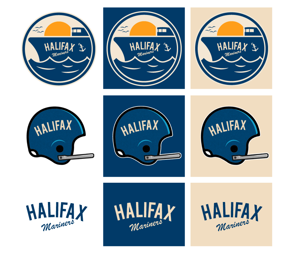
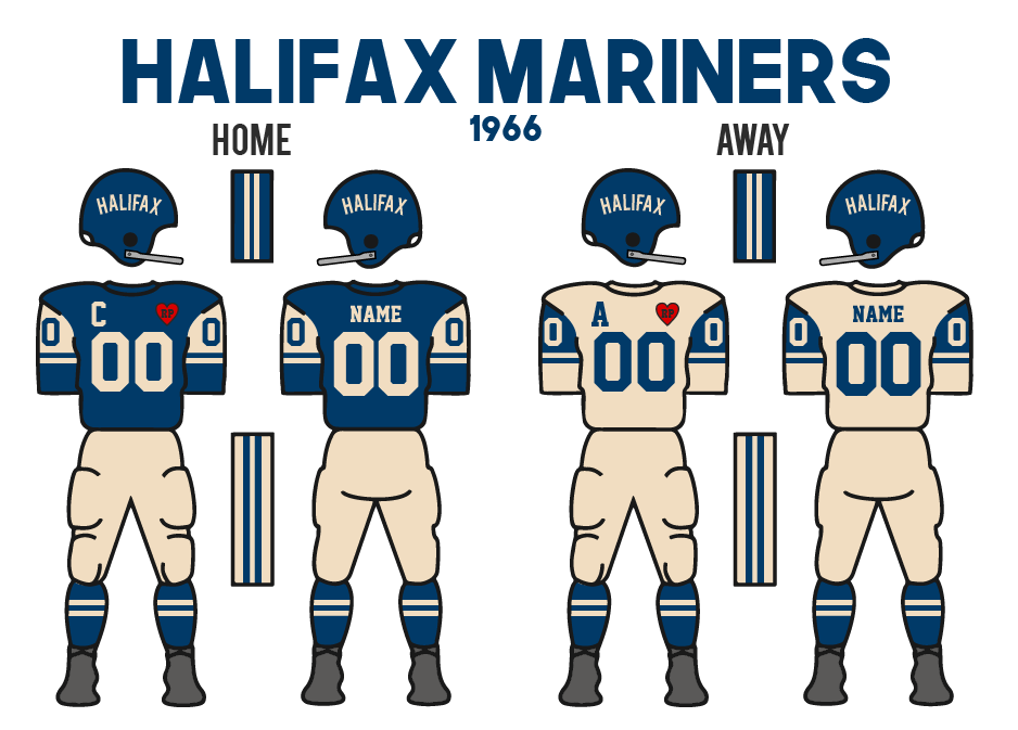
1966 Uniform Changes
In their first few seasons in the Maritimes, Halifax had been using an artistic image of their helmet as a logo, but Owner, Elliot Hudson, wanted to finally change that. In the offseason, the team came up with a brand new logo to represent the team. It features the front of a boat with the team’s name on the side, on the water during the sunset. The colours for the team remain ocean blue and Athletics’ cream despite the new orange sun in the logo. They also kept the original logo as an alternate mark.
Along with the new logo, the jerseys got a slight refresh as well with a much different striping pattern. Instead of the two stripes (which had been with the franchise back in Worcester since 1951), they now had a block along the top of the sleeve that covered the TV numbers, and then an additional stripe just below it. The new-look goes across both uniforms.


- •
- QCS
- All-Star
Offline
- From: 🌌
- Registered: 5/18/2019
- Posts: 1,960
Re: North American Association of Football - NAAF
I'm liking the updated Mariners! A very nice use of their gorgeous shade of blue and cream. I like the ship logo, I could see them iterating on that in the future. I would say that orange could be added to the look but this was definitely the era of having colors in the logo that didn't show up anywhere else in the brand so it's totally likely we never see it anywhere but the logo. I'm glad the helmet logo is sticking around, it doesn't really fit the name "Mariners" but I was used to seeing it for Halifax.
- ItDoesntMatter
- All-Star
Offline

- From: canon coast
- Registered: 5/18/2019
- Posts: 1,423
Re: North American Association of Football - NAAF
Big fan of the new Halifax look! I'll echo Quice in that I hope that orange makes it into the look someday, but the blue and cream is really nice on its own too. The league logo is a big upgrade too. Keep it up!


- osctheg
- Starter
Offline
- Registered: 12/17/2019
- Posts: 58
Re: North American Association of Football - NAAF
Halifax looks really good, and they better keep the heart patch for their entire history.

- Dan O'Mac
- All-Star
Offline

- From: Green Bay, Wisconsin
- Registered: 5/22/2019
- Posts: 2,319
Re: North American Association of Football - NAAF
Digging the Mariners look. Cream and Blue is working for them, and adding Orange would be pretty sexy, too.

5x Alt Champion :: AltLB Champion Oklahoma City Bison - 2022 :: AltFL Champion New York Emperors - 2022 :: AltBA Champion Honolulu Kahunas - 2024-25 :: AltLB Champion Oklahoma City Bison - 2025 :: AltFL Champion New York Emperors - 2025

- care4ameatball
- Rookie
Offline
- Registered: 9/19/2021
- Posts: 3
Re: North American Association of Football - NAAF
SO I have a question. I just gotta say first I am really enjoying this thread. Are the other football leagues also hybrid football rules or American/Canadian football only? If so it would be interesting to see a dynamic between the three codes.
- Stickman
- All-Star
Offline

- Registered: 5/21/2019
- Posts: 939
Re: North American Association of Football - NAAF
Very nice job on the new Mariners logo, looks cool. Orange is a color I'd love to see Halifax add in the years to come, would make a similar color scheme to what the AltHL's Halifax Kingfishers wear, and that's a good thing!


