

- Dan O'Mac
- Moderator
 Offline
- From: Green Bay, Wisconsin
- Registered: 5/22/2019
- Posts: 2,544
Re: World Baseball Softball Confederation by Sky
I like the simplicity of Norway. I was expecting something like their curling uniforms (because I love them) to really make it unique. But because of those uniforms, I was expecting a red heavy with royal blue set, so this was unexpected, in a good way.

5x Alt Champion :: AltLB Champion Oklahoma City Bison - 2022 :: AltFL Champion New York Emperors - 2022 :: AltBA Champion Honolulu Kahunas - 2024-25 :: AltLB Champion Oklahoma City Bison - 2025 :: AltFL Champion New York Emperors - 2025

- ItDoesntMatter
- All-Star
Offline

- From: canon coast
- Registered: 5/18/2019
- Posts: 1,540
Re: World Baseball Softball Confederation by Sky
glad to see this back!
I think all the updates you made based on my last round of suggestions are upgrades, especially india. that script is fantastic. I can go either way on the extra powder blue, but I do like it. also korea's new script is a huge improvement and I think it fits your set much better
pakistan is not one of my favorites. I think an asymmetrical element is a neat idea but I'm not sure just bucket filling one sleeve is the solution. personally I think there's something salvageable in the pinstriped set you linked to. that said the green color is really nice and I like the font you've chosen
poland is really nice! this is a great example of taking an existing design and making it that much better. the new script and cap logo are great, and I like the little bit of black (though if you'll allow me one nit to pick, the belt feels like a little too much)
I'm a firm believer that light blue and white is a color scheme that works, so I'm feeling micronesia. it's simple, but it works. the M feels a little small on the cap, but the font you chose is great and holds down the simple set well
part of me wishes that hong kong was just red and white with their orchid flower emblem on the cap but I do really like the blue, red, and gold look they've got now. you've done a fantastic job balancing the colors here and the font really feels like it fits. the cap logo is fantastic as well. the china thing is pretty silly from my pov sitting here in north america but I get why it's there
very excited to see norway pop up, since my mom's side of the family is very proudly norwegian. I will say expected more red given that literally every other team uses red with the flag stripe but I like that you've stuck with their established baseball aesthetic. I really like the blackletter N, but I think I like theirs better than the one you went with. that said, this is a nice, solid, no-frills set, and it looks good, even if it doesn't really look like norway to me


- sky
- All-Star
Offline

- From: 🌌
- Registered: 5/18/2019
- Posts: 2,098
Re: World Baseball Softball Confederation by Sky
Dan O'Mac wrote:
I like the simplicity of Norway. I was expecting something like their curling uniforms (because I love them) to really make it unique. But because of those uniforms, I was expecting a red heavy with royal blue set, so this was unexpected, in a good way.
Thanks! Norway's baseball team certainly doesn't match their other sports, but I think it's a really classy look that's immediately identifiable. I'm also a sucker for teams using white as their second color with a tertiary highlight.
glad to see this back!
I think all the updates you made based on my last round of suggestions are upgrades, especially india. that script is fantastic. I can go either way on the extra powder blue, but I do like it. also korea's new script is a huge improvement and I think it fits your set much better
pakistan is not one of my favorites. I think an asymmetrical element is a neat idea but I'm not sure just bucket filling one sleeve is the solution. personally I think there's something salvageable in the pinstriped set you linked to. that said the green color is really nice and I like the font you've chosen
poland is really nice! this is a great example of taking an existing design and making it that much better. the new script and cap logo are great, and I like the little bit of black (though if you'll allow me one nit to pick, the belt feels like a little too much)
I'm a firm believer that light blue and white is a color scheme that works, so I'm feeling micronesia. it's simple, but it works. the M feels a little small on the cap, but the font you chose is great and holds down the simple set well
part of me wishes that hong kong was just red and white with their orchid flower emblem on the cap but I do really like the blue, red, and gold look they've got now. you've done a fantastic job balancing the colors here and the font really feels like it fits. the cap logo is fantastic as well. the china thing is pretty silly from my pov sitting here in north america but I get why it's there
very excited to see norway pop up, since my mom's side of the family is very proudly norwegian. I will say expected more red given that literally every other team uses red with the flag stripe but I like that you've stuck with their established baseball aesthetic. I really like the blackletter N, but I think I like theirs better than the one you went with. that said, this is a nice, solid, no-frills set, and it looks good, even if it doesn't really look like norway to me
Thanks! My job got very busy and then I went on vacation so I had to take a break. But I'm hopeful to finish off soon!
For Pakistan, I definitely get where you're coming from. How about just a thick green stripe?

I think the flag being on the right sleeve makes it crowded.
Glad you like Poland and Micronesia!
Hong Kong was tough because red, navy, and gold is a tough scheme to balance but I think it came out looking nice. I had considered going in a direction based on the flag but I know that it's controversial there (geopolitics with China that I don't fully understand). Same reason "China" has to be on the jersey, probably. I agree that it's silly, Puerto Rico doesn't need "United States" on its uniforms and I think everyone knows that Hong Kong is part of China.
Thanks! I think the blackletter N the current team uses is really nice, but the curves and lack of sharpness bothered. I like my logo but also definitely get appeal of the current one.


- •
 Thread Starter
- sky
- All-Star
Offline
- From: 🌌
- Registered: 5/18/2019
- Posts: 2,098
Re: World Baseball Softball Confederation by Sky

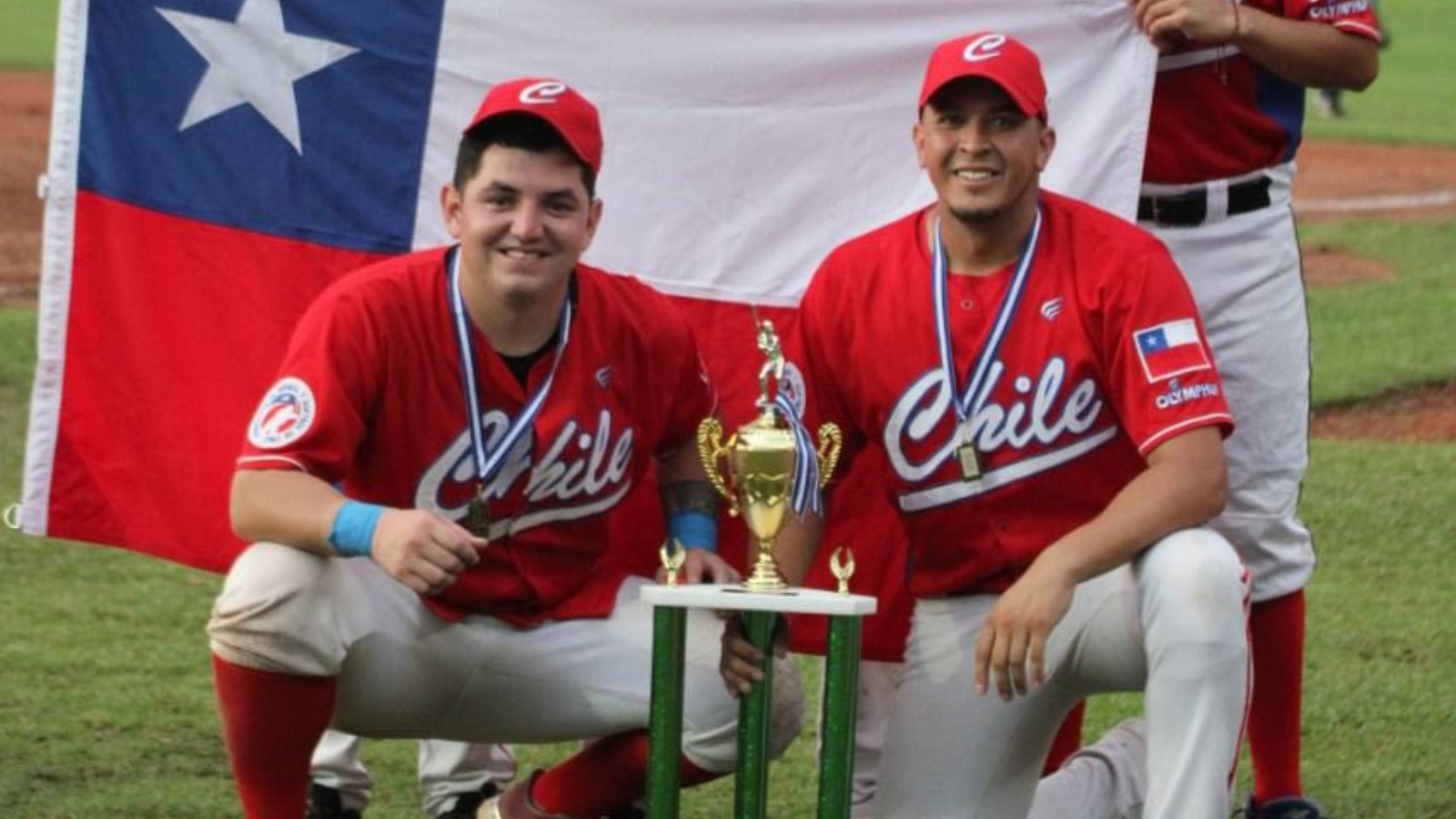
Chile is another team I didn't do much to. Their current set is the base of mine, with the addition of a star as the tittle of the I. I also added some trim of thin red and blue stripes to get a little more blue in the set.
- •
Thread Starter

- Steelman
- superadminguy
Offline

- From: The Wild West
- Registered: 5/19/2019
- Posts: 1,753
Re: World Baseball Softball Confederation by Sky
Well it's been awhile, so here goes!
Cambodia update: Fantastic. Red helps a ton.
Honduras: It's giving Royals in Raglan but I think it mostly works. Prob focus on singular usage of white pants as noted. However, I weirdly (and hate myself a little for saying this) do kinda like the blue pants option.
Serbia: I like this set a lot. Red and gold is an underrated scheme and I like the Tuscan. I hear IDM on the lack of blue but also it looks good.
India: I think the updated script is wonderful, that's def a big hit. I think powder blue is tough to get right, and I'm not totally sure I'm feeling it as-is. Feels a tad muddy I think, mostly due to the color palette. Not really your fault but blue on powder with orange is rough. I don't really know where else you could go with it. The powder on the home is odd for sure. It prob works enough now but I do feel like the bones are here for something really great.
Switzerland: Super sharp look. I like the addition of the front number and the tan added into the road gray.
Pakistan: I actually really like the funky one-off sleeve for them. I do wonder if it'd feel more balanced on the other sleeve so the flag could stand out more. I don't mind the white P logo or the ghosted version. I feel like if you did alternates, the ghost logo would be perfect. Just saw the update with the thick stripe. Def like the filled sleeve better fwiw.
Poland: Looks great! No notes.
Micronesia: Gawd, I wish they used a better shade of powdery light blue. I don't really have any issues with the design. Maybe this is a team that would look better IRL with the textile materiel helping define the super soft colors. Because of the softness, I don't think gray pants work here.
Korea: Now here's a blue and white team that works! The update is great and really pops.
Hong Kong: Looks great! It's text-heavy but I understand why they have it all there. Three primary colors are hard to balance but I think you've done a great job here. Sneaky fav!
Norway: I think they look good. I do wish there was a tad more red, perhaps on the cap logo.
Chile: I like everything about this except the placket. I think it would look a lot cleaner without it, because it muddies up the fantastic star tittle. I think you could Brewer-fy the sleeve and pants stripes a bit instead of having the placket, which might match the wide stripes on the flag. Just a thought.
Czechia: Holy Twins ripoff. Haha. I'm curious how they got away with that, I thought the numbers were a custom set developed for and owned by the team? They seem very similar. Anyways, it does look good! Cream, blue, and red? You know Steel gonna like that. I might have to "steel" that color scheme. I don't totally love the CZ mark but I do like the wordmark.

AHS Admin. Creator of the THL, PUCH, WHA: Redux and Retroliga.
- sky
- All-Star
Offline
- From: 🌌
- Registered: 5/18/2019
- Posts: 2,098
Re: World Baseball Softball Confederation by Sky
Well it's been awhile, so here goes!
India: I think the updated script is wonderful, that's def a big hit. I think powder blue is tough to get right, and I'm not totally sure I'm feeling it as-is. Feels a tad muddy I think, mostly due to the color palette. Not really your fault but blue on powder with orange is rough. I don't really know where else you could go with it. The powder on the home is odd for sure. It prob works enough now but I do feel like the bones are here for something really great.
Norway: I think they look good. I do wish there was a tad more red, perhaps on the cap logo.
Chile: I like everything about this except the placket. I think it would look a lot cleaner without it, because it muddies up the fantastic star tittle. I think you could Brewer-fy the sleeve and pants stripes a bit instead of having the placket, which might match the wide stripes on the flag. Just a thought.
Czechia: Holy Twins ripoff. Haha. I'm curious how they got away with that, I thought the numbers were a custom set developed for and owned by the team? They seem very similar. Anyways, it does look good! Cream, blue, and red? You know Steel gonna like that. I might have to "steel" that color scheme. I don't totally love the CZ mark but I do like the wordmark.
Thanks so much! Here are some updates:

This is India with the new wordmark but no powder blue stripes, which is my favorite set for the nation.
And here's Norway with a red stroke on the cap. I think I prefer the original set for its simplicity but I don't mind this either.

Good call on removing the placket stripe for Chile. Maybe it's because I just posted them but the large sleeve stripes remind me of Czechia. I definitely like them, however. I'm a sucker for 70s/80s-style thick sleeve cuffs.

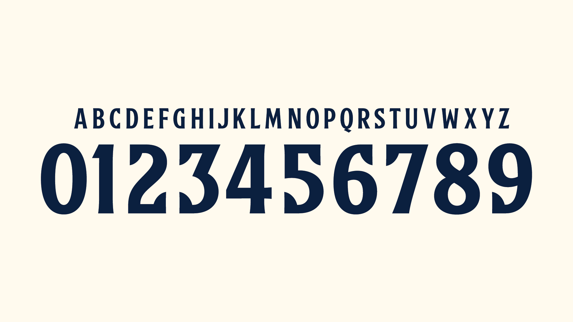
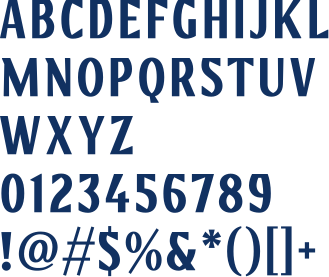
Czechia's new numbers are actually a bespoke font for them! The whole set is obviously clearly inspired by the Twins but they didn't outright steal Minnesota's numbers. Here's a better look at Minnesota's numbers and Czechia's.
- •
Thread Starter- sky
- All-Star
Offline
- From: 🌌
- Registered: 5/18/2019
- Posts: 2,098
Re: World Baseball Softball Confederation by Sky

Slovakia's baseball was pretty difficult to research. There's just not much to find on the English internet, so I mostly on my own, save for this one picture I could find. I decided to just go bold and loud, with oversized stripes on the sleeve from the Slovakia flag. On the chest is the coat of arms of Slovakia. The wordmark is a fairly basic script with the added touch of the k's stem forming the tittle of the i.

Last edited by sky (6/26/2026 10:42 am)
- •
Thread Starter- sky
- All-Star
Offline
- From: 🌌
- Registered: 5/18/2019
- Posts: 2,098
Re: World Baseball Softball Confederation by Sky

Benin is the only nation in this series that uses only green and white as their colors. I've stuck to that with a script inspired by their youth team, complete with a unique B cap logo. Growing the game in Benin is supported by Baseball In Benin, a nonprofit from Minnesota dedicated to giving youth across the nation access to the game. I went with just pinstripes on the home to highlight the kelly green color scheme and opted for simple stripes on the road.


- •
Thread Starter- Dan O'Mac
- Moderator
Offline
- From: Green Bay, Wisconsin
- Registered: 5/22/2019
- Posts: 2,544
Re: World Baseball Softball Confederation by Sky
The kelly green is really nice. I don't have any complaints about this one, it's simple, clean and no frills.
5x Alt Champion :: AltLB Champion Oklahoma City Bison - 2022 :: AltFL Champion New York Emperors - 2022 :: AltBA Champion Honolulu Kahunas - 2024-25 :: AltLB Champion Oklahoma City Bison - 2025 :: AltFL Champion New York Emperors - 2025