

- QCS
- All-Star
 Offline
- From: 🌌
- Registered: 5/18/2019
- Posts: 1,957
Re: Sky Redesigns Nippon Professional Baseball (Series Complete!)
(Bonus)
Expansion of NPB has been contentious. The only time it happened since the 1954 Takahashi Unions was the 2005 Rakuten Eagles, an extremely unconventional situation that threatened the two-league structure of NPB if it wasn't resolved. However, in 2014, the ruling Liberal Democratic Party proposed something unusual in a set of recommendations to boost Japan's economy: expand NPB to 16 teams by adding two teams in each league. While this, of course, never happened, the idea was intriguing to me. The proposal specified four areas as prime targets for a new team: Okinawa, the tropical prefecture in the far south, Shizuoka, a growing region west of Tokyo, Niigata, the only major city on Honshu on the Sea of Japan, and the island of Shikoku, the smallest of the four major islands that make up Japan.
Despite the seeming absurdity of these suggestions, there may be progress towards them eventually becoming a reality. In 2024, for the first time since the '50s, unaffiliated teams joined the Eastern and Western Leagues, the NPB's equivalent of Triple-A. Oisix Niigata Albirex BC and Kufu HAYATE Ventures Shizuoka (both articles in Japanese) joined the EL and WL respectively, Niigata from the independent minor Baseball Challenge League and Shizuoka as a brand-new team. Shikoku already has an independent pro league, the Shikoku Island League Plus, and there was a serious effort to form Okinawa's first ever pro baseball team, the Ryukyu Blue Oceans, in 2019. Unfortunately, financial mismanagement and the COVID-19 pandemic ended their hopes, but the desire is there.
So, what if those four places all got their own NPB teams? What would they look like? That's what I'm answering with our bonus teams. First will be Oisix Niigata Albirex BC!


- QCS
- All-Star
Offline
- From: 🌌
- Registered: 5/18/2019
- Posts: 1,957
Re: Sky Redesigns Nippon Professional Baseball (Series Complete!)

Quick facts:
Founded: 2006
Field: HARD OFF ECO Stadium Niigata, Niigata
Owner: Albirex Group
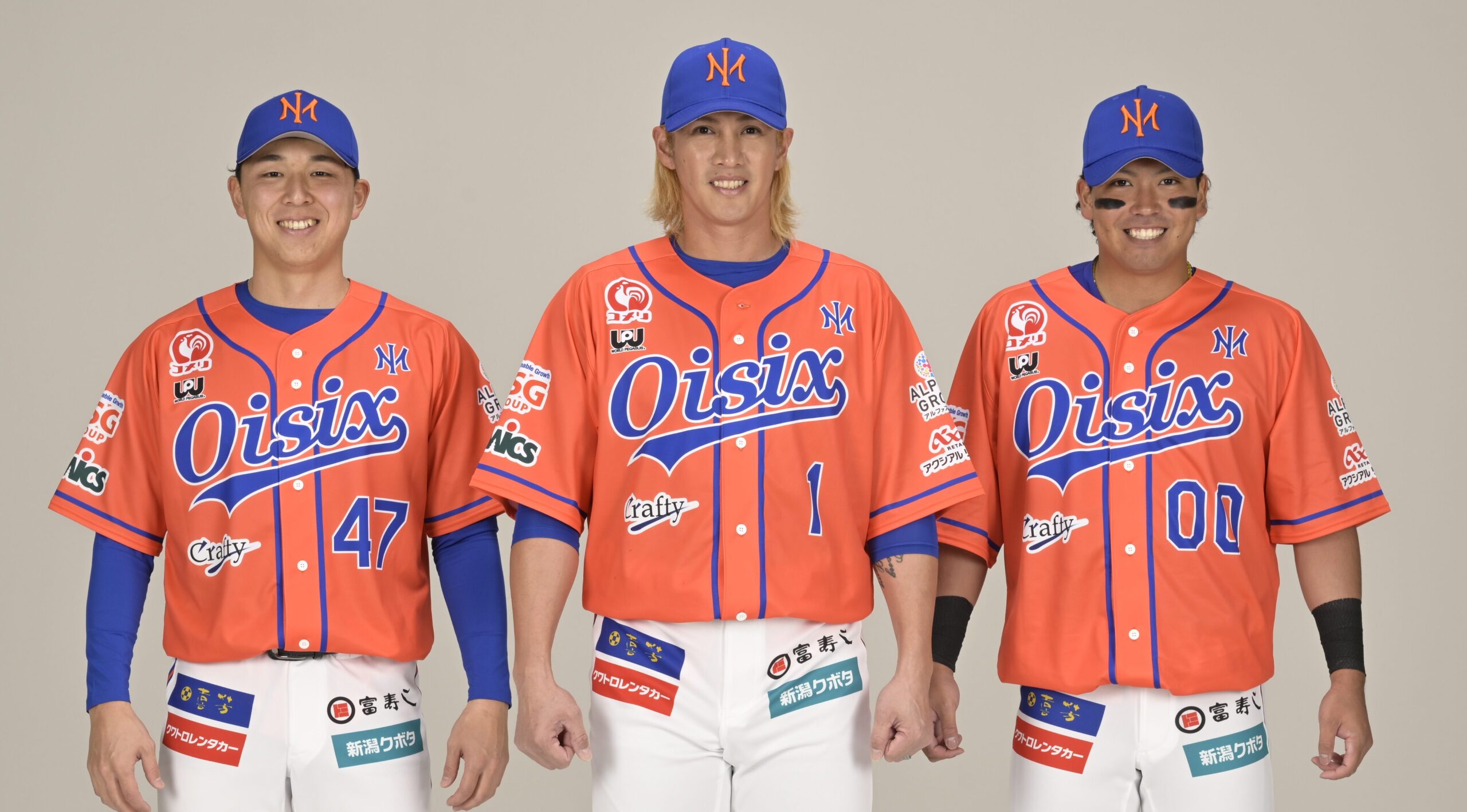
Oisix Niigata Albirex BC is the baseball team of the Albirex Group, most known for J.League team Albirex Niigata. The group has plenty of other sports, including basketball, track & field, and even motorsports. Oisix is a Japanese meal kit delivery service who have invested heavily in the team, owning the naming rights and even 20% of the team itself. Albirex comes from the brightest star in the constellation Cygnus (the swan), Albireo, and Latin for king, rex.
Being an independent minor league team, Oisix's current jerseys are plastered in ads. Their cap logo is a very attractice NA monogram that reminds me of the Yankees' NY in a good way (The NA is easier to see with their multicolored previous logo). Right away the team has a very solid brand with a unique orange and blue color scheme and excellent cap logo. They certainly improved a lot from their pre-EL set, that's for sure.

I decided to take the striping of their current home jerseys and apply them across the board, as well as adopting an excellent Albirex script from All Albirex Sports Club, an initiative to teach kids to be good at all kinds of sports. That goes on the home jersey, while a new and bold block Oisix mark is on the road. The third jersey is a simple blue color swap but the fourth is a black-and-gold look that I don't really have an inspiration for, but I think looks cool. I wanted to include a black jersey in the set, but with the orange it just ended up looking like the Giants, so I switched orange out for a metallic gold.
And that's expansion team number one, Oisix Niigata Albirex BC! It's my hope that they eventually make their way to the big leagues and join NPB. By the way, I selected the Central League for them because Niigata is quite central and it would give the league a foothold in the Tohoku region, which up until now has been purely the territory of the Pacific League.
What do you all think? All comments are appreciated! Tomorrow, we'll look at Niigata's Western League counterpart, Kufu HAYATE Ventures Shizuoka!
- •
- ItDoesntMatter
- All-Star
Offline

- From: canon coast
- Registered: 5/18/2019
- Posts: 1,384
Re: Sky Redesigns Nippon Professional Baseball (Series Complete!)
awesome job on the hawks! you managed to take an identity that feels kinda lost in the sauce and turn it completely around while keeping it tied to the existing brand recognition. the green and gold works really well, the new font is great (despite some of the weird quirks in the numbers) and while I'm not as sold on the hawk logo itself as you clearly are, it's also a huge improvement over what they have
albirex is a weird name that would take some getting used to for me, but I like what you've done with the branding! you mentioned the logo feels like the yankees (and I agree) but everything else feels like the mets, which is a compliment despite the mets being, you know, the mets. quick point about the logo: I can only see it as an IM. I get how it's trying to be an NA but it's just not. it'd be a great logo for inner mongolia or something. given the origins of the name it'd be fun to try a swan with a crown? still, I think this is a huge improvement over anything this team has given us irl, great work


- QCS
- All-Star
Offline
- From: 🌌
- Registered: 5/18/2019
- Posts: 1,957
Re: Sky Redesigns Nippon Professional Baseball (Series Complete!)
ItDoesntMatter wrote:
awesome job on the hawks! you managed to take an identity that feels kinda lost in the sauce and turn it completely around while keeping it tied to the existing brand recognition. the green and gold works really well, the new font is great (despite some of the weird quirks in the numbers) and while I'm not as sold on the hawk logo itself as you clearly are, it's also a huge improvement over what they have
albirex is a weird name that would take some getting used to for me, but I like what you've done with the branding! you mentioned the logo feels like the yankees (and I agree) but everything else feels like the mets, which is a compliment despite the mets being, you know, the mets. quick point about the logo: I can only see it as an IM. I get how it's trying to be an NA but it's just not. it'd be a great logo for inner mongolia or something. given the origins of the name it'd be fun to try a swan with a crown? still, I think this is a huge improvement over anything this team has given us irl, great work
Thanks! I understand where you're coming from with the logo, I read it as an IM at first as well. I can give an alternate cap logo a try, though!
The Ventures will be up soon!
- •
- QCS
- All-Star
Offline
- From: 🌌
- Registered: 5/18/2019
- Posts: 1,957
Re: Sky Redesigns Nippon Professional Baseball (Series Complete!)

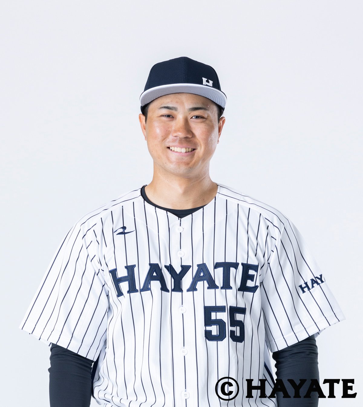
Quick facts:
Founded: 2023
Field: Churu Stadium Shimizu, Shimizu, Shizuoka
Owner: Hayate Group
The Kufu Hayate Ventures Shizuoka are the newest team in NPB's system, having been founded in 2023 and starting play in the minor Western League in 2024. Their owner, Hayate Group, is a venture capital fund that is all-in on the team, going so far as the build the team's entire brand around Hayate's own brand. Despite their status as a minor league team, the Ventures are here to win. Kufu is an all-encompassing company that purchased the naming rights for the team.
Perhaps because of Hayate's deep pockets, the Ventures' uniforms are simple and ad-free. They use a classy navy-only look with pinstripes that reminds me of the Yankees. I decided to continue with that association, opting for clean and classic uniforms for the team.

The biggest change I made is creating a matching Shizuoka wordmark that I placed on the road uniform. I understand Hayate wants to advertise themselves, but I think at least one jersey should have something else on it. Strangely, the Ventures opted to place their cap logo in the bottom right of their caps and to have a ghosted helmet logo. I scrapped both of these things for a plain white version of Hayate's H. I also placed the rope pattern underneath the wordmarks and used it as the striping for the navy third jersey.
And there's the Ventures! I hope both them and Niigata can make their way up to the major leagues, especially with Hayate's classy brand. I'm still not sold on Ventures as a team name (the first time I read the Japanese name「ベンチャーズ」I thought it read "Benchers") but I suppose that's part of Hayate's brand.
What do you all think? All comments are appreciated! Tomorrow we'll head to the island of Shikoku!
- •
- Section30
- Moderator
Offline

- From: Minnesota
- Registered: 5/18/2019
- Posts: 2,816
Re: Sky Redesigns Nippon Professional Baseball (Series Complete!)
This whole series has been fantastic!
I'm sorry for not commenting until now, I just haven't had any critiques to make lol. I've agreed with pretty much all of the changes you've made and love the amount of dedication, thought, and research you put into each design. This has truly been one of my favorite baseball design series ever and I couldn't ask for a better introduction to Japanese baseball.
Keep up the great work, I'm looking forward to these last two teams!


- QCS
- All-Star
Offline
- From: 🌌
- Registered: 5/18/2019
- Posts: 1,957
Re: Sky Redesigns Nippon Professional Baseball (Series Complete!)
This whole series has been fantastic!
I'm sorry for not commenting until now, I just haven't had any critiques to make lol. I've agreed with pretty much all of the changes you've made and love the amount of dedication, thought, and research you put into each design. This has truly been one of my favorite baseball design series ever and I couldn't ask for a better introduction to Japanese baseball.
Keep up the great work, I'm looking forward to these last two teams!
Thanks so much! I'm so glad you've enjoyed so far and that I was comprehensive enough with my team introductions, haha.
Shikoku will be up soon!
- •
- QCS
- All-Star
Offline
- From: 🌌
- Registered: 5/18/2019
- Posts: 1,957
Re: Sky Redesigns Nippon Professional Baseball (Series Complete!)

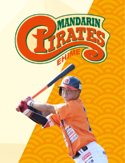
Quick facts:
Founded: 2005
Field: Botchan Stadium, Matsuyama, Ehime
Owner: Independent Baseball League of Japan Inc.
The island of Shikoku is well-known for its citrus fruits, mostly notably mikan (mandarin oranges) and iyokan. So in the Shikoku Island League Plus, the Ehime Mandarin Pirates take the field, along with three other teams found in the other three prefectures of Shikoku. I selected the Pirates as Matsuyama, their home city, is the largest in Shikoku and none of the other team names (Indigo Socks, Fighting Dogs, and Olive Guyners) really spoke to me. The Pirates also happen to be the reigning champs of the SILP, but the Guyners and Indigo Socks are both more successful overall. I did, however, change the team's region from Ehime to Shikoku as they now represent the whole island on the national stage.
Despite what their logo may suggest, the Mandarin Pirates use an orange and navy color scheme. I decided to switch the navy to green for two reasons: one, that it's a unique color scheme that represents the leaves of the trees mikan grow on, and two, Niigata is already orange and blue and having two teams with near-identical color schemes join the same league rubbed me the wrong way. I took the beautiful P from their current logo and adapted it to serve as the full-time mark, complete with dropshadow.

I decided to give the Pirates a nautical-style script and matching numbers. I considered pinstripes, as the team has worn them before, but decided against it for a cleaner look. The sleeve patch is a mandarin logo with baseball stitching. The third jersey is inspired by the Pirates' current jerseys (I think, it's difficult to find information on them on the English internet) featuring a block PIRATES across the front with headspoon piping. This time, however, it's in green and utilizes spiky lettering to match the script and numbers.
And that's the Shikoku Mandarin Pirates! One thing that I've really come to appreciate as I've done research for this project is that there's baseball everywhere in Japan, even beyond NPB. I think the Shikoku Island League Plus is awesome and I'd like to see Shikoku get a shot at an even higher level of baseball.
What do you all think? All comments are appreciated! Tomorrow we'll finish the expansion teams with a team representing Okinawa!
Last edited by QCS (11/19/2025 5:01 pm)
- •
- Section30
- Moderator
Offline
- From: Minnesota
- Registered: 5/18/2019
- Posts: 2,816
Re: Sky Redesigns Nippon Professional Baseball (Series Complete!)
Love that shade of orange and the "Mandarin Pirates" name is great!
- QCS
- All-Star
Offline
- From: 🌌
- Registered: 5/18/2019
- Posts: 1,957
Re: Sky Redesigns Nippon Professional Baseball (Series Complete!)
Love that shade of orange and the "Mandarin Pirates" name is great!
Thanks! I agree, the orange is a really appealing shade.
- •