

- QCS
- All-Star
 Offline
- From: 🌌
- Registered: 5/18/2019
- Posts: 1,957
Re: Sky Redesigns Nippon Professional Baseball (Series Complete!)
Steelman wrote:
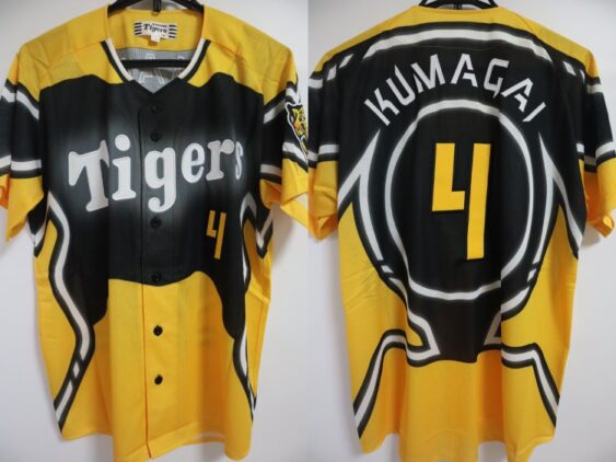
Ah yes, Ti-gers my beloved. Honestly no notes. I like the fourth jersey, it feels more professional than their other attempts...honestly that 2021 alternate is... wow. Great set!
Oh yeah, it's real rough. Their 2023 alt was not much better.
The Giants will be up soon!


- QCS
- All-Star
Offline
- From: 🌌
- Registered: 5/18/2019
- Posts: 1,957
Re: Sky Redesigns Nippon Professional Baseball (Series Complete!)

Quick facts:
Founded: 1934
Field: Tokyo Dome, Bunkyo, Tokyo
Central League Titles: 39
Japan Series Titles: 22
Owner: Yomiuri Shimbun
Posting Fee: Shun Yamaguchi, $1,270,000
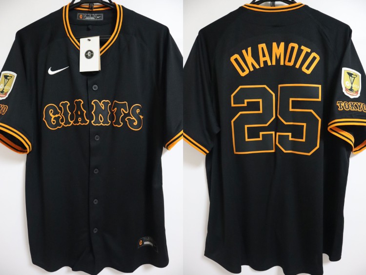
Ah, the Giants. They've truly earned their reputation as the Yankees of Japan. With a record-setting 39 CL titles and 22 Japan Series crowns, the Kyojin (Japanese for "Giants") are by far the most successful Japanese club. Founded as the Great Japan Tokyo Baseball Club, the team toured the US and were told by San Francisco Seals manager Lefty O'Doul they'd need a more marketable name. Since Tokyo was the New York of Japan, he reasoned, Giants was a natural choice.
While the Giants have mostly taken their identity from the New York and San Francisco Giants, they've forged their own way recently. Under Amour created a unique Tuscan font for the team, then in 2024, the team celebrated their 90th anniversary by adopting throwback logos and uniforms, including a TG (Tokyo Giants) monogram on the road. I prefer their old look, personally, so I mostly reverted to that. It's always confused me that the Giants don't put their iconic YG interlock in their primary logo, so I fixed that. I also slightly tweaked the orange to be less sickly.

When it comes to the jerseys, you really can't change much. By and large, the home and road jerseys are just what they wore before 2024 and the alts are just color swaps of that. Instead of the current black jersey's ghosted letters, I stripped white out of the look, a la the SF Giants. The orange jersey simply adds a white outline to the NOB. I flipped the orange and black jerseys' designations simply because I prefer the Kyojin being orange-first, like my Orioles. You'll notice that the road jersey says "Tokyo" - this is a tradition of the Giants, and as far as I can tell, they've only ever worn "Yomiuri" on the front of their jerseys once: this 2002-05 away alternate set.
Just like the Yankees, I can't say I much care for the Giants. They've been on a Japan Series drought since 2012 and if I had my way it would stay like that forever. But, again, just like the Yankees, I can't deny that the Giants have an iconic and gorgeous look.
What do you all think? All comments are appreciated! Next we'll travel just across Tokyo Bay for the Chiba Lotte Marines!
- •
- QCS
- All-Star
Offline
- From: 🌌
- Registered: 5/18/2019
- Posts: 1,957
Re: Sky Redesigns Nippon Professional Baseball (Series Complete!)

Quick facts:
Founded: 1949
Field: ZOZO Marine Stadium, Chiba
Pacific League Titles: 5
Japan Series Titles: 4
Owner: Lotte Holdings
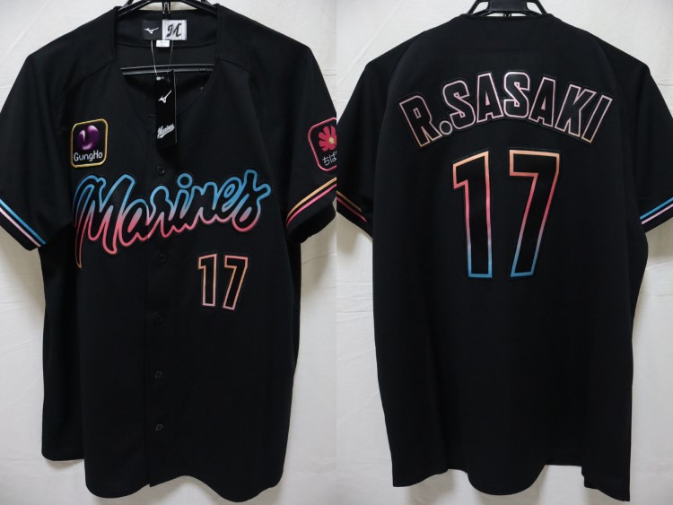
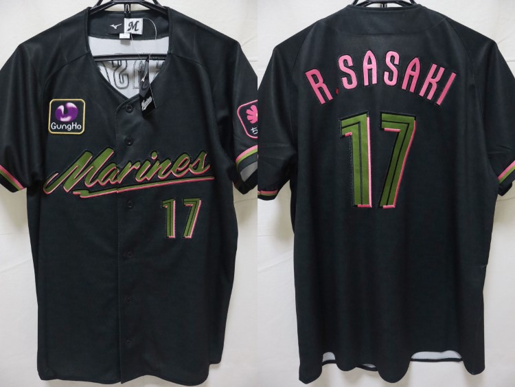
Posting Fee: Roki Sasaki, $1,625,000
The Chiba Lotte Marines (that's pronounced low-tay, by the way) were founded as the Mainichi Orions, originally playing in Tokyo proper before a short-lived move to Sendai in the northeast of the country. From there they played in Kawasaki, very close to Tokyo, before finally adopting Chiba as their home and Marines as their name in 1992. The team took its name from their home stadium, which itself was named due to its position directly on Tokyo Bay. The stadium is actually scheduled to be replaced by a brand-new field just across the Hamada River.
At first, the Marines used a unique pink and blue color scheme with a simple CLM cap logo, but this was replaced with a new set in 1995 that generally remains to this day. Currently Lotte wears a simple white-black color swap as their home and road jerseys, but it seems to me that it's a shame to not utilize their fantastic Marines script. Their logos needed no changes in my opinion.

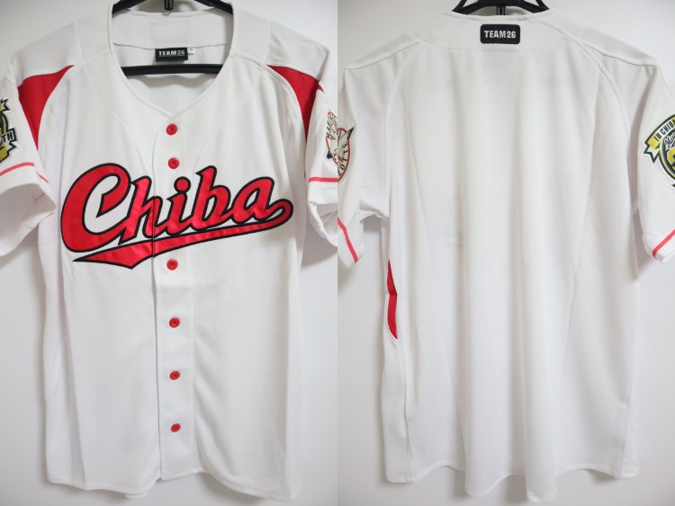
My biggest problem with the Marines' set is the overabundance of outlines. I stripped those out to create something much cleaner than the current look. In addition, grabbed the team's Chiba script (which I believe first appeared on this 2016 fan club jersey) and placed it on the road set. The team used lots of red prior to 2019, so I brought the color back as their third jersey, which is otherwise a very simple set. Recently, the Marines have been using a theme for their fourth jerseys that I would describe as "attempting to eat Miami's nachos" (see: 2021, 2022, 2023, 2024, and 2025), so I went for a jersey that's basically the White Sox's Southside set meets the Miami Heat's Vice jerseys. A pink-to-blue gradient is all over, including the pinstripes themselves.
The Marines were actually the first set I made for this concept series, but I think they turned out quite well. I especially love the Chiba script and wish the team would stop imitating the White Sox and utilize their gorgeous scripts.
What do you all think? All comments are appreciated! Tomorrow, we once again head across Tokyo Bay for the Yokohama DeNA BayStars!
- •
- QCS
- All-Star
Offline
- From: 🌌
- Registered: 5/18/2019
- Posts: 1,957
Re: Sky Redesigns Nippon Professional Baseball (Series Complete!)

Quick facts:
Founded: 1949
Field: Yokohama Stadium, Yokohama, Kanagawa
Central League Titles: 2
Japan Series Titles: 3
Owner: DeNA
Posting Fee: Yoshi Tsutsugo, $2,400,000
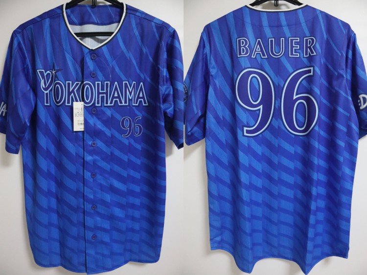
The Yokohama DeNA BayStars were originally founded as the Taiyo Whales, named after owner Maruha's Taiyo brand of seafood products, including whales. They bounced around in their early years, moving from Shimonoseki to Osaka to finally settling in Kanagawa Prefecture (just south of Tokyo) in Kawasaki Stadium. In 1977, they shifted slightly south to Yokohama Stadium and gave stayed there ever since. In 1992, due to restrictions on whaling, the Taiyo brand was ended and the team was renamed the "Yokohama BayStars". In 2011, the team was acquired by mobile game developer DeNA and updated their brand to match. You'll notice that the BayStars have one more Japan Series title than Central League pennant—in 2024, the team barely qualified for the playoffs in 3rd and, despite winning the Japan Series, were not awarded a CL pennant, which goes to the team in 1st (though I'm sure the Giants wish they had won the Japan Series instead!).
I'll be honest. I really had no idea what to do with Yokohama. I don't really love their name (and I wish they had kept Whales, along with this stunning green and orange set) and I really don't care for their current uniforms. So much of their current brand just kind of boils down to "blue" but I decided to carve a more unique path for them by emphasizing the light blue more.

I took the current chest stripe and applied it to the sleeves instead. The BayStars are also one of a few teams to receive different home and road caps, with a B logo at home and a Y on the road. The core idea of the set is that light blue is dominant at home, navy blue on the road. The alt is probably the most "out-there" uniform of this whole series. In the DeNA era, the team has worn pinstripes a lot, so I combined those with the idea of shooting stars for pinstripes that end in stars in various places around the chest. I'm unsure of the result, but I was worried sublimating them more would lose them. The current over-outlined messes of wordmarks are swapped for clean, nautical scripts, inspired by the bay that gave the team its name.
So there's the BayStars! The whole time I was making the third, I was really unsure of if this was the right way to go. Looking at it now, I wouldn't call it perfect, but I do like it. In my opinion, the entire DeNA era has been an aesthetic disaster, although I'm not sure I would call any BayStars jersey good.
What do you all think? All comments are appreciated! Tomorrow we finish our Tokyo-area excursion with the Tokyo Yakult Swallows!
Last edited by QCS (11/10/2025 2:47 pm)
- •
- QCS
- All-Star
Offline
- From: 🌌
- Registered: 5/18/2019
- Posts: 1,957
Re: Sky Redesigns Nippon Professional Baseball (Series Complete!)

Quick facts:
Founded: 1950
Field: Meiji Jingu Stadium, Shinjuku, Tokyo
Central League Titles: 9
Japan Series Titles: 6
Owner: Yakult Honsha
Posting Fee: Norichika Aoki, $2,500,000
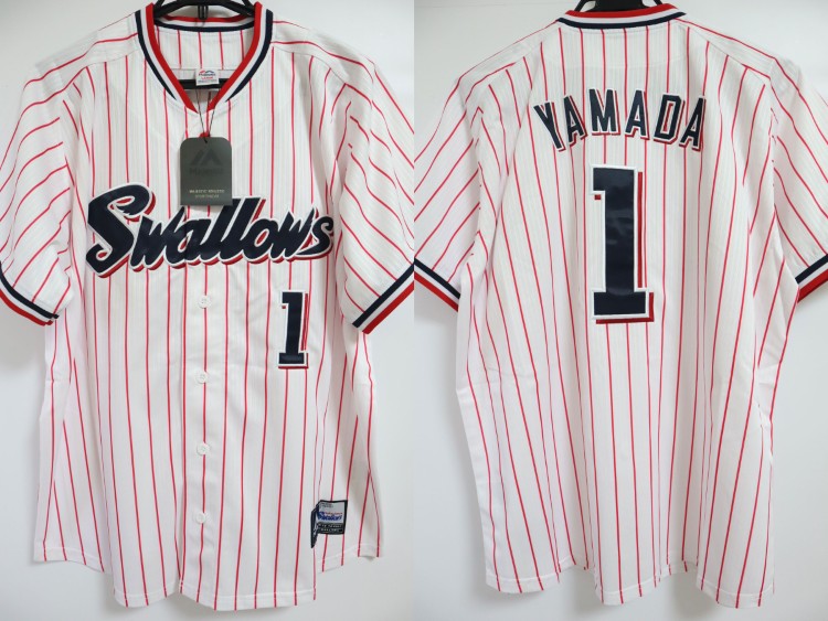
The team now known as the Tokyo Yakult Swallows were founded as the Kokutetsu Swallows in 1950, named after the then-fastest express train run by the company, the Tsubame, or swallow. After a brief stint in the '60s as the Sankei Atoms (named for who we know as Astro Boy, but who is called Mighty Atom in Japan), yogurt company Yakult purchased the team in 1970, and reverted the name to Swallows in 1974 after a failed campaign to rebrand as the Jaguars. In 2006, Tokyo was added to the name and the Swallows and Giants officially created the "Tokyo Series", an inter-city rivalry for the two clubs left in Tokyo proper. The Swallows most recently won the Japan Series in 2021 with slugger Munetaka Murakami, who was just posted to MLB this offseason.
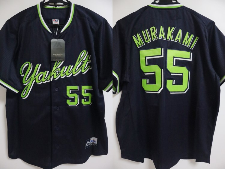
The Swallows have utilized a classic script with a winged S since their very first season, and have deviated very little from their blue and red color scheme, even during the Atoms era. When they first changed the name back to Swallows in 1974, the team used a unique YS cap logo that has returned to use in the current era after a '90s rebrand that replaced the mark. In 2013, Yakult introduced their first bright green jersey, and even decided to use the color full-time on the road in 2016. I decided to supplant red and move full-time to the navy and green, which would be an entirely unique color scheme amongst major baseball leagues.

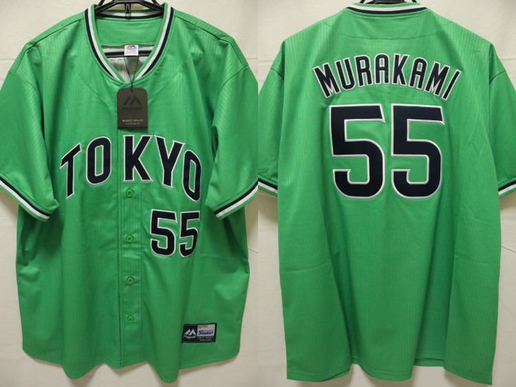
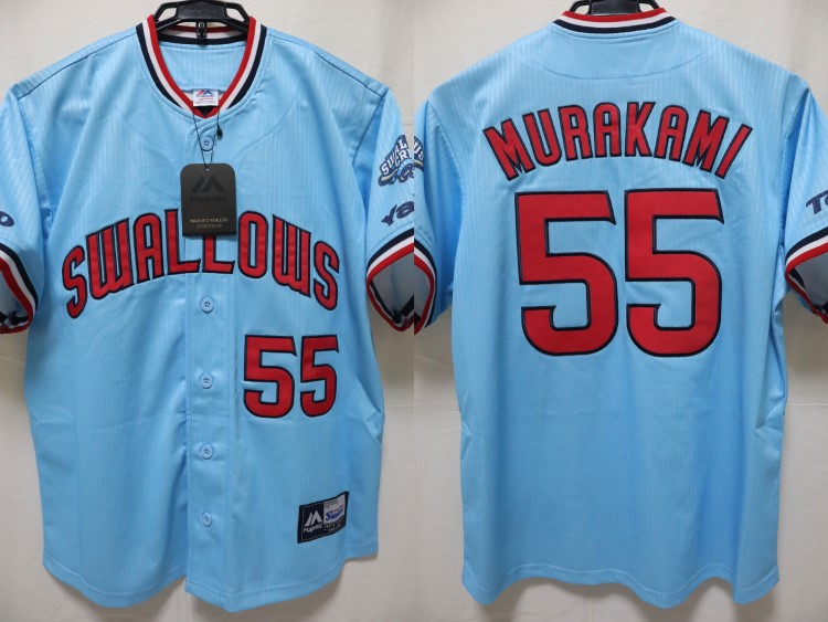
My version of the Swallows is a lot like what they wear now, just with green at home. On the road, the script and numbers are now white instead of green. The third jersey is now a dropshadow-less version of the road jersey with a new Tokyo script, matching the Yakult one, mostly inspired by this 2024 fourth jersey. The first three jerseys use this classic Swallows icon from the '50s as a sleeve patch, which I really adore. My fourth jersey is inspired by these 2024 and 2025 jerseys using powder blue, with their Padres-style font. This jersey is inspired by the bird the team uses as a mascot, flying through the skies.
And that's the Swallows! I've adopted them as my favorite Tokyo team, and would really love to see a game at Meiji Jingu before they replace it in the coming years. It's one of very few stadiums left that Babe Ruth played in! The navy and green look is very striking and despite the lack of RWB teams in NPB, I think this could carve a global niche for the Swallows to occupy.
What do you all think? All comments are appreciated! Tomorrow we'll return to the Pacific League with the most controversial team in baseball, the Orix Buffaloes!
- •
- QCS
- All-Star
Offline
- From: 🌌
- Registered: 5/18/2019
- Posts: 1,957
Re: Sky Redesigns Nippon Professional Baseball (Series Complete!)

Quick facts:
Founded: 1936
Field: Kyocera Dome Osaka, Osaka
Pacific League Titles: 15
Japan Series Titles: 5
Owner: Orix
Posting Fee: Ichiro Suzuki, $13,125,000
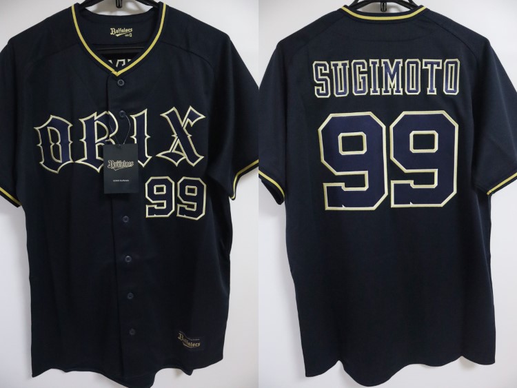
The Orix Buffaloes have possibly the strangest origin story in major sports. Originally the Hankyu Braves of Nishinomiya, the team was purchased by Orix in 1988 who changed the team's name to BlueWave, their colors to blue and gold, and their home city to Kobe, just west of Nishinomiya. These moves were unpopular amongst fans, but the true surprise was yet to come. While the newly-renamed BlueWave were finding a new home, the Osaka Kintetsu Buffaloes were struggling. Despite the success of the team and foreign star Tuffy Rhodes, team owners Kintetsu Railways were trillions of yen in debt and eventually sold the team to Orix in 2004. It was announced that the BlueWave and Buffaloes would merge into one team, the Orix Buffaloes, who would take up residence in Kintetsu's home of Osaka. The loss of a whole team caused the only players' strike in NPB history and eventually resulted in the creation of the Tohoku Rakuten Golden Eagles to maintain a 12-team structure. Despite officially being called a merger, the BlueWave basically "ate" the Buffaloes, maintaining their own history.
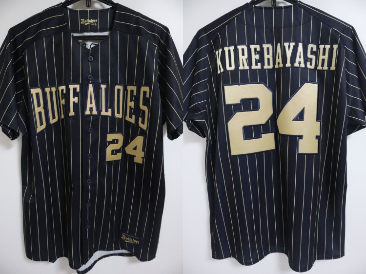
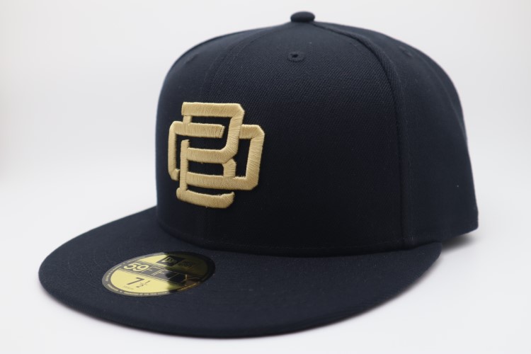
The Buffaloes use a dark navy and gold color scheme, a remnant of the BlueWave era. Truth be told, I always thought they were a black and gold team, but it's actually just a really dark navy. I've corrected this mistake by actually making the team black and gold. Other than that, I really like the club's old English wordmark and kept the marks the same beyond the color change.

Just like their logos, I like the Buffaloes' home and road uniforms just fine. All I changed was the colors and I added a curve to the NOB. My distaste for "ghosted" wordmarks and numbers shows here as I've made the road letters gold. The third is based on this jersey that the team has used for the past two seasons, complete with an OB interlocking mark on the cap. The fourth jersey is a throwback to the BlueWave's road jersey from 1991-2000, otherwise known as the "Ichiro Era". The real-life Buffaloes have thrown back to both the BlueWave and Kintetsu Buffaloes, but I think Orix would prefer to stick to their ownership. It's a shame, because I find the old Buffaloes cap logo to be really charming.
Despite their controversial origins, the Buffaloes have established themselves as a true contender lately, winning the PL pennant from 2021-23 and the Japan Series in 2022. They even return to the home of the BlueWave, Hotto Motto Field Kobe, when the Osaka Dome is being used by the Tigers due to the high school baseball tournament. I also really like their brand, it stands out in the colorful NPB.
What do you all think? All comments are appreciated! Tomorrow will be the newest NPB team and the result of the BlueWave-Buffaloes merger, the Tohoku Rakuten Golden Eagles!
- •
- QCS
- All-Star
Offline
- From: 🌌
- Registered: 5/18/2019
- Posts: 1,957
Re: Sky Redesigns Nippon Professional Baseball (Series Complete!)

Quick facts:
Founded: 2004
Field: Rakuten Mobile Park Miyagi, Sendai, Miyagi
Pacific League Titles: 1
Japan Series Titles: 1
Owner: Rakuten
Posting Fee: Masahiro Tanaka, $20,000,000
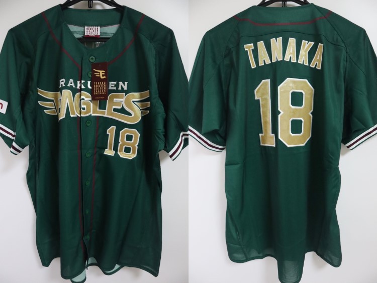
The Tohoku Rakuten Golden Eagles, or just Rakuten Eagles for short, were born out of the chaos that was the BlueWave-Buffaloes merger. The team is based in Sendai, part of the Tohoku (Northeast) region of Japan, and are named for the endangered Japanese golden eagle, which is found in the mountains of the region. The team faced the kind of challenges an expansion team would expect, but it was compounded when the devastating 2011 Tohoku earthquake struck the region. The Eagles played home games at Koshien Stadium until April, when they returned to Sendai. In 2013, much like the Saints after Katrina, the Eagles had a dominant season led by PL MVP Masahiro Tanaka and clinched their first and so far only Japan Series title at home against the Giants.
Since their birth, the Eagles have used this wordmark featuring wings on the E and S of Eagles. Since 2010, however, they've worn the Rakuten logo on the road in place of a wordmark and I find that boring. I created a new E logo that's much more modern and dynamic and made new wordmarks to match to separate the corporate Rakuten brand from the Eagles.

The jerseys feature the bold new wordmark and a striping pattern inspired by their current home jerseys. Instead of the current road jerseys, the road set is now a color swap of the home set with a new matching Rakuten wordmark. The third jersey is a continuation of the Tohoku Green series of jerseys, worn from 2013-2023. I stripped out maroon in favor of a forest green and metallic gold look, along with a new Tohoku wordmark. The fourth jersey is a retro fauxback, inspired by these 2017 and 2025 alternate jerseys. They gave me the inspiration for the Tuscan-style wordmark and the idea of the newest team having the oldest-looking jersey gave me a chuckle. The cap is even a one-color E instead of the winged E mark.
The Eagles have a surprisingly consistent identity despite their origins as a rushed 2000s team. That said, I think it's finally time to bring them into the modern era with a bold new look. I'm glad to see baseball in Sendai and I think they're the one good thing to come out of the BlueWave-Buffaloes merger!
What do you all think? All comments are appreciated! Tomorrow we finish off the current NPB with the reigning champs and only team to have never posted a player, the Fukuoka SoftBank Hawks!
Last edited by QCS (11/14/2025 2:25 pm)
- •
- ItDoesntMatter
- All-Star
Offline

- From: canon coast
- Registered: 5/18/2019
- Posts: 1,384
Re: Sky Redesigns Nippon Professional Baseball (Series Complete!)
you've been putting out some some great stuff recently, and it's a shame nobody's commented on it. lemme change that!
lions: I like the double blue for them a lot. not feeling the font - I don't like the way it zags to the left, it's just weird - but it's their existing wordmark, so I can't really fault you for that. other than that, it's a classic look, feels very baseball, and the throwback is nice
tigers: not much to go on here, but I think the new shade of yellow is significantly better and the tiger stripes on the fourth are great. the wordmarks are once again a little weird but I don't think you can change them in this case. one change I would suggest would be to add a cap for the third with a single-color HT. feels like it would fit the jersey betterbears, oh my!
giants: again, not a ton here, but the new shade of orange is sooo much better and the logo feels more yomiuri giants. it all just feels yomiuri giants. nicely done
marines: now this is an upgrade. the jerseys look much nicer (and less white sox-y) with the single layer scripts on the home and road. I adore the magenta alt, that might be my favorite jersey you've posted so far. the chiba vice set is a lot of fun too, and imo significantly better than most of their attempts
baystars: now this is an even bigger upgrade. your take on the brand feels like it has so much more life than the original. the color scheme is great, although it's kinda similar to the lions, and I wish there was a little more of that yellow-gold to differentiate them. I had the same thought with the away uniform, since saitama uses navy on the road, it'd be nice to see them go with the lighter blue, but on the other hand, I really like the alt and I don't think it would work as well with the colors reversed. overall I think this is your best work yet
swallows: I like the navy and green a lot! clearly this proves that blue and green is a viable color scheme :) the drop shadow works really well with this set too. the fourth is yet another banger - I just think maybe the numbers could be a little bit bolder to match the wordmark. love the colors, though, and the clouds are really well done
buffaloes: not feeling this one, but that's mostly the fault of the existing brand, which you didn't really change. there are just too many outlines, especially for such a complex blackletter font, and I've never understood the Fs in the script. I will say the improvements you made to the color scheme, and road and third jerseys are definitely better - I'm with you that the buffs feel more like a black and gold team than a blue and gold team
eagles: this is a great set that keeps the same vibe the eagles have had and takes it up a notch. the new logo and wordmarks are such great modernizations of the existing concept, and it all looks great in both red and green. the fauxback is, honestly, a good bit, but it looks great too. this is just what the golden eagles should be wearing
hopefully that sated your critique appetite! can't wait for you to post (japanese baseball pun) the next team


- QCS
- All-Star
Offline
- From: 🌌
- Registered: 5/18/2019
- Posts: 1,957
Re: Sky Redesigns Nippon Professional Baseball (Series Complete!)
you've been putting out some some great stuff recently, and it's a shame nobody's commented on it. lemme change that!
lions: not feeling the font - I don't like the way it zags to the left, it's just weird - but it's their existing wordmark, so I can't really fault you for that.
tigers: one change I would suggest would be to add a cap for the third with a single-color HT. feels like it would fit the jersey better
baystars: I wish there was a little more of that yellow-gold to differentiate them. I had the same thought with the away uniform, since saitama uses navy on the road, it'd be nice to see them go with the lighter blue, but on the other hand, I really like the alt and I don't think it would work as well with the colors reversed.
swallows: the fourth is yet another banger - I just think maybe the numbers could be a little bit bolder to match the wordmark.
buffaloes: not feeling this one, but that's mostly the fault of the existing brand, which you didn't really change. there are just too many outlines, especially for such a complex blackletter font, and I've never understood the Fs in the script.
hopefully that sated your critique appetite! can't wait for you to post (japanese baseball pun) the next team
Thanks so much for your comments! Lemme respond to your critiques:
Lions: I agree that the font is kind of strange but it's also charming to me in a way? It's mostly the cap logo that I like from the real-world set, it's very satisfying.
Tigers: Yep, agreed. Not sure how I didn't think of that.
BayStars: Ironically, I redid the BayStars and Lions brands to try and separate them but they ended up sort of blurring together again. When I posted the team I was a little surprised at just how little gold I ended up using, but it's like you said: the alt works much better as a light blue jersey than a navy one. Looking back, I could probably swap white in the stripes for gold.
Swallows: Funnily enough, I'm certain that's the exact same font, the 11 is just a particularly thin number.
Buffaloes: I think it's totally fair to not like the Buffaloes' current logo package, but like the Lions, it has a bit of charm to me. It's probably the Olde English B cap logo that convinced me to keep it.
So glad you've been enjoying the series so far! The Hawks will be up soon.
- •
- QCS
- All-Star
Offline
- From: 🌌
- Registered: 5/18/2019
- Posts: 1,957
Re: Sky Redesigns Nippon Professional Baseball (Series Complete!)

Quick facts:
Founded: 1938
Field: Mizuho PayPay Dome Fukuoka, Fukuoka
Pacific League Titles: 21
Japan Series Titles: 12
Owner: SoftBank Group
Posting Fee: N/A
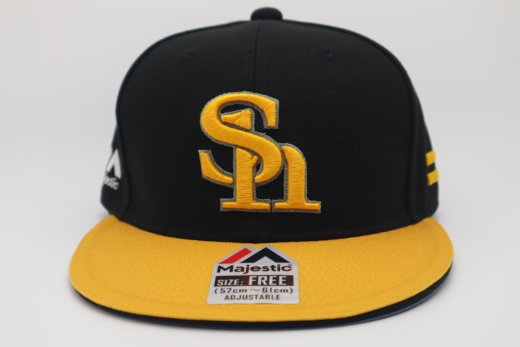
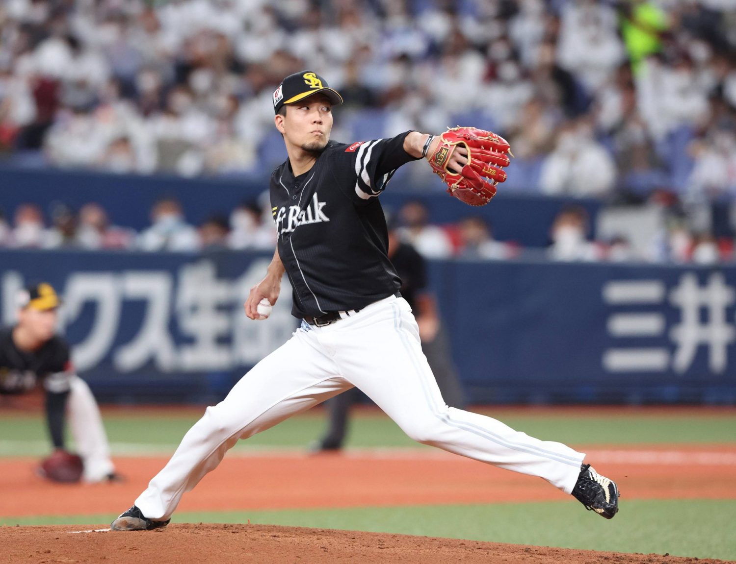
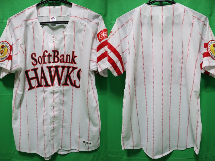
The Fukuoka SoftBank Hawks are the current undisputed best team in NPB. Since 1999, the team has won 10 Japan Series titles and 11 Pacific League pennants, creating a formidable dynasty based on analytics and not posting players. Founded as the Nankai Club in 1938 in Osaka, the team adopted the nickname Hawks in 1947 and maintained their name and stadium until 1988, when supermarket chain Daiei purchased the team. The brand was looking to break into the Kyushu market and so moved the team to Fukuoka, the largest city on the island, and renamed them the Fukuoka Daiei Hawks. Finally in 2005, investment company SoftBank purchased the team.
The Hawks' current brand is heavily based on SoftBank's. Their logo is based on their parent company's and their uniforms feature the same thick stripes. However, the Hawks have a rich visual history that I pulled from to revitalize their brand. The new logo is a return to this classic '50s mark, a gorgeous, simple hawk icon. I also decided to swap SoftBank's black for a dark green, harkening back to the Hawks teams of the 1970s. The hawk logo also replaces the Sh cap logo, which I've never been a fan of.

Despite my complaining about the Hawks' SoftBank-inspired identity, I actually really like the striping pattern and I think it makes for a unique look the team can own. I was tempted to restore this classic Hawks script, but I decided I was already pulling a lot from the past. The new wordmark font is modern and stands out amongst a sea of scripts and block fonts that NPB has. I also added much more color to the road uniform, which is currently sorely lacking gold. The fourth jersey uses a red and black color scheme and pinstripes, both things that SoftBank is quite familiar with.
And that's the last NPB team! The Hawks have probably my second-least-favorite real-life look (after the BayStars) but I think just switching the colors and fonts add a lot of much-needed energy to the set. Then again, when you win 8 championships in a single look, usually it tends to stick around. I'll just have to keep rooting against them
What do you all think? All comments are appreciated! Next week, we'll begin the hypothetical expansion teams!
- •